设置全局 CSS 样式;基本的 HTML 元素均可以通过 class 设置样式并得到增强效果;还有先进的栅格系统。
基本样式
布局容器
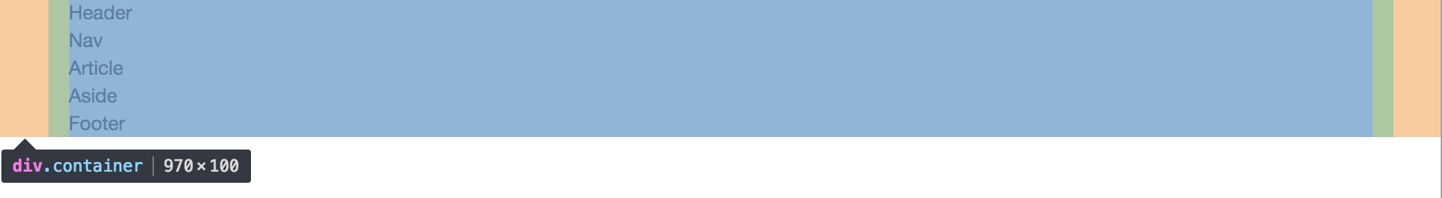
Bootstrap 需要为页面内容和栅格系统包裹一个 .container 容器。我们提供了两个作此用处的类。注意,由于 padding 等属性的原因,这两种 容器类不能互相嵌套。
<div class="container">
  ...
</div>
.container-fluid 类用于 100% 宽度,占据全部视口(viewport)的容器。
<div class="container-fluid">
  ...
</div>
// Container widths
//
// Set the container width, and override it for fixed navbars in media queries.
.container {
@include container-fixed;
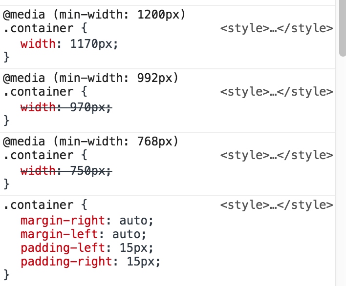
@media (min-width: $screen-sm-min) {
width: $container-sm;
}
@media (min-width: $screen-md-min) {
width: $container-md;
}
@media (min-width: $screen-lg-min) {
width: $container-lg;
}
}
// Fluid container
//
// Utilizes the mixin meant for fixed width containers, but without any defined
// width for fluid, full width layouts.
.container-fluid {
@include container-fixed;
}
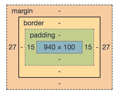
- container-fixed是预制的宏,用来处理container横向居中
- 通过媒体查询@media来给出不同屏幕宽度下的容器宽度,以md样式为例,当屏幕宽度为992到1200之间时,使用md宽度,使用container-md的值(940+30)=970px
// Extra small screen / phone
//** Deprecated `$screen-xs` as of v3.0.1
$screen-xs:                  480px !default;
//** Deprecated `$screen-xs-min` as of v3.2.0
$screen-xs-min:              $screen-xs !default;
//** Deprecated `$screen-phone` as of v3.0.1
$screen-phone:               $screen-xs-min !default;

// Small screen / tablet
//** Deprecated `$screen-sm` as of v3.0.1
$screen-sm:                  768px !default;
$screen-sm-min:              $screen-sm !default;
//** Deprecated `$screen-tablet` as of v3.0.1
$screen-tablet:              $screen-sm-min !default;

// Medium screen / desktop
//** Deprecated `$screen-md` as of v3.0.1
$screen-md:                  992px !default;
$screen-md-min:              $screen-md !default;
//** Deprecated `$screen-desktop` as of v3.0.1
$screen-desktop:             $screen-md-min !default;

// Large screen / wide desktop
//** Deprecated `$screen-lg` as of v3.0.1
$screen-lg:                  1200px !default;
$screen-lg-min:              $screen-lg !default;
//** Deprecated `$screen-lg-desktop` as of v3.0.1
$screen-lg-desktop:          $screen-lg-min !default;


// Small screen / tablet
$container-tablet:             (720px + $grid-gutter-width) !default;
//** For `$screen-sm-min` and up.
$container-sm:                 $container-tablet !default;

// Medium screen / desktop
$container-desktop:            (940px + $grid-gutter-width) !default;
//** For `$screen-md-min` and up.
$container-md:                 $container-desktop !default;

// Large screen / wide desktop
$container-large-desktop:      (1140px + $grid-gutter-width) !default;
//** For `$screen-lg-min` and up.
$container-lg:                 $container-large-desktop !default;
- container-fluid容器则是去掉了媒体查询和宽度限制,默认沾满整个屏幕
container-fixed是预制的混合宏
_variables.scss中定义了需要的默认值,grid-gutter-width表示列的默认列间距30px
//** Padding between columns. Gets divided in half for the left and right.
$grid-gutter-width:         30px !default;
// Centered container element
@mixin container-fixed($gutter: $grid-gutter-width) {
  margin-right: auto;
  margin-left: auto;
  padding-left:  floor(($gutter / 2));
  padding-right: ceil(($gutter / 2));
  @include clearfix;
}
- @minin语法定义混合宏
- $gutter: $grid-gutter-width - $gutter是传入参数,默认值是上文定义的30px;实际使用时,可以自定义列宽度
- padding-left和padding-right通过padding来消除列之间的空白
- @include clearfix使用另一个混合宏来消除浮动布局的塌陷问题
// Clearfix
//
// For modern browsers
// 1. The space content is one way to avoid an Opera bug when the
//    contenteditable attribute is included anywhere else in the document.
//    Otherwise it causes space to appear at the top and bottom of elements
//    that are clearfixed.
// 2. The use of `table` rather than `block` is only necessary if using
//    `:before` to contain the top-margins of child elements.
//
// Source: http://nicolasgallagher.com/micro-clearfix-hack/

@mixin clearfix() {
  &:before,
  &:after {
    content: " "; // 1
    display: table; // 2
  }
  &:after {
    clear: both;
  }
}
container编译后的结果为:
栅格系统
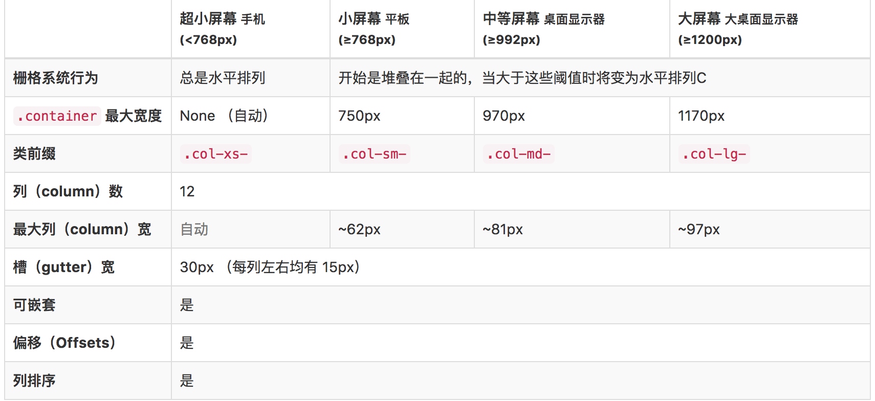
栅格系统用于通过一系列的行(row)与列(column)的组合来创建页面布局,你的内容就可以放入这些创建好的布局中。下面就介绍一下 Bootstrap 栅格系统的工作原理:
- “行(row)”必须包含在 .container (固定宽度)或 .container-fluid (100% 宽度)中,以便为其赋予合适的排列(aligment)和内补(padding)。
- 通过“行(row)”在水平方向创建一组“列(column)”。
- 你的内容应当放置于“列(column)”内,并且,只有“列(column)”可以作为行(row)”的直接子元素。
- 类似 .row 和 .col-xs-4 这种预定义的类,可以用来快速创建栅格布局。Bootstrap 源码中定义的 mixin 也可以用来创建语义化的布局。
- 通过为“列(column)”设置 padding 属性,从而创建列与列之间的间隔(gutter)。通过为 .row 元素设置负值 margin 从而抵消掉为 .container 元素设置的 padding,也就间接为“行(row)”所包含的“列(column)”抵消掉了padding。
- 负值的 margin就是下面的示例为什么是向外突出的原因。在栅格列中的内容排成一行。
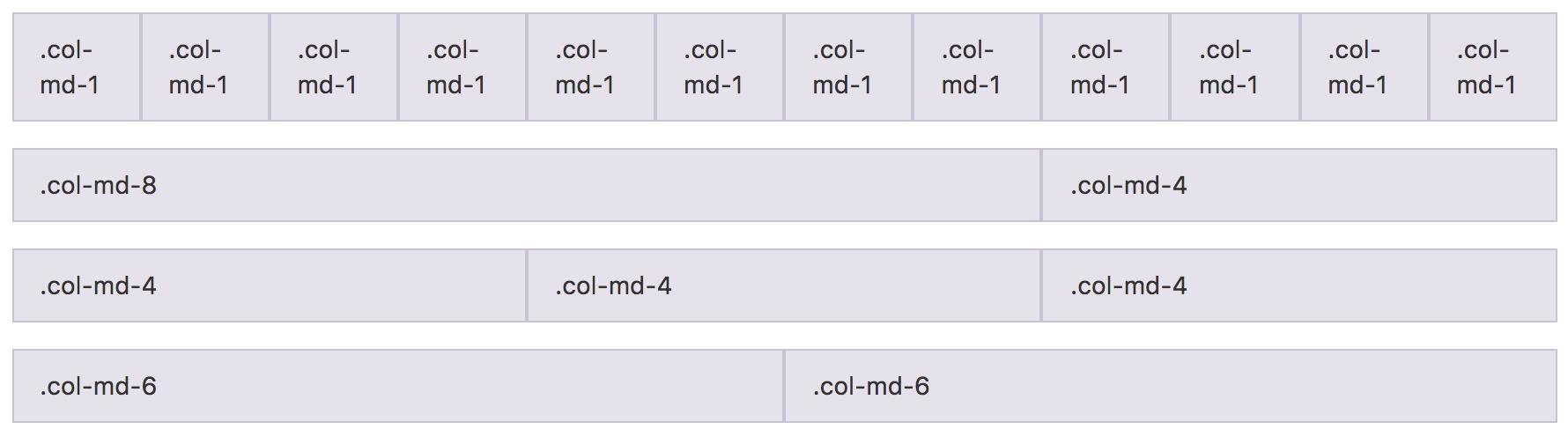
- 栅格系统中的列是通过指定1到12的值来表示其跨越的范围。例如,三个等宽的列可以使用三个 .col-xs-4 来创建。
- 如果一“行(row)”中包含了的“列(column)”大于 12,多余的“列(column)”所在的元素将被作为一个整体另起一行排列。
- 栅格类适用于与屏幕宽度大于或等于分界点大小的设备 , 并且针对小屏幕设备覆盖栅格类。 因此,在元素上应用任何 .col-md-* 栅格类适用于与屏幕宽度大于或等于分界点大小的设备 , 并且针对小屏幕设备覆盖栅格类。 因此,在元素上应用任何 .col-lg-* 不存在, 也影响大屏幕设备。
栅格参数
<div class="row">
  <div class="col-md-1">.col-md-1</div>
  <div class="col-md-1">.col-md-1</div>
  <div class="col-md-1">.col-md-1</div>
  <div class="col-md-1">.col-md-1</div>
  <div class="col-md-1">.col-md-1</div>
  <div class="col-md-1">.col-md-1</div>
  <div class="col-md-1">.col-md-1</div>
  <div class="col-md-1">.col-md-1</div>
  <div class="col-md-1">.col-md-1</div>
  <div class="col-md-1">.col-md-1</div>
  <div class="col-md-1">.col-md-1</div>
  <div class="col-md-1">.col-md-1</div>
</div>
<div class="row">
  <div class="col-md-8">.col-md-8</div>
  <div class="col-md-4">.col-md-4</div>
</div>
<div class="row">
  <div class="col-md-4">.col-md-4</div>
  <div class="col-md-4">.col-md-4</div>
  <div class="col-md-4">.col-md-4</div>
</div>
<div class="row">
  <div class="col-md-6">.col-md-6</div>
  <div class="col-md-6">.col-md-6</div>
</div>
row
// Row
//
// Rows contain and clear the floats of your columns.

.row {
  @include make-row;
}
- make-row是预定义的混合宏: 与container类似,主要处理左右边距的便宜,保证页面两侧的对齐。
// Creates a wrapper for a series of columns
@mixin make-row($gutter: $grid-gutter-width) {
margin-left:  ceil(($gutter / -2));
margin-right: floor(($gutter / -2));
@include clearfix;
}
column
column的定义通过混合宏来引入
// Columns
//
// Common styles for small and large grid columns

@include make-grid-columns;
@mixin make-grid-columns($i: 1, $list: ".col-xs-#{$i}, .col-sm-#{$i}, .col-md-#{$i}, .col-lg-#{$i}") {
  @for $i from (1 + 1) through $grid-columns {
    $list: "#{$list}, .col-xs-#{$i}, .col-sm-#{$i}, .col-md-#{$i}, .col-lg-#{$i}";
  }
  #{$list} {
    position: relative;
    // Prevent columns from collapsing when empty
    min-height: 1px;
    // Inner gutter via padding
    padding-left:  ceil(($grid-gutter-width / 2));
    padding-right: floor(($grid-gutter-width / 2));
  }
}
- 利用@for循环,生成各种列宽的样式
- $grid-columns是默认的列数,值为12
- $list 变量是生成的选择器,将循环变量$i插入到选择器中
- 生成的样式包含了定位、最小高度、消除左右边距
make-grid
具体计算各个尺寸下的宽度:
// Extra small grid
//
// Columns, offsets, pushes, and pulls for extra small devices like
// smartphones.

@include make-grid(xs);


// Small grid
//
// Columns, offsets, pushes, and pulls for the small device range, from phones
// to tablets.

@media (min-width: $screen-sm-min) {
  @include make-grid(sm);
}


// Medium grid
//
// Columns, offsets, pushes, and pulls for the desktop device range.

@media (min-width: $screen-md-min) {
  @include make-grid(md);
}


// Large grid
//
// Columns, offsets, pushes, and pulls for the large desktop device range.

@media (min-width: $screen-lg-min) {
  @include make-grid(lg);
}
// Create grid for specific class
@mixin make-grid($class) {
  @include float-grid-columns($class);
  @include loop-grid-columns($grid-columns, $class, width);
  @include loop-grid-columns($grid-columns, $class, pull);
  @include loop-grid-columns($grid-columns, $class, push);
  @include loop-grid-columns($grid-columns, $class, offset);
}
float-grid-columns
// [converter] This is defined recursively in LESS, but Sass supports real loops
@mixin float-grid-columns($class, $i: 1, $list: ".col-#{$class}-#{$i}") {
  @for $i from (1 + 1) through $grid-columns {
    $list: "#{$list}, .col-#{$class}-#{$i}";
  }
  #{$list} {
    float: left;
  }
}
- 生成选择器和向左浮动
loop-grid-columns
// [converter] This is defined recursively in LESS, but Sass supports real loops
@mixin loop-grid-columns($columns, $class, $type) {
  @for $i from 0 through $columns {
    @include calc-grid-column($i, $class, $type);
  }
}
@mixin calc-grid-column($index, $class, $type) {
  @if ($type == width) and ($index > 0) {
    .col-#{$class}-#{$index} {
      width: percentage(($index / $grid-columns));
    }
  }
  @if ($type == push) and ($index > 0) {
    .col-#{$class}-push-#{$index} {
      left: percentage(($index / $grid-columns));
    }
  }
  @if ($type == push) and ($index == 0) {
    .col-#{$class}-push-0 {
      left: auto;
    }
  }
  @if ($type == pull) and ($index > 0) {
    .col-#{$class}-pull-#{$index} {
      right: percentage(($index / $grid-columns));
    }
  }
  @if ($type == pull) and ($index == 0) {
    .col-#{$class}-pull-0 {
      right: auto;
    }
  }
  @if ($type == offset) {
    .col-#{$class}-offset-#{$index} {
      margin-left: percentage(($index / $grid-columns));
    }
  }
}
在这个混合宏中定义了各种能力的计算方式:
- width 栅格系统中的宽度,percentage(($index / $grid-columns)),使用百分比给出宽度
- pull和push 修改float的方向和位置
- offset 通过margin-left给出便宜时的位置
列偏移
<div class="row">
  <div class="col-md-4">.col-md-4</div>
  <div class="col-md-4 col-md-offset-4">.col-md-4 .col-md-offset-4</div>
</div>
<div class="row">
  <div class="col-md-3 col-md-offset-3">.col-md-3 .col-md-offset-3</div>
  <div class="col-md-3 col-md-offset-3">.col-md-3 .col-md-offset-3</div>
</div>
<div class="row">
  <div class="col-md-6 col-md-offset-3">.col-md-6 .col-md-offset-3</div>
</div>
使用 .col-md-offset-* 类可以将列向右侧偏移。这些类实际是通过使用 * 选择器为当前元素增加了左侧的边距(margin)。
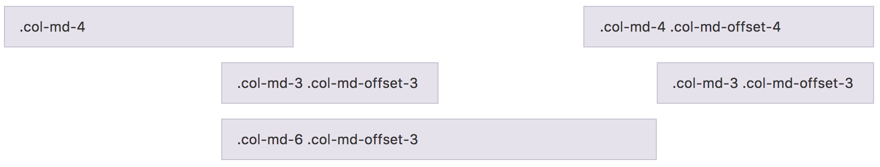
结合之前的源码,offset是通过margin-left增加偏移处理:
  @if ($type == offset) {
    .col-#{$class}-offset-#{$index} {
      margin-left: percentage(($index / $grid-columns));
    }
嵌套列
<div class="row">
  <div class="col-sm-9">
    Level 1: .col-sm-9
    <div class="row">
      <div class="col-xs-8 col-sm-6">
        Level 2: .col-xs-8 .col-sm-6
      </div>
      <div class="col-xs-4 col-sm-6">
        Level 2: .col-xs-4 .col-sm-6
      </div>
    </div>
  </div>
</div>
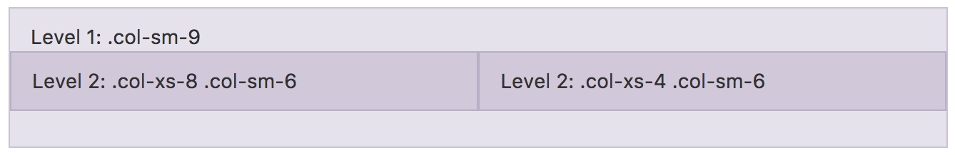
为了使用内置的栅格系统将内容再次嵌套,可以通过添加一个新的 .row 元素和一系列 .col-sm-* 元素到已经存在的 .col-sm-* 元素内。
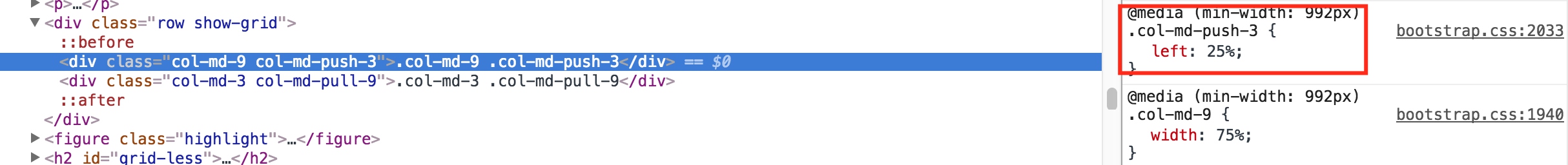
列排序
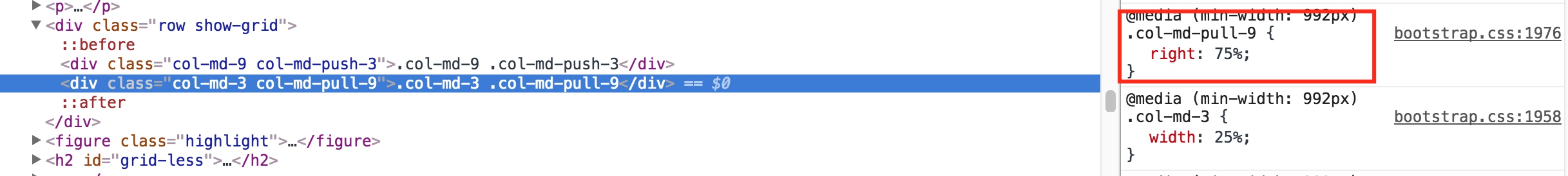
通过使用 .col-md-push-* 和 .col-md-pull-* 类就可以很容易的改变列(column)的顺序。
<div class="row">
  <div class="col-md-9 col-md-push-3">.col-md-9 .col-md-push-3</div>
  <div class="col-md-3 col-md-pull-9">.col-md-3 .col-md-pull-9</div>
</div>

- 将md-9向后推3列
- 将md-3向前移9列
- 通过之前的源码分析,push和pull是通过left和right的百分比进行位移
排版
标题
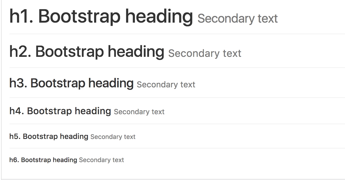
<h1>h1. Bootstrap heading <small>Secondary text</small></h1>
<h2>h2. Bootstrap heading <small>Secondary text</small></h2>
<h3>h3. Bootstrap heading <small>Secondary text</small></h3>
<h4>h4. Bootstrap heading <small>Secondary text</small></h4>
<h5>h5. Bootstrap heading <small>Secondary text</small></h5>
<h6>h6. Bootstrap heading <small>Secondary text</small></h6>
// Headings
// -------------------------

h1, h2, h3, h4, h5, h6,
.h1, .h2, .h3, .h4, .h5, .h6 {
  font-family: $headings-font-family;
  font-weight: $headings-font-weight;
  line-height: $headings-line-height;
  color: $headings-color;

  small,
  .small {
    font-weight: normal;
    line-height: 1;
    color: $headings-small-color;
  }
}

h1, .h1,
h2, .h2,
h3, .h3 {
  margin-top: $line-height-computed;
  margin-bottom: ($line-height-computed / 2);

  small,
  .small {
    font-size: 65%;
  }
}
h4, .h4,
h5, .h5,
h6, .h6 {
  margin-top: ($line-height-computed / 2);
  margin-bottom: ($line-height-computed / 2);

  small,
  .small {
    font-size: 75%;
  }
}

h1, .h1 { font-size: $font-size-h1; }
h2, .h2 { font-size: $font-size-h2; }
h3, .h3 { font-size: $font-size-h3; }
h4, .h4 { font-size: $font-size-h4; }
h5, .h5 { font-size: $font-size-h5; }
h6, .h6 { font-size: $font-size-h6; }
- hx和small的区别在于font-weight和font-size的设置,其中small是正常字体的65%
- 其中使用的大量的变量预设大小,可以在使用时通过设置变量值进行定制
- $line-height-computed 通过其他变量的默认值进行计算,并给文字的上下留间距
$font-size-base:          14px !default;
$line-height-base:        1.428571429 !default; // 20/14
$line-height-computed:    floor(($font-size-base * $line-height-base)) !default; // ~20px
主体
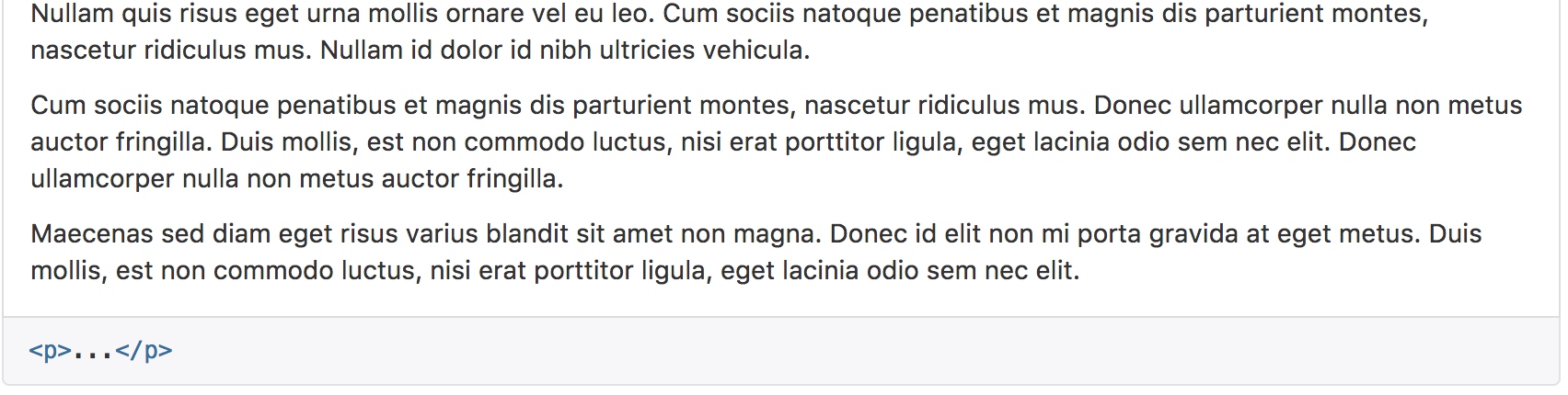
<p>...</p>
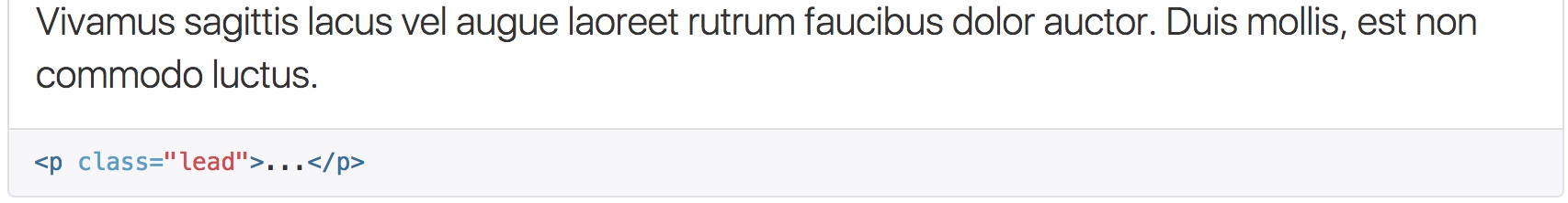
<p class="lead">...</p>
p {
  margin: 0 0 ($line-height-computed / 2);
}

.lead {
  margin-bottom: $line-height-computed;
  font-size: floor(($font-size-base * 1.15));
  font-weight: 300;
  line-height: 1.4;

  @media (min-width: $screen-sm-min) {
    font-size: ($font-size-base * 1.5);
  }
}
- 为主体内容设置下边距
- lead内容放大下边距;文字加粗;放大字体和行号
- 应用媒体查询,在屏幕大于sm的时候放大到1.5倍
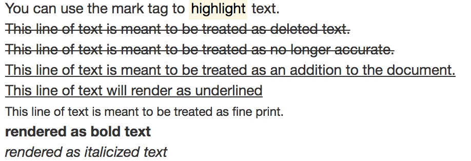
内联文本
You can use the mark tag to <mark>highlight</mark> text.<br />
<del>This line of text is meant to be treated as deleted text.</del><br />
<s>This line of text is meant to be treated as no longer accurate.</s><br />
<ins>This line of text is meant to be treated as an addition to the document.</ins><br />
<u>This line of text will render as underlined</u><br />
<small>This line of text is meant to be treated as fine print.</small><br />
<strong>rendered as bold text</strong><br />
<em>rendered as italicized text</em><br />
对齐
<p class="text-left">Left aligned text.</p>
<p class="text-center">Center aligned text.</p>
<p class="text-right">Right aligned text.</p>
<p class="text-justify">Justified text.</p>
<p class="text-nowrap">No wrap text.</p>
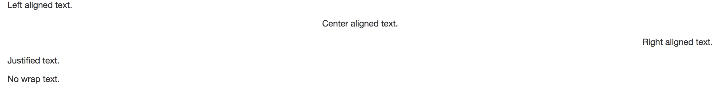
源码上很简单,只是利用css的text-align
.text-left           { text-align: left; }
.text-right          { text-align: right; }
.text-center         { text-align: center; }
.text-justify        { text-align: justify; }
.text-nowrap         { white-space: nowrap; }
改变大小写
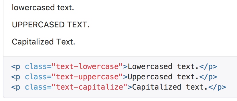
// Transformation
.text-lowercase      { text-transform: lowercase; }
.text-uppercase      { text-transform: uppercase; }
.text-capitalize     { text-transform: capitalize; }
缩略语
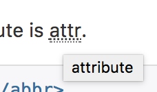
当鼠标悬停在缩写和缩写词上时就会显示完整内容,Bootstrap 实现了对 HTML 的 元素的增强样式。缩略语元素带有 title 属性,外观表现为带有较浅的虚线框,鼠标移至上面时会变成带有“问号”的指针。如想看完整的内容可把鼠标悬停在缩略语上(对使用辅助技术的用户也可见), 但需要包含 title 属性。
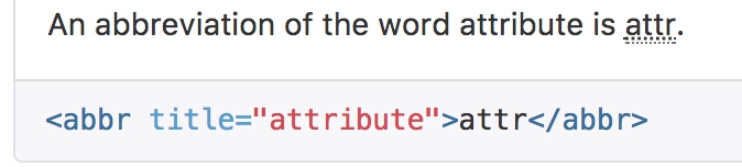
abbr[title],
// Add data-* attribute to help out our tooltip plugin, per https://github.com/twbs/bootstrap/issues/5257
abbr[data-original-title] {
  cursor: help;
  border-bottom: 1px dotted $abbr-border-color;
}
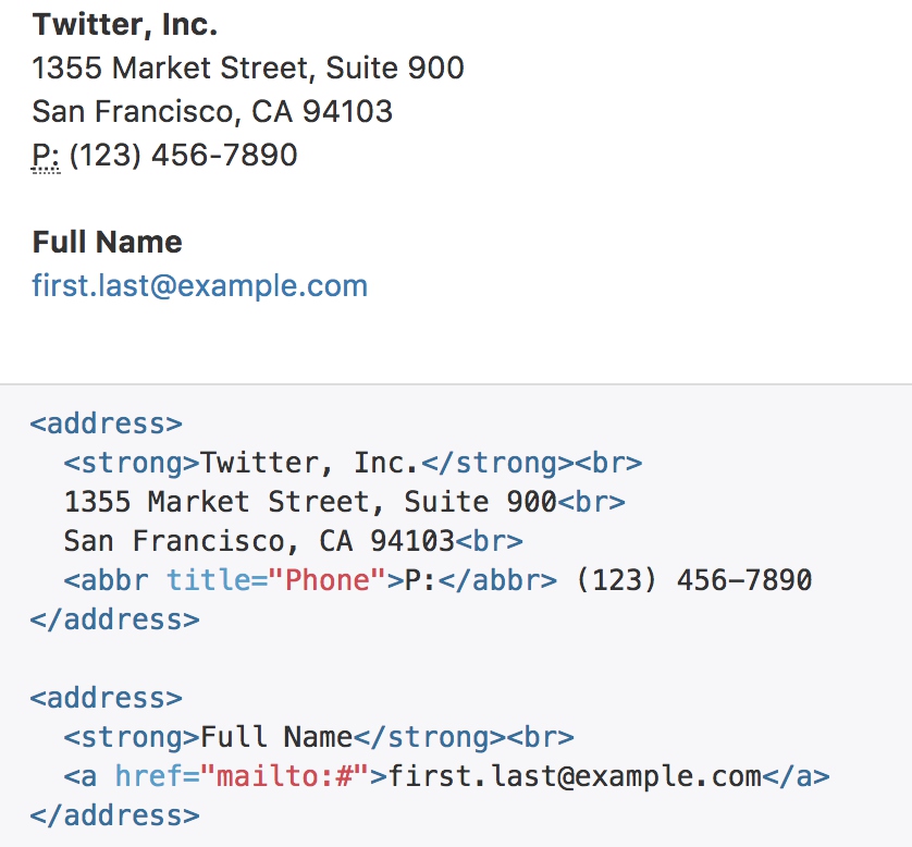
地址
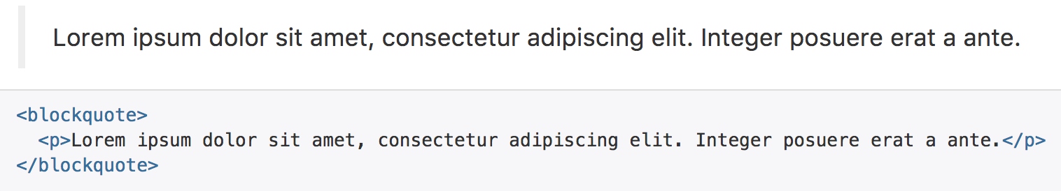
将任何 HTML 元素包裹在 blockquote 中即可表现为引用样式。对于直接引用,我们建议用 p 标签。
引用
blockquote {
  padding: ($line-height-computed / 2) $line-height-computed;
  margin: 0 0 $line-height-computed;
  font-size: $blockquote-font-size;
  border-left: 5px solid $blockquote-border-color;

  p,
  ul,
  ol {
    &:last-child {
      margin-bottom: 0;
    }
  }

  // Note: Deprecated small and .small as of v3.1.0
  // Context: https://github.com/twbs/bootstrap/issues/11660
  footer,
  small,
  .small {
    display: block;
    font-size: 80%; // back to default font-size
    line-height: $line-height-base;
    color: $blockquote-small-color;

    &:before {
      content: '\2014 \00A0'; // em dash, nbsp
    }
  }
}
- border-left 给定了5像素的左侧边距,作为引用样式
列表
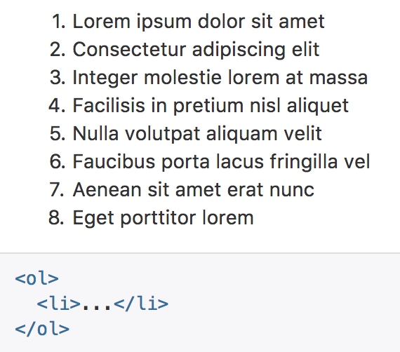
// Unordered and Ordered lists
ul,
ol {
  margin-top: 0;
  margin-bottom: ($line-height-computed / 2);
  ul,
  ol {
    margin-bottom: 0;
  }
}
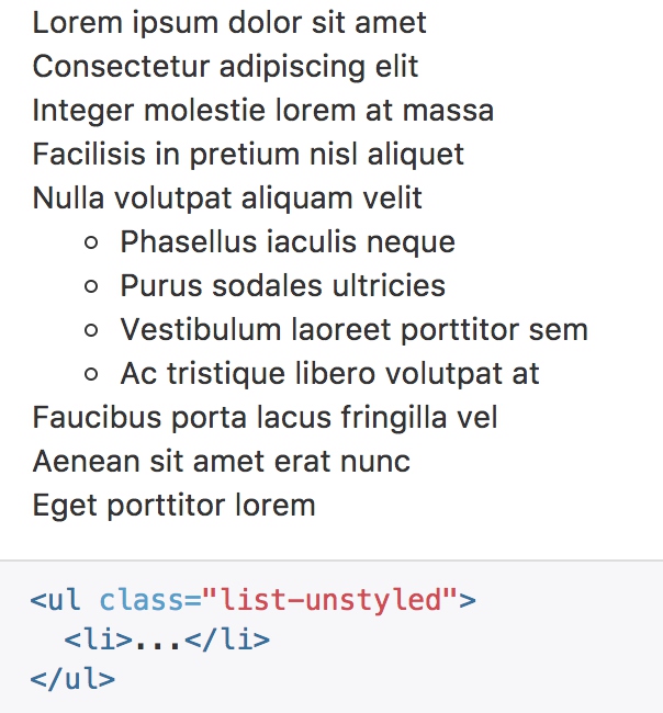
// [converter] extracted from `.list-unstyled` for libsass compatibility
@mixin list-unstyled {
padding-left: 0;
list-style: none;
}
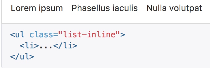
// Inline turns list items into inline-block
.list-inline {
@include list-unstyled;
margin-left: -5px;
> li {
display: inline-block;
padding-left: 5px;
padding-right: 5px;
}
}
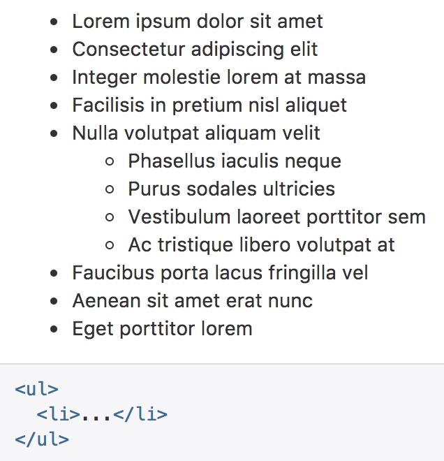
- 无序列表通过inline-block消除换行
- 通过padding来增加间距
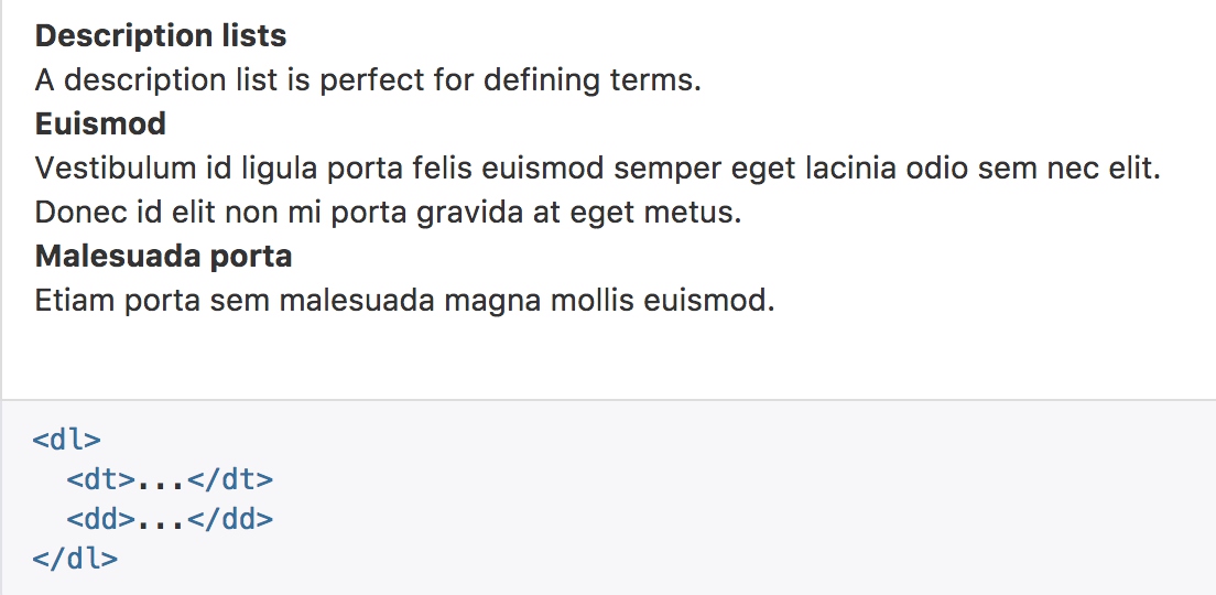
// Description Lists
dl {
  margin-top: 0; // Remove browser default
  margin-bottom: $line-height-computed;
}
dt,
dd {
  line-height: $line-height-base;
}
dt {
  font-weight: bold;
}
dd {
  margin-left: 0; // Undo browser default
}
- dt通过文字加粗来凸显标题
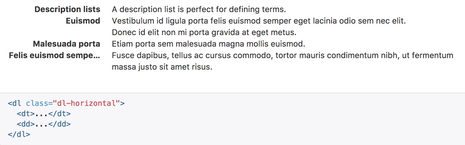
.dl-horizontal {
  dd {
    @include clearfix; // Clear the floated `dt` if an empty `dd` is present
  }

  @media (min-width: $dl-horizontal-breakpoint) {
    dt {
      float: left;
      width: ($dl-horizontal-offset - 20);
      clear: left;
      text-align: right;
      @include text-overflow;
    }
    dd {
      margin-left: $dl-horizontal-offset;
    }
  }
}
- dl-horizontal 的重点是float:left来水平布局
- text-align 使标题向右对齐
- text-overflow 使用预制宏处理文本超长
@mixin text-overflow() {
  overflow: hidden;
  text-overflow: ellipsis;
  white-space: nowrap;
}
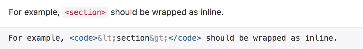
代码
内联代码
通过 标签包裹内联样式的代码片段。
// Inline and block code styles
code,
kbd,
pre,
samp {
  font-family: $font-family-monospace;
}

// Inline code
code {
  padding: 2px 4px;
  font-size: 90%;
  color: $code-color;
  background-color: $code-bg;
  border-radius: $border-radius-base;
}
- code与普通文本的区别在于文字、边距、颜色、背景色、圆角的不同
用户输入
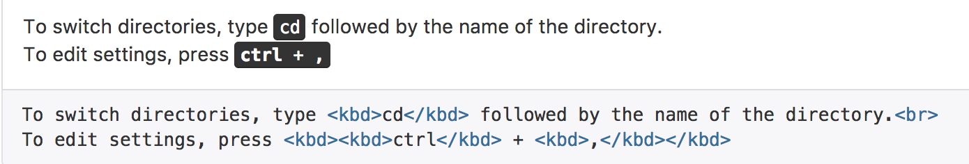
kbd {
  padding: 2px 4px;
  font-size: 90%;
  color: $kbd-color;
  background-color: $kbd-bg;
  border-radius: $border-radius-small;
  box-shadow: inset 0 -1px 0 rgba(0,0,0,.25);

  kbd {
    padding: 0;
    font-size: 100%;
    font-weight: bold;
    box-shadow: none;
  }
}
- kbd改变了背景颜色和阴影
- kbd可以嵌套显示,在内层中没有使用多余的边距和阴影,但是文字被加粗
代码块
多行代码可以使用 “pre” 标签。为了正确的展示代码,注意将尖括号做转义处理。 .pre-scrollable 类,其作用是设置 max-height 为 350px ,并在垂直方向展示滚动条。
// Blocks of code
pre {
  display: block;
  padding: (($line-height-computed - 1) / 2);
  margin: 0 0 ($line-height-computed / 2);
  font-size: ($font-size-base - 1); // 14px to 13px
  line-height: $line-height-base;
  word-break: break-all;
  word-wrap: break-word;
  color: $pre-color;
  background-color: $pre-bg;
  border: 1px solid $pre-border-color;
  border-radius: $border-radius-base;

  // Account for some code outputs that place code tags in pre tags
  code {
    padding: 0;
    font-size: inherit;
    color: inherit;
    white-space: pre-wrap;
    background-color: transparent;
    border-radius: 0;
  }
}

// Enable scrollable blocks of code
.pre-scrollable {
  max-height: $pre-scrollable-max-height;
  overflow-y: scroll;
}
- 多行文本主要处理的是文字换行
- 以及纵向滚动条
变量
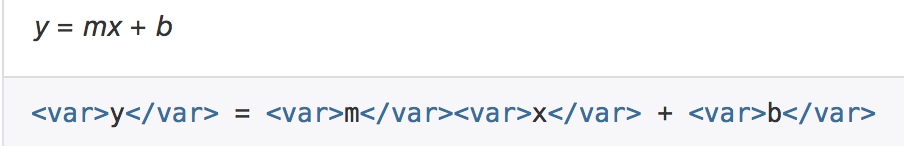
var使用浏览器默认样式,没有重新定义
程序输出
通过 标签来标记程序输出的内容。
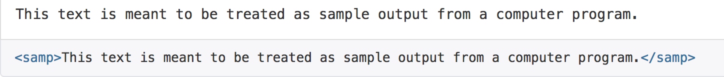
samp只是重置了显示字体
表格
基本实例
为任意 <table> 标签添加 .table 类可以为其赋予基本的样式 — 少量的内补(padding)和水平方向的分隔线。
<table class="table">
        <caption>Optional table caption.</caption>
        <thead>
          <tr>
            <th>#</th>
            <th>First Name</th>
            <th>Last Name</th>
            <th>Username</th>
          </tr>
        </thead>
        <tbody>
          <tr>
            <th scope="row">1</th>
            <td>Mark</td>
            <td>Otto</td>
            <td>@mdo</td>
          </tr>
          <tr>
            <th scope="row">2</th>
            <td>Jacob</td>
            <td>Thornton</td>
            <td>@fat</td>
          </tr>
          <tr>
            <th scope="row">3</th>
            <td>Larry</td>
            <td>the Bird</td>
            <td>@twitter</td>
          </tr>
        </tbody>
      </table>
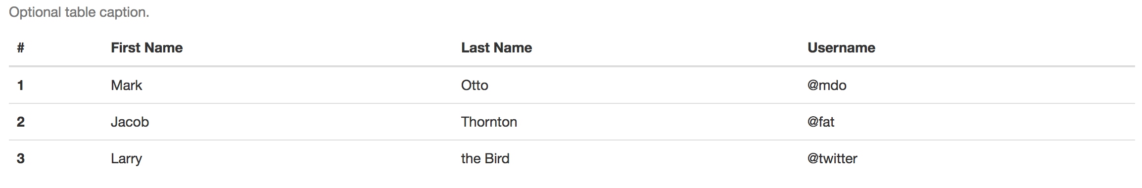
table {
  background-color: $table-bg;
}
caption {
  padding-top: $table-cell-padding;
  padding-bottom: $table-cell-padding;
  color: $text-muted;
  text-align: left;
}
th {
  text-align: left;
}


// Baseline styles

.table {
  width: 100%;
  max-width: 100%;
  margin-bottom: $line-height-computed;
  // Cells
  > thead,
  > tbody,
  > tfoot {
    > tr {
      > th,
      > td {
        padding: $table-cell-padding;
        line-height: $line-height-base;
        vertical-align: top;
        border-top: 1px solid $table-border-color;
      }
    }
  }
  // Bottom align for column headings
  > thead > tr > th {
    vertical-align: bottom;
    border-bottom: 2px solid $table-border-color;
  }
  // Remove top border from thead by default
  > caption + thead,
  > colgroup + thead,
  > thead:first-child {
    > tr:first-child {
      > th,
      > td {
        border-top: 0;
      }
    }
  }
  // Account for multiple tbody instances
  > tbody + tbody {
    border-top: 2px solid $table-border-color;
  }

  // Nesting
  .table {
    background-color: $body-bg;
  }
}
- table使用预置变量$table-bg指定默认颜色
- caption 设定表格标题的边距和颜色
- table中定义表格中thead和其他部分的样式区别:垂直对齐方式和边框样式
- 比较有意思的是thead和body之间的边距处理,使用thead的2像素下边距,覆盖第一行1像素的上边距
条纹状表格
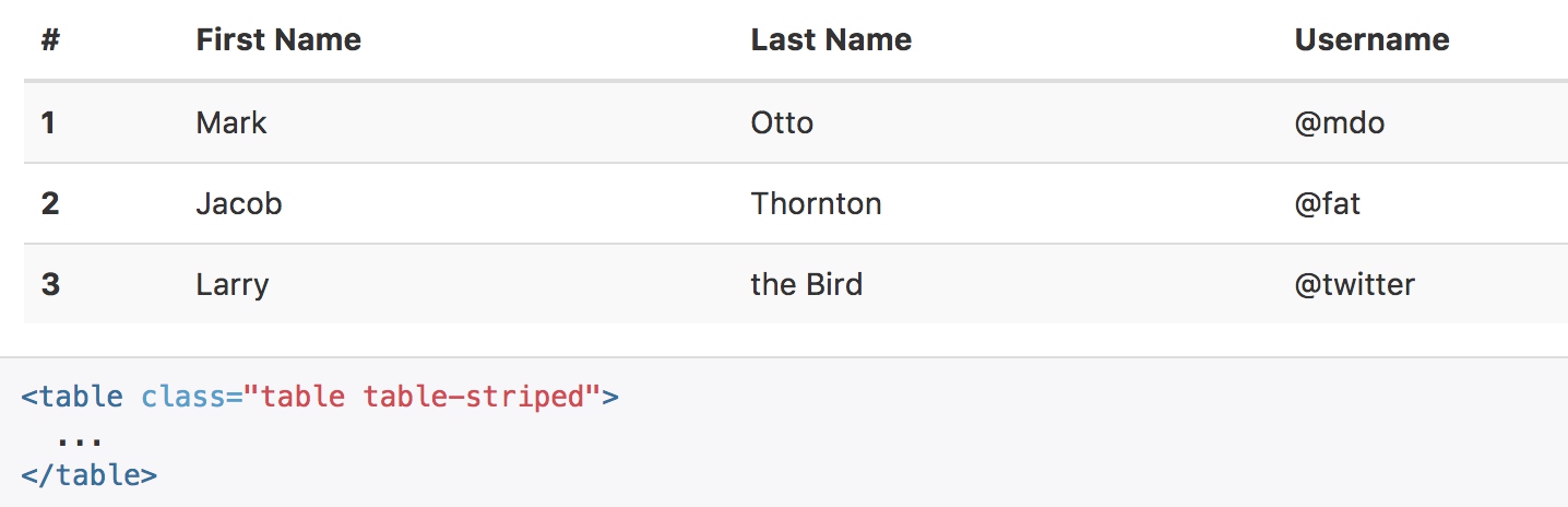
.table-striped {
  > tbody > tr:nth-of-type(odd) {
    background-color: $table-bg-accent;
  }
}
- 利用css选择器,给奇数行特定的颜色
带边框的表格
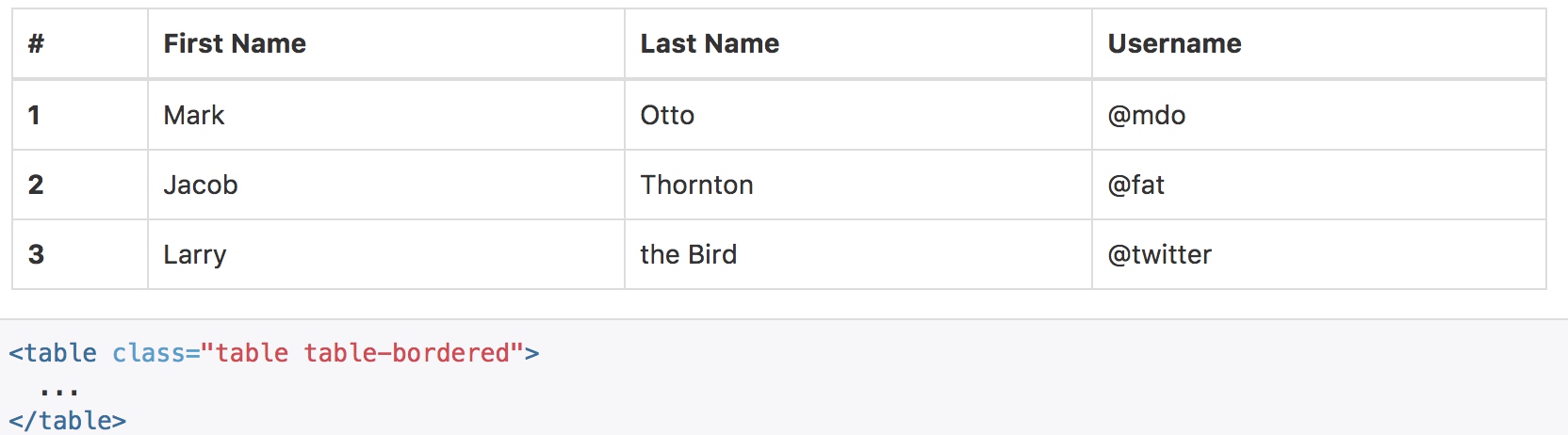
.table-bordered {
  border: 1px solid $table-border-color;
  > thead,
  > tbody,
  > tfoot {
    > tr {
      > th,
      > td {
        border: 1px solid $table-border-color;
      }
    }
  }
  > thead > tr {
    > th,
    > td {
      border-bottom-width: 2px;
    }
  }
}
鼠标悬停
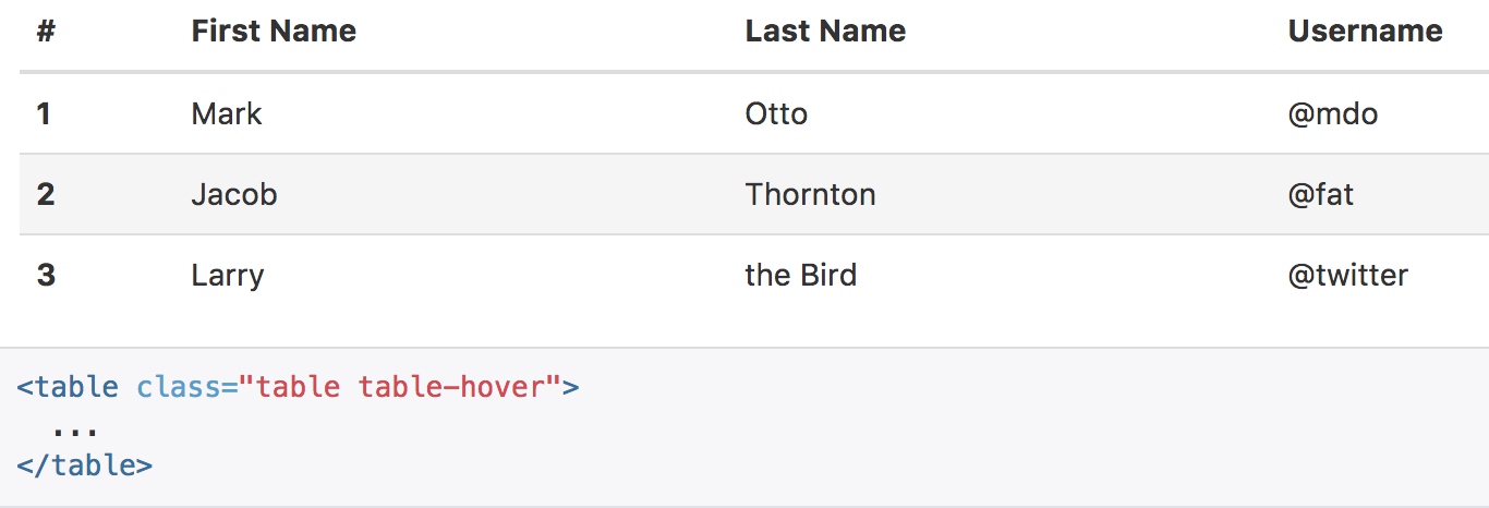
.table-hover {
  > tbody > tr:hover {
    background-color: $table-bg-hover;
  }
}
紧缩表格
.table-condensed {
  > thead,
  > tbody,
  > tfoot {
    > tr {
      > th,
      > td {
        padding: $table-condensed-cell-padding;
      }
    }
  }
}
状态类
通过这些状态类可以为行或单元格设置颜色。
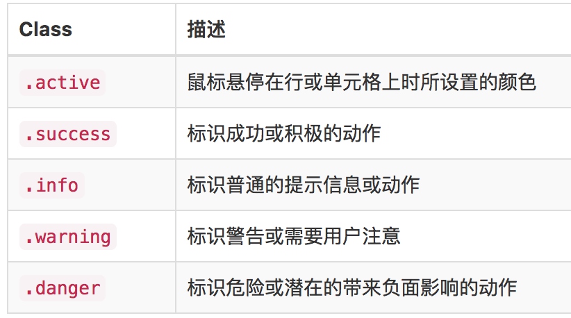
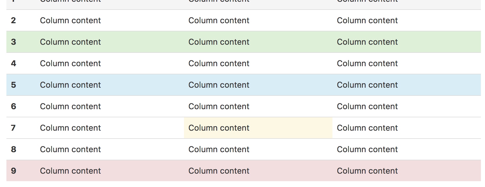
// Generate the contextual variants
@include table-row-variant('active', $table-bg-active);
@include table-row-variant('success', $state-success-bg);
@include table-row-variant('info', $state-info-bg);
@include table-row-variant('warning', $state-warning-bg);
@include table-row-variant('danger', $state-danger-bg);
@mixin table-row-variant($state, $background) {
  // Exact selectors below required to override `.table-striped` and prevent
  // inheritance to nested tables.
  .table > thead > tr,
  .table > tbody > tr,
  .table > tfoot > tr {
    > td.#{$state},
    > th.#{$state},
    &.#{$state} > td,
    &.#{$state} > th {
      background-color: $background;
    }
  }

  // Hover states for `.table-hover`
  // Note: this is not available for cells or rows within `thead` or `tfoot`.
  .table-hover > tbody > tr {
    > td.#{$state}:hover,
    > th.#{$state}:hover,
    &.#{$state}:hover > td,
    &:hover > .#{$state},
    &.#{$state}:hover > th {
      background-color: darken($background, 5%);
    }
  }
}
- 这个预设宏是可以复用的功能,通过class进行选择,并设置指定的背景颜色
- 并且如果使用了table-hover功能,在鼠标悬浮的时候,利用darken将颜色加重5%
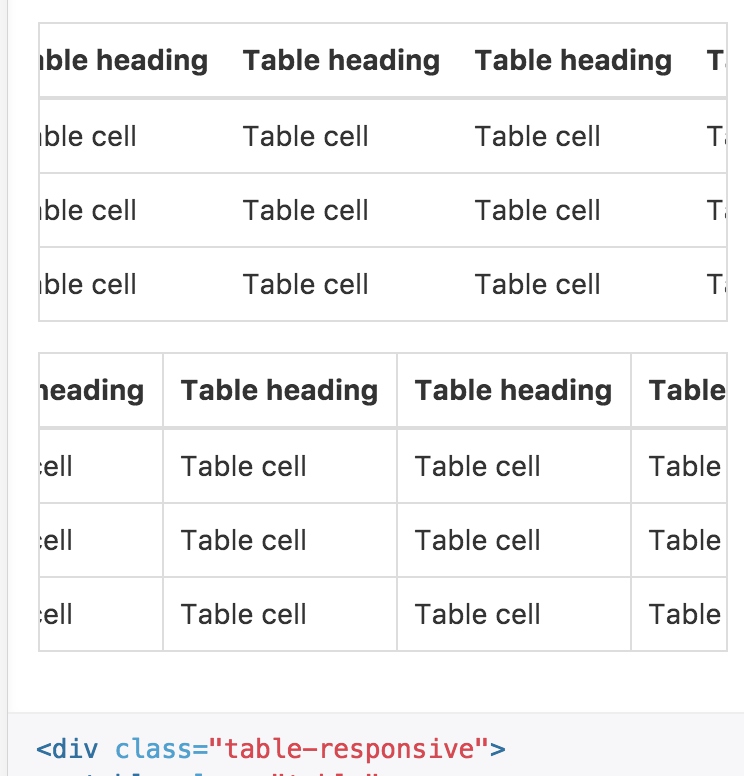
响应式表格
将任何 .table 元素包裹在 .table-responsive 元素内,即可创建响应式表格,其会在小屏幕设备上(小于768px)水平滚动。当屏幕大于 768px 宽度时,水平滚动条消失。
.table-responsive {
  overflow-x: auto;
  min-height: 0.01%; // Workaround for IE9 bug (see https://github.com/twbs/bootstrap/issues/14837)

  @media screen and (max-width: $screen-xs-max) {
    width: 100%;
    margin-bottom: ($line-height-computed * 0.75);
    overflow-y: hidden;
    -ms-overflow-style: -ms-autohiding-scrollbar;
    border: 1px solid $table-border-color;
- 启用横向滚动条
- 表格下方预留滚动条的位置
- y轴不进行滚动显示
- 添加额外的边框
按钮
为 a元素添加按钮类(button class)即可使用 Bootstrap 提供的样式。
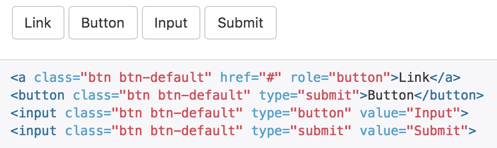
- 虽然按钮类可以应用到 a 和 button 元素上,但是,导航和导航条组件只支持 button 元素。
- 如果 a 元素被作为按钮使用, 并用于在当前页面触发某些功能, 而不是用于链接其他页面或链接当前页面中的其他部分,那么,务必为其设置 role=”button” 属性。
- 强烈建议尽可能使用button元素来获得在各个浏览器上获得相匹配的绘制效果。
.btn {
  display: inline-block;
  margin-bottom: 0; // For input.btn
  font-weight: $btn-font-weight;
  text-align: center;
  vertical-align: middle;
  touch-action: manipulation;
  cursor: pointer;
  background-image: none; // Reset unusual Firefox-on-Android default style; see https://github.com/necolas/normalize.css/issues/214
  border: 1px solid transparent;
  white-space: nowrap;
  @include button-size($padding-base-vertical, $padding-base-horizontal, $font-size-base, $line-height-base, $btn-border-radius-base);
  @include user-select(none);

  &,
  &:active,
  &.active {
    &:focus,
    &.focus {
      @include tab-focus;
    }
  }

  &:hover,
  &:focus,
  &.focus {
    color: $btn-default-color;
    text-decoration: none;
  }

  &:active,
  &.active {
    outline: 0;
    background-image: none;
    @include box-shadow(inset 0 3px 5px rgba(0,0,0,.125));
  }

  &.disabled,
  &[disabled],
  fieldset[disabled] & {
    cursor: $cursor-disabled;
    @include opacity(.65);
    @include box-shadow(none);
  }

  // [converter] extracted a& to a.btn
}

a.btn {
  &.disabled,
  fieldset[disabled] & {
    pointer-events: none; // Future-proof disabling of clicks on `<a>` elements
  }
}
- btn类给出了大量的基础样式:边框、字体、鼠标悬浮样式、居中、文字换行、背景、边框等
- button-size调用预设宏,设置大小相关的样式
// Button sizes @mixin button-size($padding-vertical, $padding-horizontal, $font-size, $line-height, $border-radius) { padding: $padding-vertical $padding-horizontal; font-size: $font-size; line-height: $line-height; border-radius: $border-radius; } - user-select调用预设宏,添加浏览器前缀,禁用文本选择
@mixin user-select($select) {
  -webkit-user-select: $select;
     -moz-user-select: $select;
      -ms-user-select: $select; // IE10+
          user-select: $select;
}
- tab-focus 只针对webkit浏览器进行焦点样式设置
@mixin tab-focus() { // WebKit-specific. Other browsers will keep their default outline style. // (Initially tried to also force default via `outline: initial`, // but that seems to erroneously remove the outline in Firefox altogether.) outline: 5px auto -webkit-focus-ring-color; outline-offset: -2px; } - disabled 屏蔽了鼠标指针;并设置禁用样式;借助混合宏自动添加浏览器兼容前缀
预定义样式
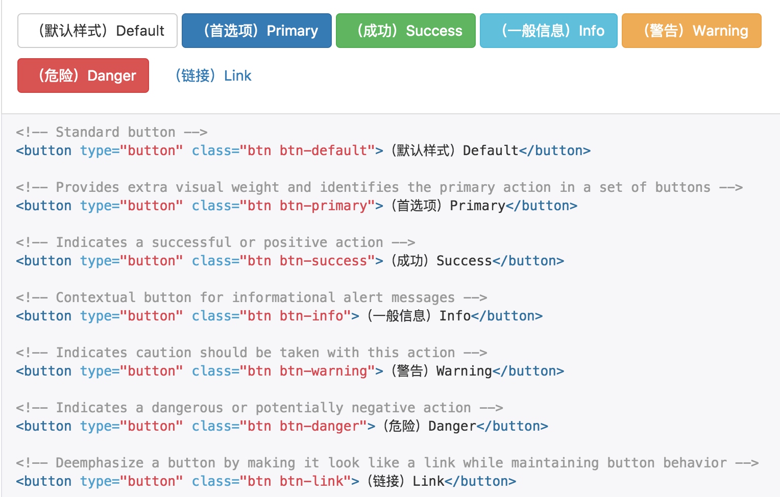
.btn-default {
  @include button-variant($btn-default-color, $btn-default-bg, $btn-default-border);
}
.btn-primary {
  @include button-variant($btn-primary-color, $btn-primary-bg, $btn-primary-border);
}
// Success appears as green
.btn-success {
  @include button-variant($btn-success-color, $btn-success-bg, $btn-success-border);
}
// Info appears as blue-green
.btn-info {
  @include button-variant($btn-info-color, $btn-info-bg, $btn-info-border);
}
// Warning appears as orange
.btn-warning {
  @include button-variant($btn-warning-color, $btn-warning-bg, $btn-warning-border);
}
// Danger and error appear as red
.btn-danger {
  @include button-variant($btn-danger-color, $btn-danger-bg, $btn-danger-border);
}
利用混合宏button-variant来设置各种类型按钮的样式,如同参数所表述的,不同类型按钮,只是颜色、背景色、边框的颜色不同;
@mixin button-variant($color, $background, $border) {
}
尺寸
需要让按钮具有不同尺寸吗?使用 .btn-lg、.btn-sm 或 .btn-xs 就可以获得不同尺寸的按钮。
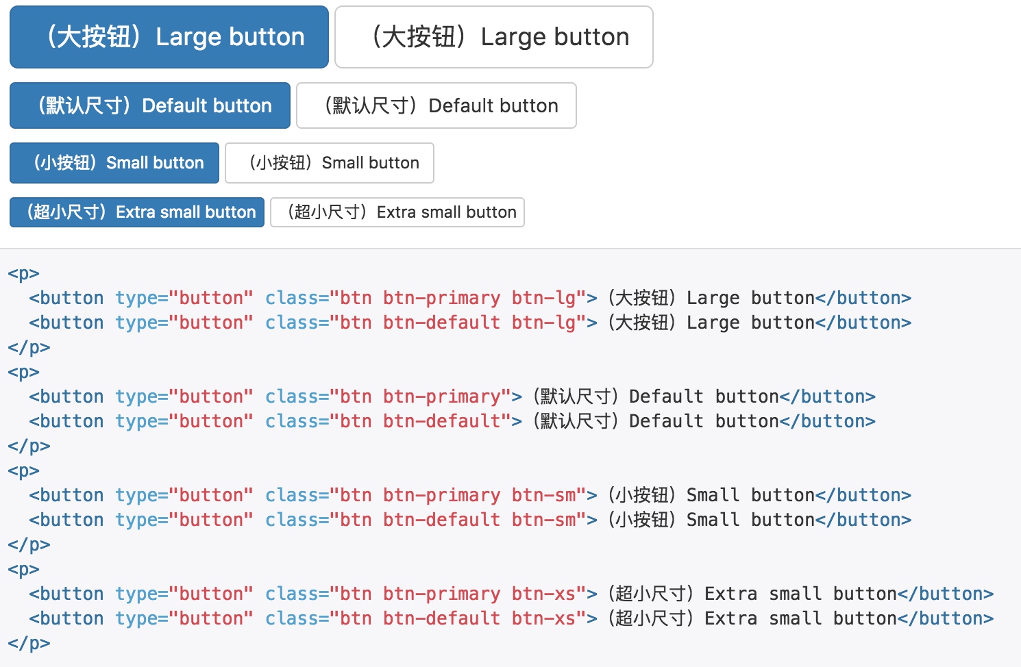
.btn-lg {
  // line-height: ensure even-numbered height of button next to large input
  @include button-size($padding-large-vertical, $padding-large-horizontal, $font-size-large, $line-height-large, $btn-border-radius-large);
}
.btn-sm {
  // line-height: ensure proper height of button next to small input
  @include button-size($padding-small-vertical, $padding-small-horizontal, $font-size-small, $line-height-small, $btn-border-radius-small);
}
.btn-xs {
  @include button-size($padding-xs-vertical, $padding-xs-horizontal, $font-size-small, $line-height-small, $btn-border-radius-small);
}
不用的尺寸,通过button-size宏进行样式覆盖。
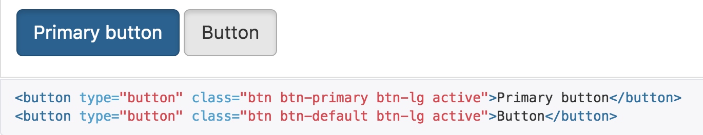
激活状态
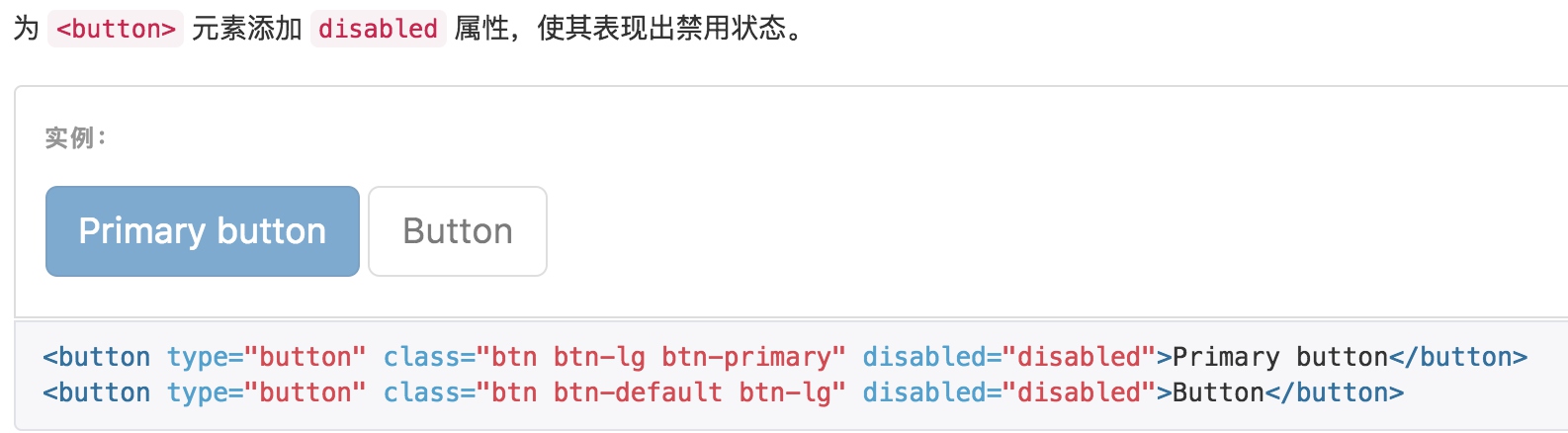
禁用状态
图片
响应式图片
通过为图片添加 .img-responsive 类可以让图片支持响应式布局。其实质是为图片设置了 max-width: 100%;、 height: auto; 和 display: block; 属性,从而让图片在其父元素中更好的缩放。
如果需要让使用了 .img-responsive 类的图片水平居中,请使用 .center-block 类,不要用 .text-center
<img src="..." class="img-responsive" alt="Responsive image">
// Responsive image
//
// Keep images from scaling beyond the width of their parents.
@mixin img-responsive($display: block) {
  display: $display;
  max-width: 100%; // Part 1: Set a maximum relative to the parent
  height: auto; // Part 2: Scale the height according to the width, otherwise you get stretching
}
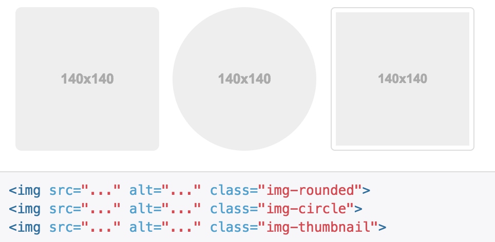
图片形状
通过为 元素添加以下相应的类,可以让图片呈现不同的形状。
// Rounded corners
.img-rounded {
  border-radius: $border-radius-large;
}

// Image thumbnails
//
// Heads up! This is mixin-ed into thumbnails.less for `.thumbnail`.
.img-thumbnail {
  padding: $thumbnail-padding;
  line-height: $line-height-base;
  background-color: $thumbnail-bg;
  border: 1px solid $thumbnail-border;
  border-radius: $thumbnail-border-radius;
  @include transition(all .2s ease-in-out);

  // Keep them at most 100% wide
  @include img-responsive(inline-block);
}

// Perfect circle
.img-circle {
  border-radius: 50%; // set radius in percents
}
- rounded和circle都是通过圆角来控制形状
- img-thumbnail则是通过内边距、背景、border来设置外框的样式