响应式工具
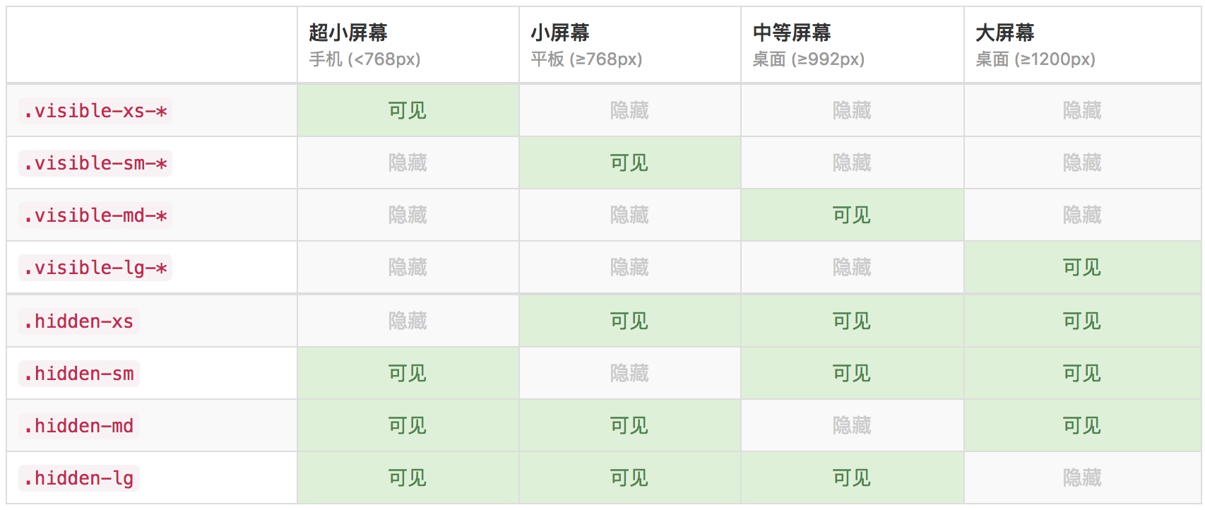
为了加快对移动设备友好的页面开发工作,利用媒体查询功能并使用这些工具类可以方便的针对不同设备展示或隐藏页面内容。另外还包含了针对打印机显示或隐藏内容的工具类。
可用的类
通过单独或联合使用以下列出的类,可以针对不同屏幕尺寸隐藏或显示页面内容。
.visible-xs-block,
.visible-xs-inline,
.visible-xs-inline-block,
.visible-sm-block,
.visible-sm-inline,
.visible-sm-inline-block,
.visible-md-block,
.visible-md-inline,
.visible-md-inline-block,
.visible-lg-block,
.visible-lg-inline,
.visible-lg-inline-block {
  display: none !important;
}

@media (max-width: $screen-xs-max) {
  @include responsive-visibility('.visible-xs');
}
.visible-xs-block {
  @media (max-width: $screen-xs-max) {
    display: block !important;
  }
}
.visible-xs-inline {
  @media (max-width: $screen-xs-max) {
    display: inline !important;
  }
}
.visible-xs-inline-block {
  @media (max-width: $screen-xs-max) {
    display: inline-block !important;
  }
}
从源码可以看到,其实现原理是先隐藏;再根据媒体查询显示匹配的元素。
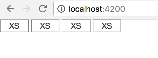
  <div class="row show-grid">
    <div class="col-md-2 visible-xs-inline-block">XS</div>
    <div class="col-md-2 visible-xs-inline-block">XS</div>
    <div class="col-md-2 visible-xs-inline-block">XS</div>
    <div class="col-md-2 visible-xs-inline-block">XS</div>
    <div class="col-md-2 visible-md-inline-block">MD</div>
    <div class="col-md-2 visible-md-inline-block">MD</div>
  </div>
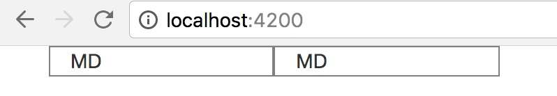
当屏幕宽度匹配xs的时候
当放大屏幕宽度匹配到md的时候
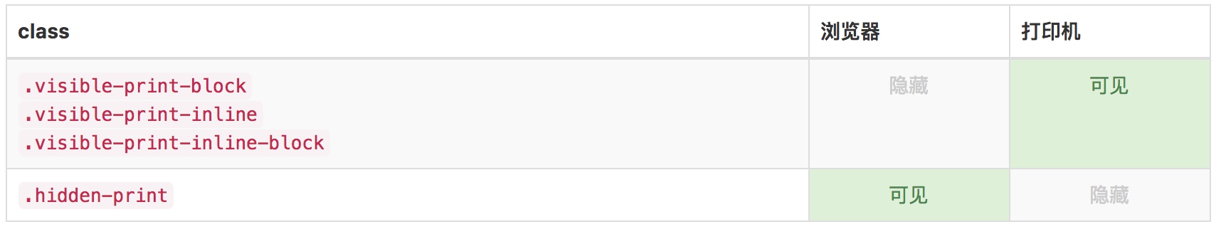
打印类
和常规的响应式类一样,使用下面的类可以针对打印机隐藏或显示某些内容。
@include responsive-invisibility('.visible-print');

@media print {
  @include responsive-visibility('.visible-print');
}
.visible-print-block {
  display: none !important;

  @media print {
    display: block !important;
  }
}
.visible-print-inline {
  display: none !important;

  @media print {
    display: inline !important;
  }
}
- print是使用媒体查询查询device类型
辅助类
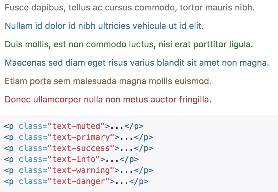
情境文本颜色
通过颜色来展示意图,Bootstrap 提供了一组工具类。这些类可以应用于链接,并且在鼠标经过时颜色可以还可以加深,就像默认的链接一样。
.text-muted {
  color: $text-muted;
}

@include text-emphasis-variant('.text-primary', $brand-primary);

@include text-emphasis-variant('.text-success', $state-success-text);

@include text-emphasis-variant('.text-info', $state-info-text);

@include text-emphasis-variant('.text-warning', $state-warning-text);

@include text-emphasis-variant('.text-danger', $state-danger-text);
@mixin text-emphasis-variant($parent, $color) {
  #{$parent} {
    color: $color;
  }
  a#{$parent}:hover,
  a#{$parent}:focus {
    color: darken($color, 10%);
  }
}
- 借助预置宏,给不同class的text设置不同的字体颜色,
- 同时,如果应用到a标签上,鼠标悬浮的时候会加深颜色。
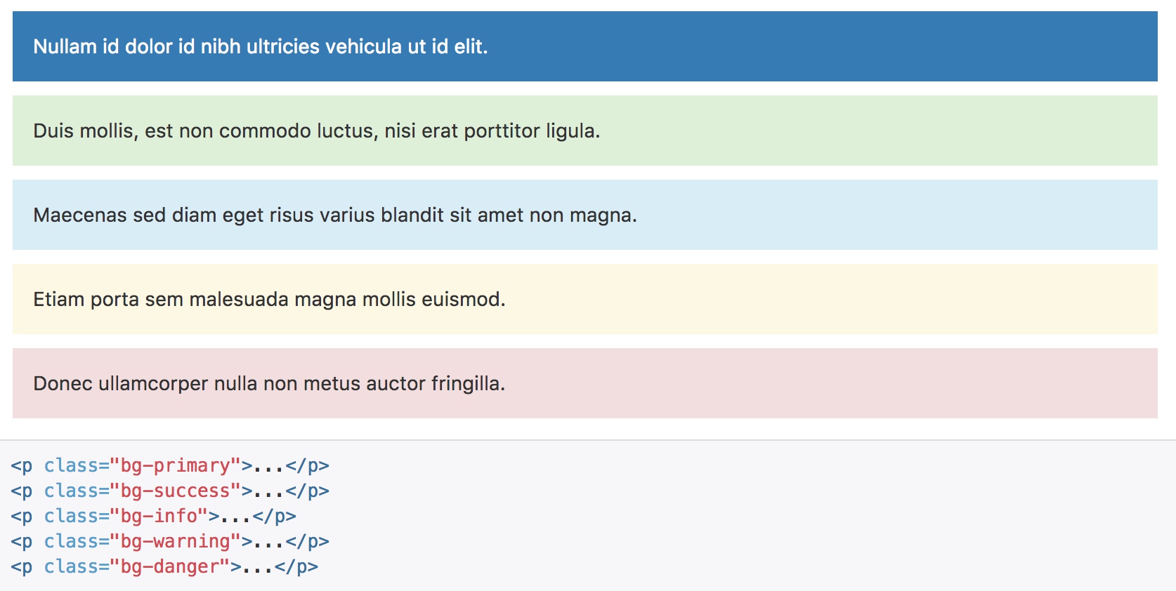
情境背景色
.bg-primary {
  // Given the contrast here, this is the only class to have its color inverted
  // automatically.
  color: #fff;
}
@include bg-variant('.bg-primary', $brand-primary);

@include bg-variant('.bg-success', $state-success-bg);

@include bg-variant('.bg-info', $state-info-bg);

@include bg-variant('.bg-warning', $state-warning-bg);

@include bg-variant('.bg-danger', $state-danger-bg);
@mixin bg-variant($parent, $color) {
  #{$parent} {
    background-color: $color;
  }
  a#{$parent}:hover,
  a#{$parent}:focus {
    background-color: darken($color, 10%);
  }
}
- 与之前的文本颜色类似,a标签悬浮的时候会加深颜色
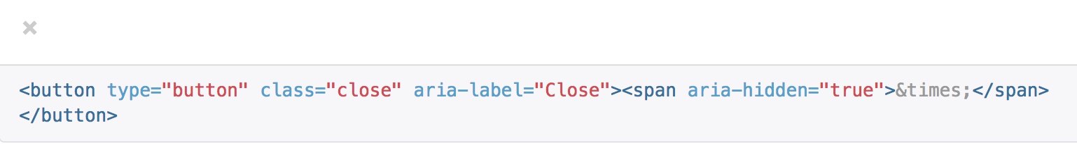
关闭按钮
通过使用一个象征关闭的图标,可以让模态框和警告框消失。
.close {
  float: right;
  font-size: ($font-size-base * 1.5);
  font-weight: $close-font-weight;
  line-height: 1;
  color: $close-color;
  text-shadow: $close-text-shadow;
  @include opacity(.2);

  &:hover,
  &:focus {
    color: $close-color;
    text-decoration: none;
    cursor: pointer;
    @include opacity(.5);
  }

  // [converter] extracted button& to button.close
}
- close通过文本X来表示图形
- 通过文本字体来模拟按钮样式
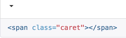
三角符号
通过使用三角符号可以指示某个元素具有下拉菜单的功能。注意,向上弹出式菜单中的三角符号是反方向的。
.caret {
  display: inline-block;
  width: 0;
  height: 0;
  margin-left: 2px;
  vertical-align: middle;
  border-top:   $caret-width-base dashed;
  border-top:   $caret-width-base solid \9; // IE8
  border-right: $caret-width-base solid transparent;
  border-left:  $caret-width-base solid transparent;
}
- 三角符号的实现,没有借助图片,而是通过border的相互覆盖来实现符号样式
- left和right的border,通过透明颜色,覆盖掉top的角落,实现三角形
快速浮动
<div class="pull-left">...</div>
<div class="pull-right">...</div>
// Classes
.pull-left {
  float: left !important;
}
.pull-right {
  float: right !important;
}
让内容块居中
为任意元素设置 display: block 属性并通过 margin 属性让其中的内容居中。下面列出的类还可以作为 mixin 使用。
<div class="center-block">...</div>
@mixin center-block() {
  display: block;
  margin-left: auto;
  margin-right: auto;
}
清除浮动
通过为父元素添加 .clearfix 类可以很容易地清除浮动(float)。这里所使用的是 Nicolas Gallagher 创造的 micro clearfix 方式。此类还可以作为 mixin 使用。
@mixin clearfix() {
  &:before,
  &:after {
    content: " "; // 1
    display: table; // 2
  }
  &:after {
    clear: both;
  }
}
显示或隐藏内容
.show 和 .hidden 类可以强制任意元素显示或隐藏(对于屏幕阅读器也能起效)。这些类通过 !important 来避免 CSS 样式优先级问题,就像 quick floats 一样的做法。注意,这些类只对块级元素起作用,另外,还可以作为 mixin 使用。
.invisible 类可以被用来仅仅影响元素的可见性,也就是说,元素的 display 属性不被改变,并且这个元素仍然能够影响文档流的排布。
.show {
  display: block !important;
}
.invisible {
  visibility: hidden;
}
.text-hide {
  @include text-hide;
}
.hidden {
  display: none !important;
}
@mixin hide-text() {
  font: 0/0 a;
  color: transparent;
  text-shadow: none;
  background-color: transparent;
  border: 0;
}

// New mixin to use as of v3.0.1
@mixin text-hide() {
  @include hide-text;
}
-
font:0/0 a – a shorthand property that zeros out the font size and line-height. The a value acts as a very short font-family (an idea taken from the BEM implementation of this method). The CSS validator complains that using 0/0 in the shorthand font property is not valid, but every browser accepts it and this appears to be an error in the validator. Using font:0px/0 a passes validation but it displayed as font:0/0 a in the code that the validator flags as valid.
- text-shadow:none – makes sure that any inherited text shadow is removed for the text. This prevents the chance of any text shadow colors showing over the background.
- color:transparent – needed for browsers than don’t completely crush the text to the point of being invisible. Safari 4 (extremely rare) is an example of such a browser. There may also be mobile browsers than require this declaration. IE6/7/8 don’t recognise this value for color, but fortunately IE7/8 don’t show any trace of the text. IE6 shows a faint trace.
表单
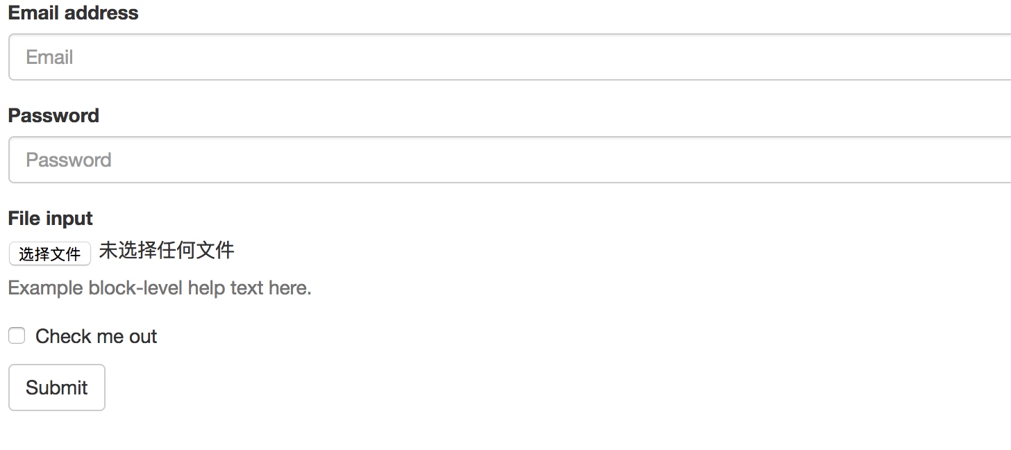
基本实例
单独的表单控件会被自动赋予一些全局样式。所有设置了 .form-control 类的 input、textarea 和 select 元素都将被默认设置宽度属性为 width: 100%;。 将 label 元素和前面提到的控件包裹在 .form-group 中可以获得最好的排列。
<form>
  <div class="form-group">
    <label for="exampleInputEmail1">Email address</label>
    <input type="email" class="form-control" id="exampleInputEmail1" placeholder="Email">
  </div>
  <div class="form-group">
    <label for="exampleInputPassword1">Password</label>
    <input type="password" class="form-control" id="exampleInputPassword1" placeholder="Password">
  </div>
  <div class="form-group">
    <label for="exampleInputFile">File input</label>
    <input type="file" id="exampleInputFile">
    <p class="help-block">Example block-level help text here.</p>
  </div>
  <div class="checkbox">
    <label>
      <input type="checkbox"> Check me out
    </label>
  </div>
  <button type="submit" class="btn btn-default">Submit</button>
</form>
.form-control {
  display: block;
  width: 100%;
  height: $input-height-base; // Make inputs at least the height of their button counterpart (base line-height + padding + border)
  padding: $padding-base-vertical $padding-base-horizontal;
  font-size: $font-size-base;
  line-height: $line-height-base;
  color: $input-color;
  background-color: $input-bg;
  background-image: none; // Reset unusual Firefox-on-Android default style; see https://github.com/necolas/normalize.css/issues/214
  border: 1px solid $input-border;
  border-radius: $input-border-radius; // Note: This has no effect on <select>s in some browsers, due to the limited stylability of <select>s in CSS.
  @include box-shadow(inset 0 1px 1px rgba(0,0,0,.075));
  @include transition(border-color ease-in-out .15s, box-shadow ease-in-out .15s);

  // Customize the `:focus` state to imitate native WebKit styles.
  @include form-control-focus;

  // Placeholder
  @include placeholder;

  // Unstyle the caret on `<select>`s in IE10+.
  &::-ms-expand {
    border: 0;
    background-color: transparent;
  }

  // Disabled and read-only inputs
  //
  // HTML5 says that controls under a fieldset > legend:first-child won't be
  // disabled if the fieldset is disabled. Due to implementation difficulty, we
  // don't honor that edge case; we style them as disabled anyway.
  &[disabled],
  &[readonly],
  fieldset[disabled] & {
    background-color: $input-bg-disabled;
    opacity: 1; // iOS fix for unreadable disabled content; see https://github.com/twbs/bootstrap/issues/11655
  }

  &[disabled],
  fieldset[disabled] & {
    cursor: $cursor-disabled;
  }

  // [converter] extracted textarea& to textarea.form-control
}
- form-control将input、textarea、select设置为block,并且宽度为100%
- placeholder宏定义类placeholder的颜色
// Placeholder text
@mixin placeholder($color: $input-color-placeholder) {
  // Firefox
  &::-moz-placeholder {
    color: $color;
    opacity: 1; // Override Firefox's unusual default opacity; see https://github.com/twbs/bootstrap/pull/11526
  }
  &:-ms-input-placeholder { color: $color; } // Internet Explorer 10+
  &::-webkit-input-placeholder  { color: $color; } // Safari and Chrome
}
- form-control-focus定义了输入框选中时的样式
@mixin form-control-focus($color: $input-border-focus) { $color-rgba: rgba(red($color), green($color), blue($color), .6); &:focus { border-color: $color; outline: 0; @include box-shadow(inset 0 1px 1px rgba(0,0,0,.075), 0 0 8px $color-rgba); } } - form-group通过下边距来进行分组显示
.form-group {
  margin-bottom: $form-group-margin-bottom;
}
内联表单
为 form 元素添加 .form-inline 类可使其内容左对齐并且表现为 inline-block 级别的控件。只适用于视口(viewport)至少在 768px 宽度时(视口宽度再小的话就会使表单折叠)。
<form class="form-inline">
  <div class="form-group">
    <label for="exampleInputName2">Name</label>
    <input type="text" class="form-control" id="exampleInputName2" placeholder="Jane Doe">
  </div>
  <div class="form-group">
    <label for="exampleInputEmail2">Email</label>
    <input type="email" class="form-control" id="exampleInputEmail2" placeholder="jane.doe@example.com">
  </div>
  <button type="submit" class="btn btn-default">Send invitation</button>
</form>

@mixin form-inline {

  // Kick in the inline
  @media (min-width: $screen-sm-min) {
    // Inline-block all the things for "inline"
    .form-group {
      display: inline-block;
      margin-bottom: 0;
      vertical-align: middle;
    }

    // In navbar-form, allow folks to *not* use `.form-group`
    .form-control {
      display: inline-block;
      width: auto; // Prevent labels from stacking above inputs in `.form-group`
      vertical-align: middle;
    }
- bootstrap限制了最小生效宽度
- 将内部元素的显示方式修改为inline-block
- 对一些元素项的宽度进行重置
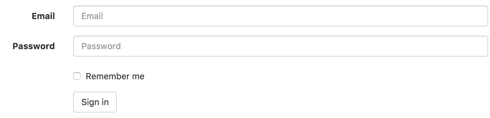
水平排列的表单
通过为表单添加 .form-horizontal 类,并联合使用 Bootstrap 预置的栅格类,可以将 label 标签和控件组水平并排布局。这样做将改变 .form-group 的行为,使其表现为栅格系统中的行(row),因此就无需再额外添加 .row 了。
<form class="form-horizontal">
  <div class="form-group">
    <label for="inputEmail3" class="col-sm-2 control-label">Email</label>
    <div class="col-sm-10">
      <input type="email" class="form-control" id="inputEmail3" placeholder="Email">
    </div>
  </div>
  <div class="form-group">
    <label for="inputPassword3" class="col-sm-2 control-label">Password</label>
    <div class="col-sm-10">
      <input type="password" class="form-control" id="inputPassword3" placeholder="Password">
    </div>
  </div>
  <div class="form-group">
    <div class="col-sm-offset-2 col-sm-10">
      <div class="checkbox">
        <label>
          <input type="checkbox"> Remember me
        </label>
      </div>
    </div>
  </div>
  <div class="form-group">
    <div class="col-sm-offset-2 col-sm-10">
      <button type="submit" class="btn btn-default">Sign in</button>
    </div>
  </div>
</form>
// Horizontal forms
//
// Horizontal forms are built on grid classes and allow you to create forms with
// labels on the left and inputs on the right.

.form-horizontal {

  // Consistent vertical alignment of radios and checkboxes
  //
  // Labels also get some reset styles, but that is scoped to a media query below.
  .radio,
  .checkbox,
  .radio-inline,
  .checkbox-inline {
    margin-top: 0;
    margin-bottom: 0;
    padding-top: ($padding-base-vertical + 1); // Default padding plus a border
  }
  // Account for padding we're adding to ensure the alignment and of help text
  // and other content below items
  .radio,
  .checkbox {
    min-height: ($line-height-computed + ($padding-base-vertical + 1));
  }

  // Make form groups behave like rows
  .form-group {
    @include make-row;
  }

  // Reset spacing and right align labels, but scope to media queries so that
  // labels on narrow viewports stack the same as a default form example.
  @media (min-width: $screen-sm-min) {
    .control-label {
      text-align: right;
      margin-bottom: 0;
      padding-top: ($padding-base-vertical + 1); // Default padding plus a border
    }
  }

  // Validation states
  //
  // Reposition the icon because it's now within a grid column and columns have
  // `position: relative;` on them. Also accounts for the grid gutter padding.
  .has-feedback .form-control-feedback {
    right: floor(($grid-gutter-width / 2));
  }

  // Form group sizes
  //
  // Quick utility class for applying `.input-lg` and `.input-sm` styles to the
  // inputs and labels within a `.form-group`.
  .form-group-lg {
    @media (min-width: $screen-sm-min) {
      .control-label {
        padding-top: ($padding-large-vertical + 1);
        font-size: $font-size-large;
      }
    }
  }
  .form-group-sm {
    @media (min-width: $screen-sm-min) {
      .control-label {
        padding-top: ($padding-small-vertical + 1);
        font-size: $font-size-small;
      }
    }
  }
}
- form-horizontal是与col--配合来进行布局
- .form-group 中的make-row的作用是处理左右对齐和清除浮动 ```sass // Creates a wrapper for a series of columns @mixin make-row($gutter: $grid-gutter-width) { margin-left: ceil(($gutter / -2)); margin-right: floor(($gutter / -2)); @include clearfix; }
## 被支持的控件
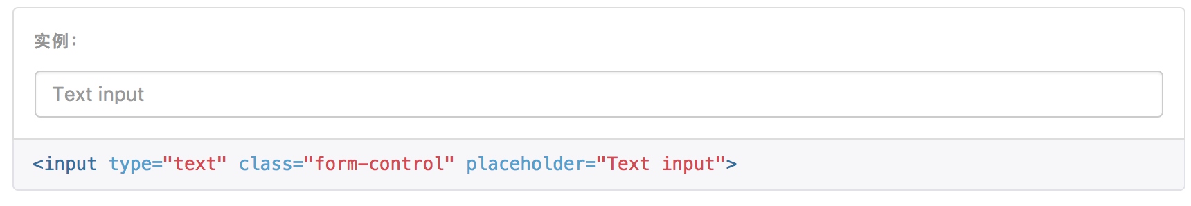
### 输入框
包括大部分表单控件、文本输入域控件,还支持所有 HTML5 类型的输入控件: text、password、datetime、datetime-local、date、month、time、week、number、email、url、search、tel 和 color。
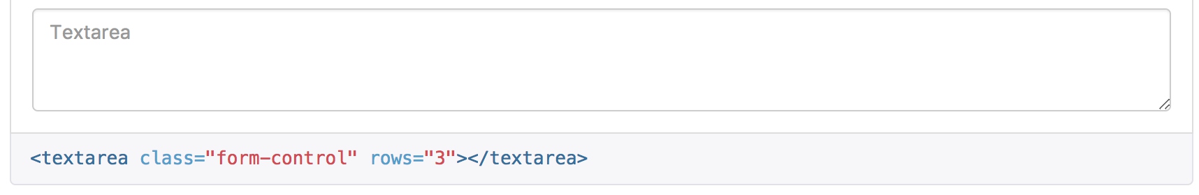
### 文本域
支持多行文本的表单控件。可根据需要改变 rows 属性。
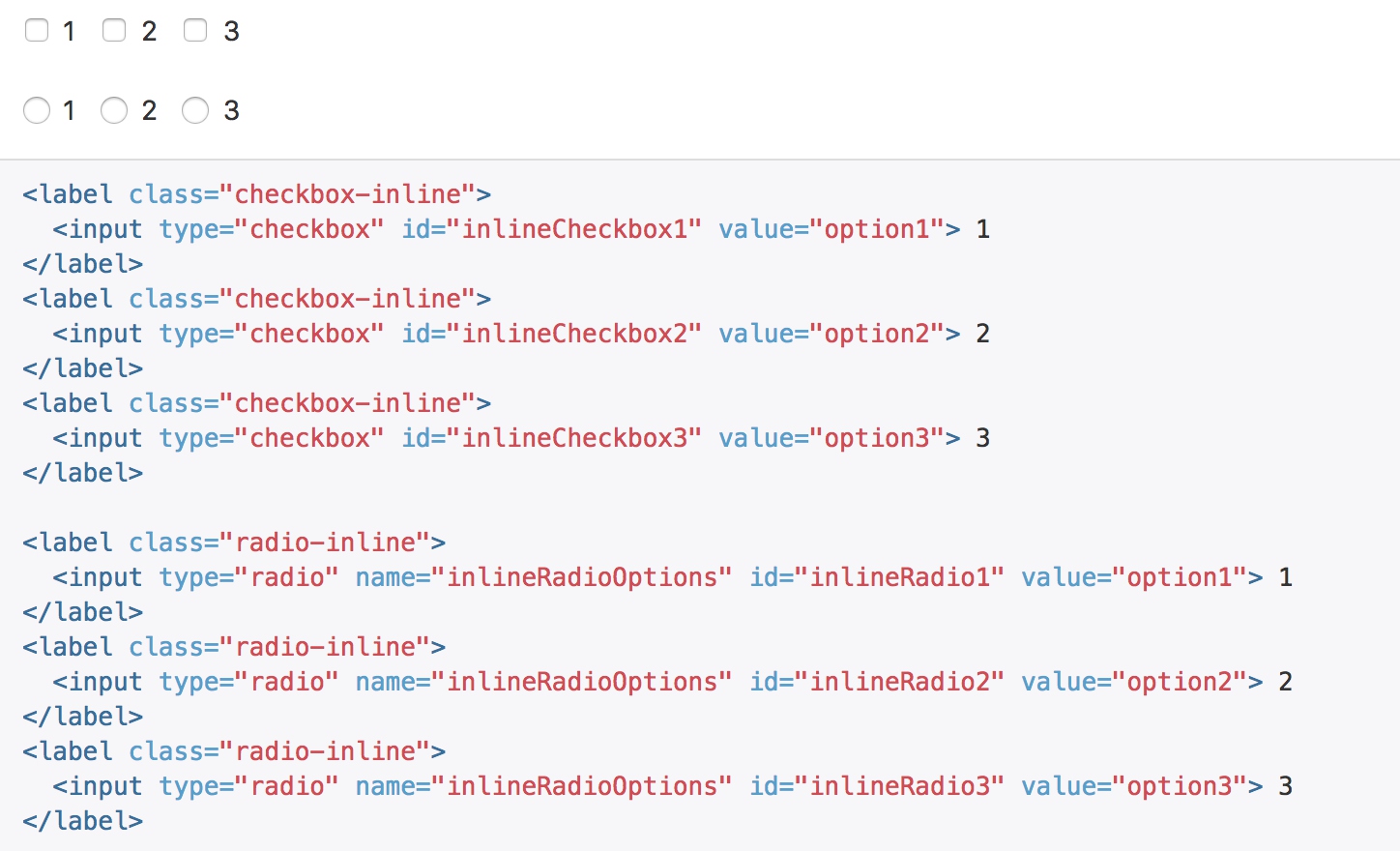
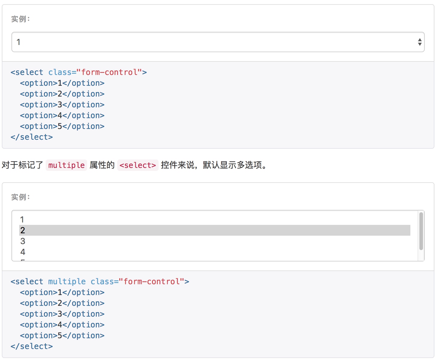
### 多选和单选框
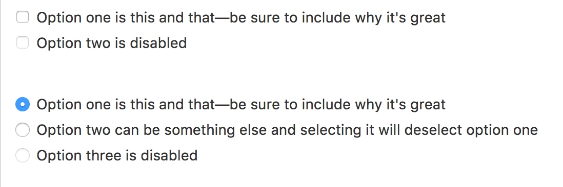
通过将 .checkbox-inline 或 .radio-inline 类应用到一系列的多选框(checkbox)或单选框(radio)控件上,可以使这些控件排列在一行。
### 下拉列表(select)
注意,很多原生选择菜单 - 即在 Safari 和 Chrome 中 - 的圆角是无法通过修改 border-radius 属性来改变的。
### 静态控件
如果需要在表单中将一行纯文本和 label 元素放置于同一行,为 <p> 元素添加 .form-control-static 类即可。
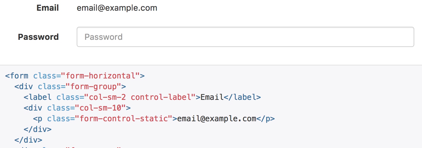
form-control-static并没有什么特殊的能力,只是为了保证样式对齐。
```sass
.form-control-static {
// Size it appropriately next to real form controls
padding-top: ($padding-base-vertical + 1);
padding-bottom: ($padding-base-vertical + 1);
// Remove default margin from `p`
margin-bottom: 0;
min-height: ($line-height-computed + $font-size-base);
&.input-lg,
&.input-sm {
padding-left: 0;
padding-right: 0;
}
}
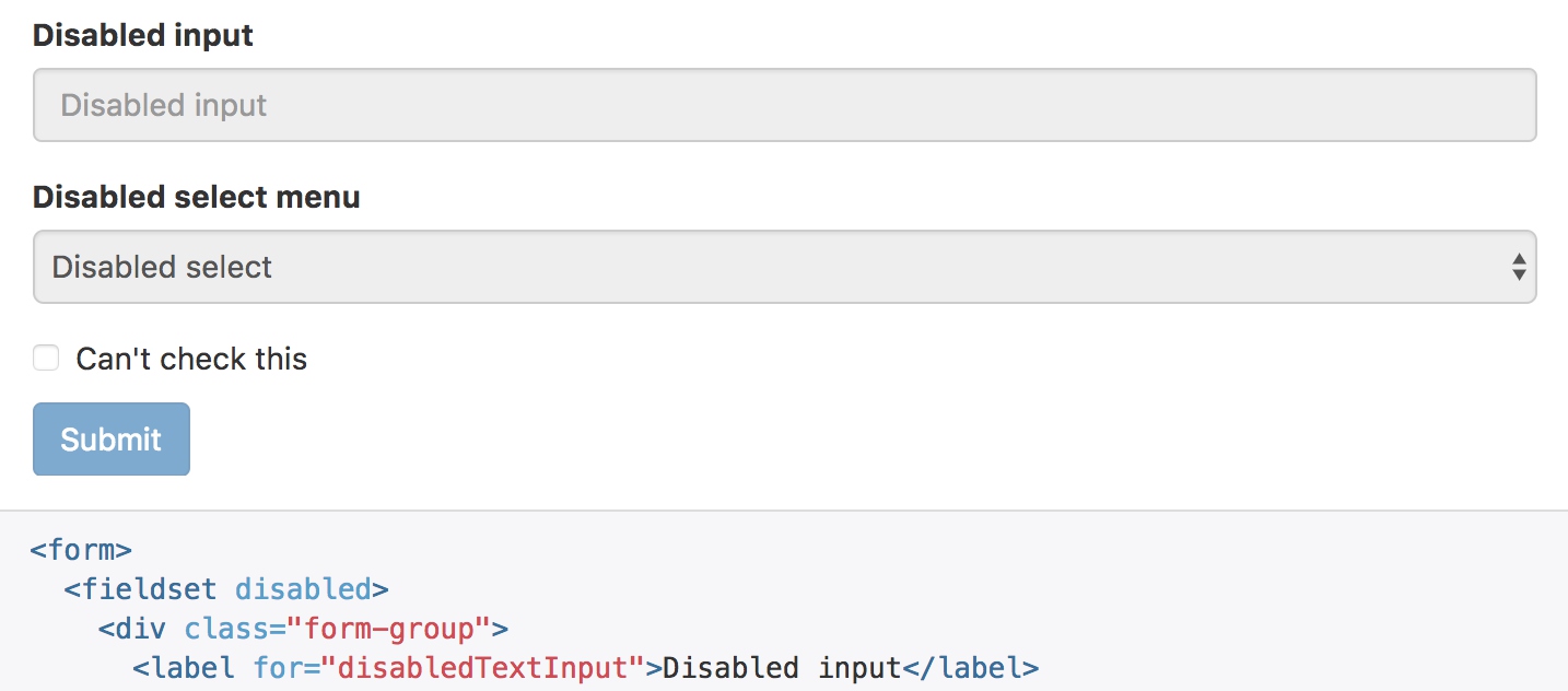
被禁用的 fieldset
为fieldset 设置 disabled 属性,可以禁用包含的所有控件。
Help text
Block level help text for form controls
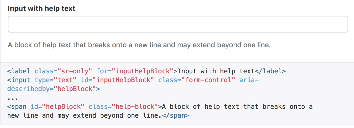
help-block的秘密就是文字颜色上变浅25%
.help-block {
  display: block; // account for any element using help-block
  margin-top: 5px;
  margin-bottom: 10px;
  color: lighten($text-color, 25%); // lighten the text some for contrast
}
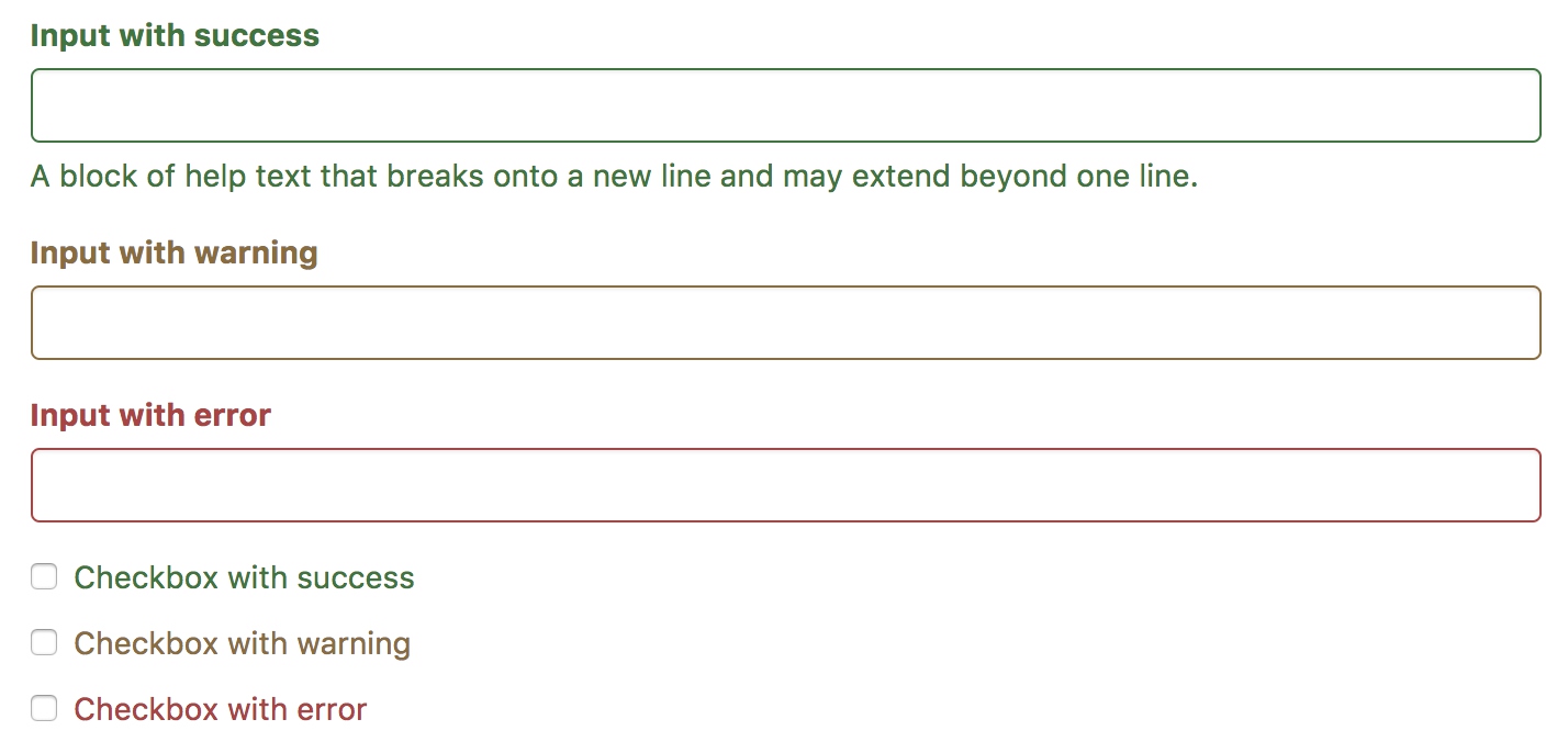
校验状态
Bootstrap 对表单控件的校验状态,如 error、warning 和 success 状态,都定义了样式。使用时,添加 .has-warning、.has-error 或 .has-success 类到这些控件的父元素即可。任何包含在此元素之内的 .control-label、.form-control 和 .help-block 元素都将接受这些校验状态的样式。
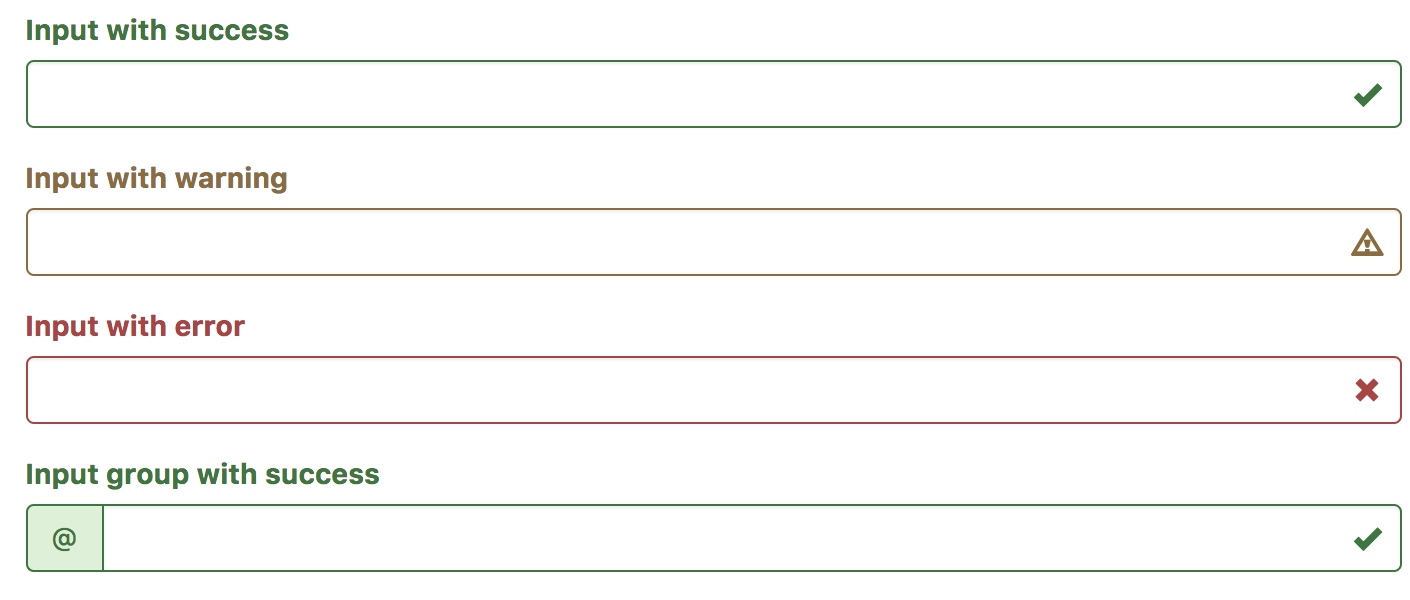
添加额外的图标
你还可以针对校验状态为输入框添加额外的图标。只需设置相应的 .has-feedback 类并添加正确的图标即可。
反馈图标(feedback icon)只能使用在文本输入框 input class=”form-control” 元素上。
<div class="form-group has-success has-feedback">
  <label class="control-label" for="inputSuccess2">Input with success</label>
  <input type="text" class="form-control" id="inputSuccess2" aria-describedby="inputSuccess2Status">
  <span class="glyphicon glyphicon-ok form-control-feedback" aria-hidden="true"></span>
  <span id="inputSuccess2Status" class="sr-only">(success)</span>
</div>
<div class="form-group has-warning has-feedback">
  <label class="control-label" for="inputWarning2">Input with warning</label>
  <input type="text" class="form-control" id="inputWarning2" aria-describedby="inputWarning2Status">
  <span class="glyphicon glyphicon-warning-sign form-control-feedback" aria-hidden="true"></span>
  <span id="inputWarning2Status" class="sr-only">(warning)</span>
</div>
<div class="form-group has-error has-feedback">
  <label class="control-label" for="inputError2">Input with error</label>
  <input type="text" class="form-control" id="inputError2" aria-describedby="inputError2Status">
  <span class="glyphicon glyphicon-remove form-control-feedback" aria-hidden="true"></span>
  <span id="inputError2Status" class="sr-only">(error)</span>
</div>
<div class="form-group has-success has-feedback">
  <label class="control-label" for="inputGroupSuccess1">Input group with success</label>
  <div class="input-group">
    <span class="input-group-addon">@</span>
    <input type="text" class="form-control" id="inputGroupSuccess1" aria-describedby="inputGroupSuccess1Status">
  </div>
  <span class="glyphicon glyphicon-ok form-control-feedback" aria-hidden="true"></span>
  <span id="inputGroupSuccess1Status" class="sr-only">(success)</span>
</div>
- 首先要在from-group上添加has-feedback在输入框右侧预留边距,以放置图标
.has-feedback {
  // Enable absolute positioning
  position: relative;

  // Ensure icons don't overlap text
  .form-control {
    padding-right: ($input-height-base * 1.25);
  }
}
- 在图标span的class上添加form-control-feedback,通过绝对定位将图标定位在预留的空间上
.form-control-feedback {
  position: absolute;
  top: 0;
  right: 0;
  z-index: 2; // Ensure icon is above input groups
  display: block;
  width: $input-height-base;
  height: $input-height-base;
  line-height: $input-height-base;
  text-align: center;
  pointer-events: none;
}
- glyphicon则是应用具体的图标,bootstrap提供了一批默认的字体图标
.glyphicon {
  position: relative;
  top: 1px;
  display: inline-block;
  font-family: 'Glyphicons Halflings';
  font-style: normal;
  font-weight: normal;
  line-height: 1;
  -webkit-font-smoothing: antialiased;
  -moz-osx-font-smoothing: grayscale;
}
- 上述的图标还只是没有颜色的,具体的颜色是在has-success上赋予的,连带输入框和图标一同提供颜色
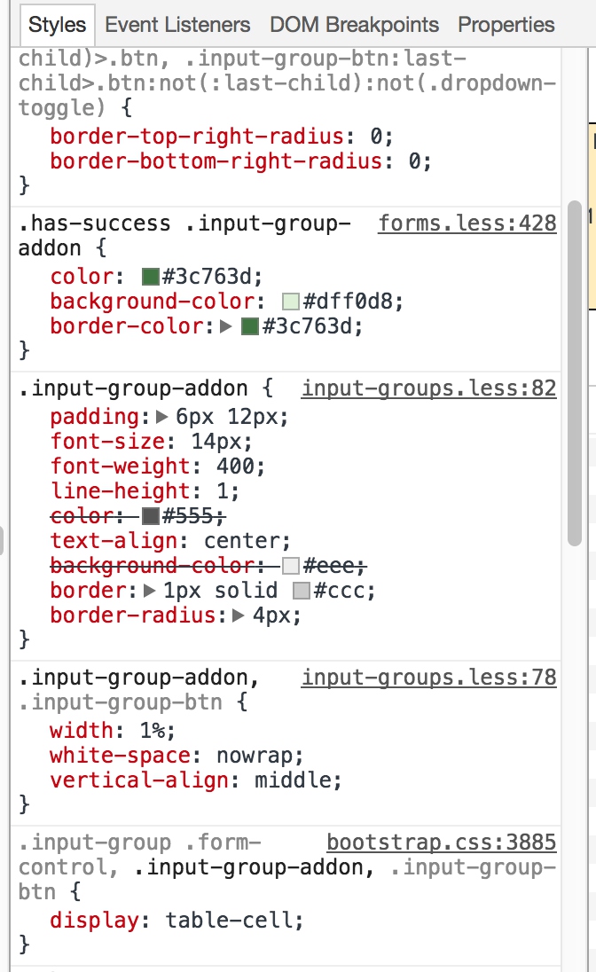
- input-group-addon则是在左侧通过控制圆角来表现当前样式,其样式定义比较分散,这里截取最终生效的样式
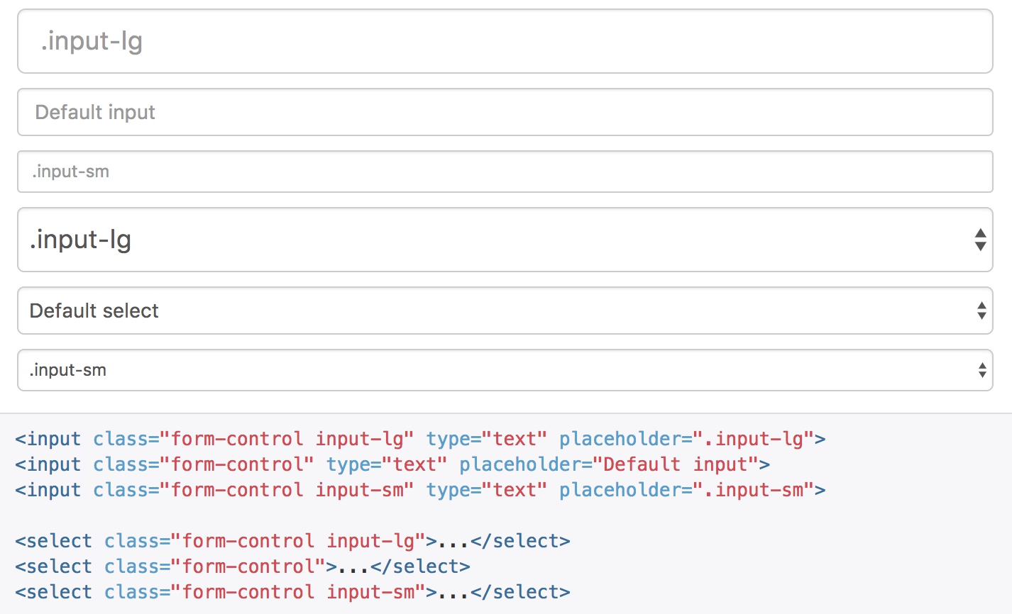
控件尺寸
通过 .input-lg 类似的类可以为控件设置高度,通过 .col-lg-* 类似的类可以为控件设置宽度。
调整列(column)尺寸
用栅格系统中的列(column)包裹输入框或其任何父元素,都可很容易的为其设置宽度。
输入框本身是100%宽度,会自动沾满栅格的空间。