无数可复用的组件,包括字体图标、下拉菜单、导航、警告框、弹出框等更多功能。
Glyphicons 字体图标
- 出于性能的考虑,所有图标都需要一个基类和对应每个图标的类。
- 为了设置正确的内补(padding),务必在图标和文本之间添加一个空格。
- 图标类不能和其它组件直接联合使用。它们不能在同一个元素上与其他类共同存在。应该创建一个嵌套的 span 标签,并将图标类应用到这个 span 标签上。
- 图标类只能应用在不包含任何文本内容或子元素的元素上。
- 为了避免 屏幕识读设备抓取非故意的和可能产生混淆的输出内容(尤其是当图标纯粹作为装饰用途时),我们为这些图标设置了 aria-hidden=”true” 属性。
<button type="button" class="btn btn-default" aria-label="Left Align">
<span class="glyphicon glyphicon-align-left" aria-hidden="true"></span>
</button>
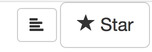
<button type="button" class="btn btn-default btn-lg">
<span class="glyphicon glyphicon-star" aria-hidden="true"></span> Star
</button>
.glyphicon {
  position: relative;
  top: 1px;
  display: inline-block;
  font-family: 'Glyphicons Halflings';
  font-style: normal;
  font-weight: normal;
  line-height: 1;
  -webkit-font-smoothing: antialiased;
  -moz-osx-font-smoothing: grayscale;
}

.glyphicon-star                   { &:before { content: "\e006"; } }
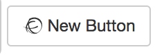
图标还可以使用fontawesome
  <button type="button" class="btn btn-default btn-sm">
    <i class="fa fa-ravelry" aria-hidden="true"></i> New Button
  </button>
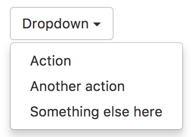
下拉菜单
用于显示链接列表的可切换、有上下文的菜单。
<div class="dropdown">
  <button class="btn btn-default dropdown-toggle" type="button" id="dropdownMenu1" data-toggle="dropdown" aria-haspopup="true" aria-expanded="true">
    Dropdown
    <span class="caret"></span>
  </button>
  <ul class="dropdown-menu" aria-labelledby="dropdownMenu1">
    <li><a href="#">Action</a></li>
    <li><a href="#">Another action</a></li>
    <li><a href="#">Something else here</a></li>
    <li role="separator" class="divider"></li>
    <li><a href="#">Separated link</a></li>
  </ul>
</div>
通过为下拉菜单的父元素设置 .dropup 类,可以让菜单向上弹出(默认是向下弹出的)。
.dropup,
.dropdown {
  position: relative;
}
- dropup和dropdown没有特殊的样式,只是设置position是relative,只是为下拉菜单的绝对定位提供基础
// The dropdown menu (ul)
.dropdown-menu {
  position: absolute;
  top: 100%;
  left: 0;
  z-index: $zindex-dropdown;
  display: none; // none by default, but block on "open" of the menu
  float: left;
  min-width: 160px;
  padding: 5px 0;
  margin: 2px 0 0; // override default ul
  list-style: none;
  font-size: $font-size-base;
  text-align: left; // Ensures proper alignment if parent has it changed (e.g., modal footer)
  background-color: $dropdown-bg;
  border: 1px solid $dropdown-fallback-border; // IE8 fallback
  border: 1px solid $dropdown-border;
  border-radius: $border-radius-base;
  @include box-shadow(0 6px 12px rgba(0,0,0,.175));
  background-clip: padding-box;
- top: 100%; 是让菜单保持在按钮的底部
- 默认是左侧对齐
- 其余便是设置尺寸、边框、背景以及阴影等样式
对齐
B默认情况下,下拉菜单自动沿着父元素的上沿和左侧被定位为 100% 宽度。 为 .dropdown-menu 添加 .dropdown-menu-right 类可以让菜单右对齐。
<ul class="dropdown-menu dropdown-menu-right" aria-labelledby="dLabel">
  ...
</ul>
.dropdown-menu-right {
  left: auto; // Reset the default from `.dropdown-menu`
  right: 0;
}
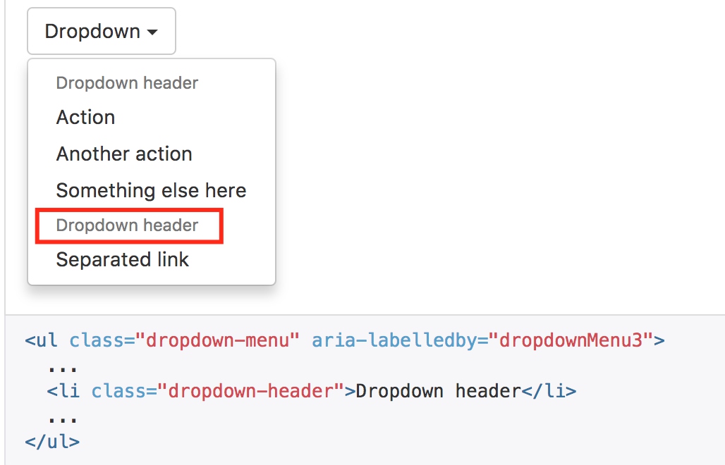
标题
在任何下拉菜单中均可通过添加标题来标明一组动作。
.dropdown-header {
  display: block;
  padding: 3px 20px;
  font-size: $font-size-small;
  line-height: $line-height-base;
  color: $dropdown-header-color;
  white-space: nowrap; // as with > li > a
}
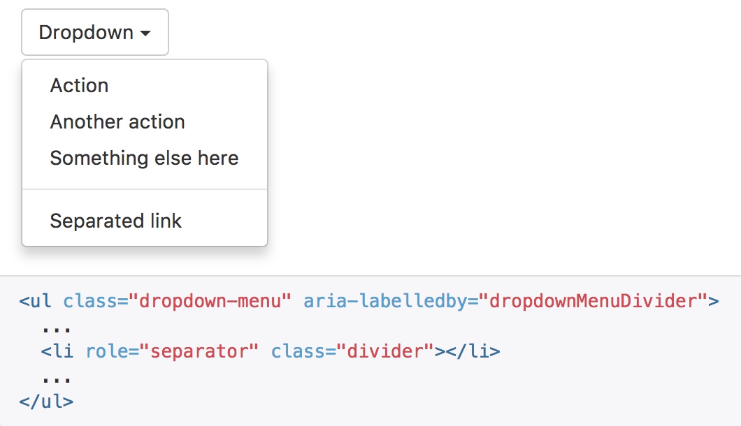
分割线
为下拉菜单添加一条分割线,用于将多个链接分组。
  .divider {
    @include nav-divider($dropdown-divider-bg);
  }

@mixin nav-divider($color: #e5e5e5) {
  height: 1px;
  margin: (($line-height-computed / 2) - 1) 0;
  overflow: hidden;
  background-color: $color;
}
- divider 是嵌套在dropdown-menu当中,调用宏来生成样式
- 上下提供边距,高度设置为1,通过背景颜色使样式生效
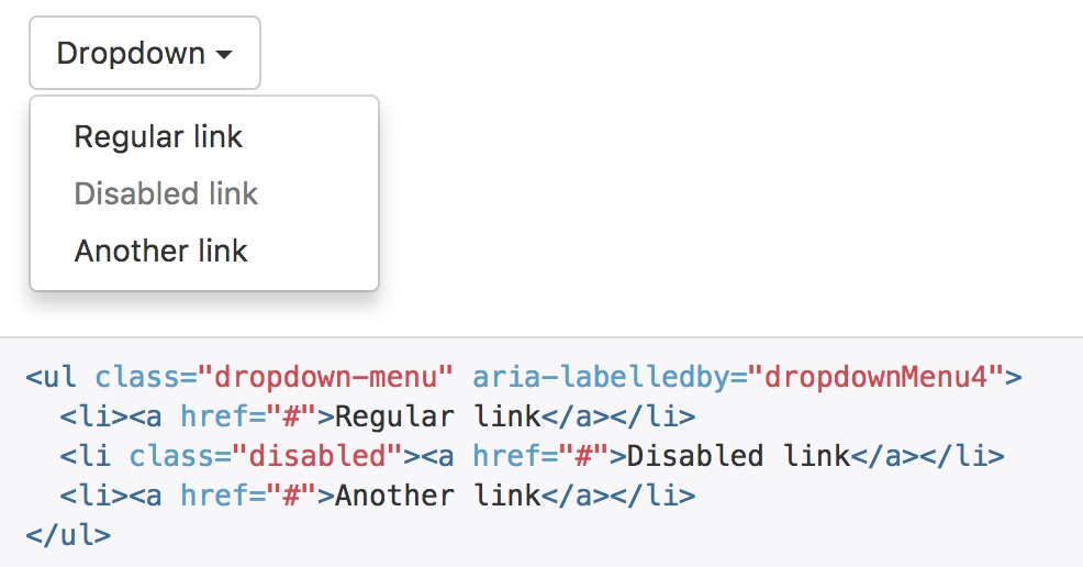
禁用的菜单项
为下拉菜单中的 li 元素添加 .disabled 类,从而禁用相应的菜单项。
// Active state
.dropdown-menu > .active > a {
  &,
  &:hover,
  &:focus {
    color: $dropdown-link-active-color;
    text-decoration: none;
    outline: 0;
    background-color: $dropdown-link-active-bg;
  }
}

// Disabled state
//
// Gray out text and ensure the hover/focus state remains gray

.dropdown-menu > .disabled > a {
  &,
  &:hover,
  &:focus {
    color: $dropdown-link-disabled-color;
  }
- 结合启用的选择项来对比样式,正常选项当鼠标悬浮时,会修改文字和背景颜色
- 禁用选项与其并列,可以屏蔽鼠标悬浮样式,而且使用禁用的字体颜色
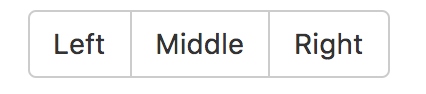
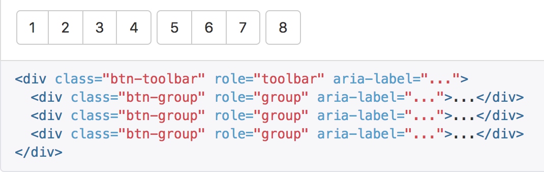
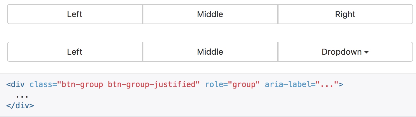
按钮组
通过按钮组容器把一组按钮放在同一行里。
<div class="btn-group" role="group" aria-label="...">
  <button type="button" class="btn btn-default">Left</button>
  <button type="button" class="btn btn-default">Middle</button>
  <button type="button" class="btn btn-default">Right</button>
</div>
.btn-group,
.btn-group-vertical {
  position: relative;
  display: inline-block;
  vertical-align: middle; // match .btn alignment given font-size hack above
  > .btn {
    position: relative;
    float: left;
    // Bring the "active" button to the front
    &:hover,
    &:focus,
    &:active,
    &.active {
      z-index: 2;
    }
  }
}
- btn-group中的btn类,通过float:left靠左进行排列
比较有意思的是对圆角的控制
- 首先,按钮的默认从btn类继承4px的圆角,然后通过css的伪类选择器一层层的去处多余的圆角
- 其次,在选择器中,都排除掉了只有一个按钮的情况
// 中间的按钮,都不需要圆角
.btn-group > .btn:not(:first-child):not(:last-child):not(.dropdown-toggle) {
  border-radius: 0;
}

// 第一个按钮去掉右上和右下的圆角
// Set corners individual because sometimes a single button can be in a .btn-group and we need :first-child and :last-child to both match
.btn-group > .btn:first-child {
  margin-left: 0;
  &:not(:last-child):not(.dropdown-toggle) {
    @include border-right-radius(0);
  }
}

// 最后一个按钮去掉左上和左下的圆角
// Need .dropdown-toggle since :last-child doesn't apply, given that a .dropdown-menu is used immediately after it
.btn-group > .btn:last-child:not(:first-child),
.btn-group > .dropdown-toggle:not(:first-child) {
  @include border-left-radius(0);
}
按钮工具栏
可以在btn-group之外再包裹一层btn-toolbar
.btn-toolbar {
  margin-left: -5px; // Offset the first child's margin
  @include clearfix;

  .btn,
  .btn-group,
  .input-group {
    float: left;
  }
  > .btn,
  > .btn-group,
  > .input-group {
    margin-left: 5px;
  }
}
- btn-toolbar对group的影响就在于margin-left的5个像素
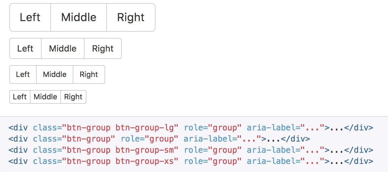
尺寸
只要给 .btn-group 加上 .btn-group-* 类,就省去为按钮组中的每个按钮都赋予尺寸类了,如果包含了多个按钮组时也适用。
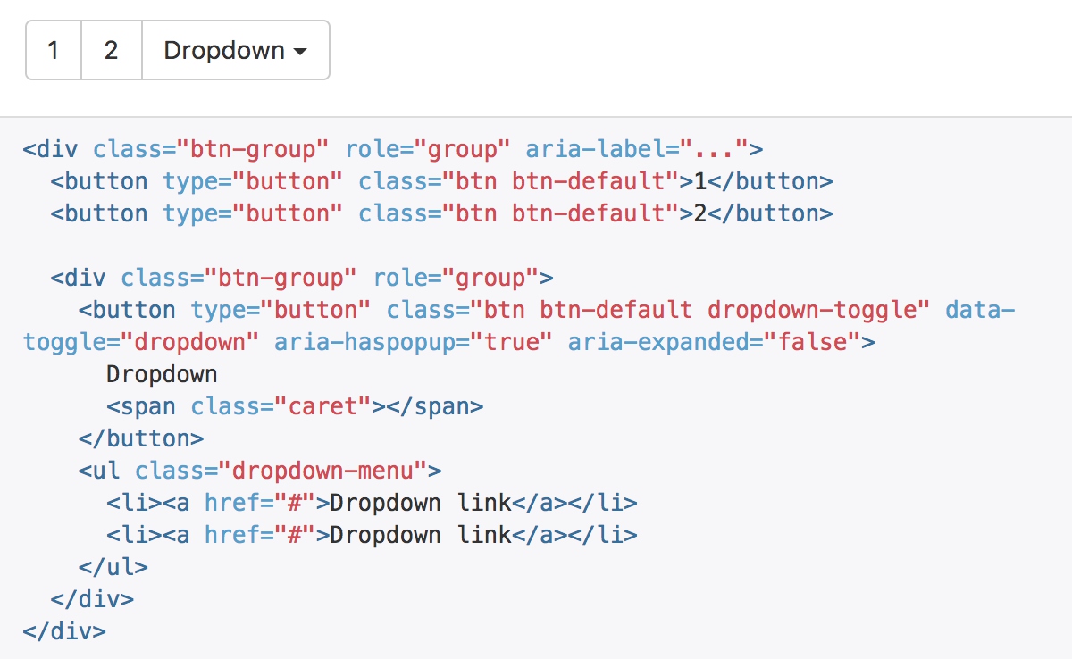
嵌套
想要把下拉菜单混合到一系列按钮中,只须把 .btn-group 放入另一个 .btn-group 中。
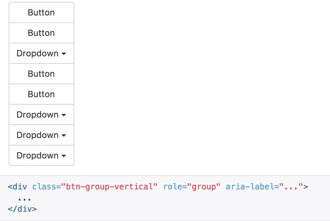
垂直排列
让一组按钮垂直堆叠排列显示而不是水平排列。分列式按钮下拉菜单不支持这种方式。
.btn-group-vertical > .btn {
  &:not(:first-child):not(:last-child) {
    border-radius: 0;
  }
  &:first-child:not(:last-child) {
    @include border-top-radius($btn-border-radius-base);
    @include border-bottom-radius(0);
  }
  &:last-child:not(:first-child) {
    @include border-top-radius(0);
    @include border-bottom-radius($btn-border-radius-base);
  }
}
.btn-group-vertical > .btn-group:not(:first-child):not(:last-child) > .btn {
  border-radius: 0;
}
.btn-group-vertical > .btn-group:first-child:not(:last-child) {
  > .btn:last-child,
  > .dropdown-toggle {
    @include border-bottom-radius(0);
  }
}
.btn-group-vertical > .btn-group:last-child:not(:first-child) > .btn:first-child {
  @include border-top-radius(0);
}
- 与水平相比,选择器规则很类似,只是重置的圆角样式从左右变为了上下
两端对齐排列的按钮组
让一组按钮拉长为相同的尺寸,填满父元素的宽度。对于按钮组中的按钮式下拉菜单也同样适用。
.btn-group-justified {
  display: table;
  width: 100%;
  table-layout: fixed;
  border-collapse: separate;
  > .btn,
  > .btn-group {
    float: none;
    display: table-cell;
    width: 1%;
  }
  > .btn-group .btn {
    width: 100%;
  }

  > .btn-group .dropdown-menu {
    left: auto;
  }
}
- 将按钮组设置为table显示
- 同事使用table-layout:fixed,使得table固定大小,里面的文字强制换行
- 利用table-cell进行水平均分
- 为了将 button 元素用于两端对齐的按钮组中,必须将每个按钮包裹进一个按钮组中you must wrap each button in a button group。
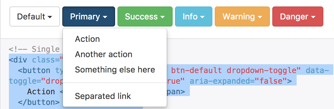
按钮式下拉菜单
把任意一个按钮放入 .btn-group 中,然后加入适当的菜单标签,就可以让按钮作为菜单的触发器了。
按钮式下拉菜单依赖下拉菜单插件 ,因此需要将此插件包含在你所使用的 Bootstrap 版本中。
<div class="btn-group">
  <button type="button" class="btn btn-default dropdown-toggle" data-toggle="dropdown" aria-haspopup="true" aria-expanded="false">
    Action <span class="caret"></span>
  </button>
  <ul class="dropdown-menu">
    <li><a href="#">Action</a></li>
    <li><a href="#">Another action</a></li>
    <li><a href="#">Something else here</a></li>
    <li role="separator" class="divider"></li>
    <li><a href="#">Separated link</a></li>
  </ul>
</div>
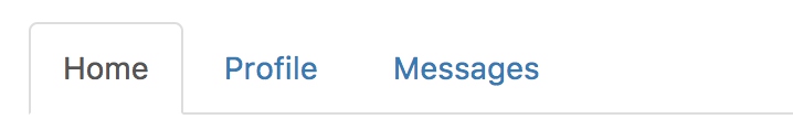
导航
Bootstrap 中的导航组件都依赖同一个 .nav 类,状态类也是共用的。改变修饰类可以改变样式。 由于标签页需要控制内容区的展示,因此,你必须使用 标签页组件的 JavaScript 插件。另外还要添加 role 和 ARIA 属性 – 详细信息请参考该插件的 实例。
<ul class="nav nav-tabs">
  <li role="presentation" class="active"><a href="#">Home</a></li>
  <li role="presentation"><a href="#">Profile</a></li>
  <li role="presentation"><a href="#">Messages</a></li>
</ul>
.nav
.nav {
  margin-bottom: 0;
  padding-left: 0; // Override default ul/ol
  list-style: none;
  @include clearfix;

  > li {
    position: relative;
    display: block;

    > a {
      position: relative;
      display: block;
      padding: $nav-link-padding;
      &:hover,
      &:focus {
        text-decoration: none;
        background-color: $nav-link-hover-bg;
      }
    }

    // Disabled state sets text to gray and nukes hover/tab effects
    &.disabled > a {
      color: $nav-disabled-link-color;

      &:hover,
      &:focus {
        color: $nav-disabled-link-hover-color;
        text-decoration: none;
        background-color: transparent;
        cursor: $cursor-disabled;
      }
    }
  }

  // Open dropdowns
  .open > a {
    &,
    &:hover,
    &:focus {
      background-color: $nav-link-hover-bg;
      border-color: $link-color;
    }
  }

  // Nav dividers (deprecated with v3.0.1)
  //
  // This should have been removed in v3 with the dropping of `.nav-list`, but
  // we missed it. We don't currently support this anywhere, but in the interest
  // of maintaining backward compatibility in case you use it, it's deprecated.
  .nav-divider {
    @include nav-divider;
  }

  // Prevent IE8 from misplacing imgs
  //
  // See https://github.com/h5bp/html5-boilerplate/issues/984#issuecomment-3985989
  > li > a > img {
    max-width: none;
  }
}
- nav类只设置了一些基本的样式,包括边框、颜色、状态等基本信息
.nav-tabs
.nav-tabs {
  border-bottom: 1px solid $nav-tabs-border-color;
  > li {
    float: left;
    // Make the list-items overlay the bottom border
    margin-bottom: -1px;

    // Actual tabs (as links)
    > a {
      margin-right: 2px;
      line-height: $line-height-base;
      border: 1px solid transparent;
      border-radius: $border-radius-base $border-radius-base 0 0;
      &:hover {
        border-color: $nav-tabs-link-hover-border-color $nav-tabs-link-hover-border-color $nav-tabs-border-color;
      }
    }

    // Active state, and its :hover to override normal :hover
    &.active > a {
      &,
      &:hover,
      &:focus {
        color: $nav-tabs-active-link-hover-color;
        background-color: $nav-tabs-active-link-hover-bg;
        border: 1px solid $nav-tabs-active-link-hover-border-color;
        border-bottom-color: transparent;
        cursor: default;
      }
    }
  }
  // pulling this in mainly for less shorthand
  &.nav-justified {
    @extend .nav-justified;
    @extend .nav-tabs-justified;
  }
}
- nav-tabs中包含了更多的具体设置,使按钮项向左浮动
- 底部通过-1边距隐藏选中项的底部border
- border: 1px solid transparent; 是为了与选中项保持对齐,但实际不显示边框
- &.active > a中主要定义选中项的颜色和边框,底部边框隐藏
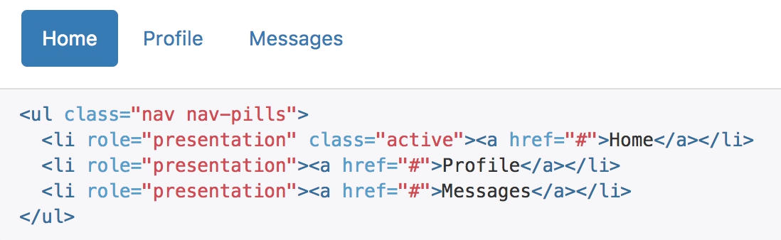
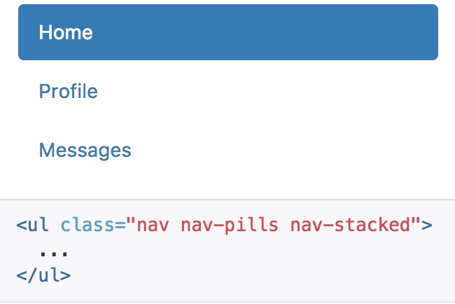
胶囊式标签页
HTML 标记相同,但使用 .nav-pills 类:
.nav-pills {
  > li {
    float: left;

    // Links rendered as pills
    > a {
      border-radius: $nav-pills-border-radius;
    }
    + li {
      margin-left: 2px;
    }

    // Active state
    &.active > a {
      &,
      &:hover,
      &:focus {
        color: $nav-pills-active-link-hover-color;
        background-color: $nav-pills-active-link-hover-bg;
      }
    }
  }
}
- 胶囊式导航的区别就是选中项的样式,去掉了border,通过文本和背景颜色来表现
胶囊是标签页也是可以垂直方向堆叠排列的。只需添加 .nav-stacked 类。
// Stacked pills
.nav-stacked {
  > li {
    float: none;
    + li {
      margin-top: 2px;
      margin-left: 0; // no need for this gap between nav items
    }
  }
}
- 消除浮动显示,使用默认的display:block样式
- 将横向的间距改为垂直的间距
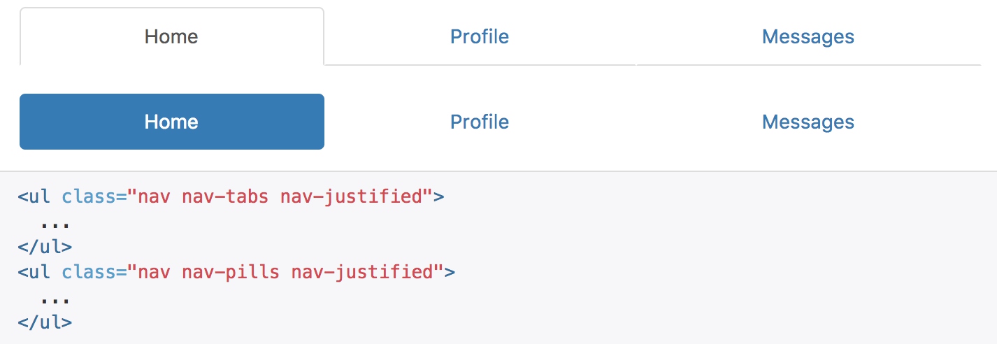
两端对齐的标签页
在大于 768px 的屏幕上,通过 .nav-justified 类可以很容易的让标签页或胶囊式标签呈现出同等宽度。在小屏幕上,导航链接呈现堆叠样式。
.nav-justified {
  width: 100%;

  > li {
    float: none;
    > a {
      text-align: center;
      margin-bottom: 5px;
    }
  }

  > .dropdown .dropdown-menu {
    top: auto;
    left: auto;
  }

  @media (min-width: $screen-sm-min) {
    > li {
      display: table-cell;
      width: 1%;
      > a {
        margin-bottom: 0;
      }
    }
  }
}
- 与按钮组类似,使用table-cell来均分布局
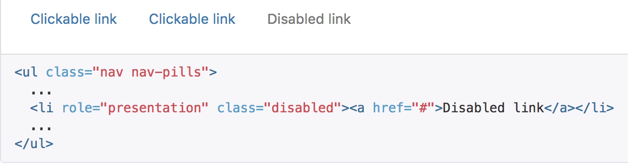
禁用的链接
对任何导航组件(标签页、胶囊式标签页),都可以添加 .disabled 类,从而实现链接为灰色且没有鼠标悬停效果。
导航条
默认样式的导航条
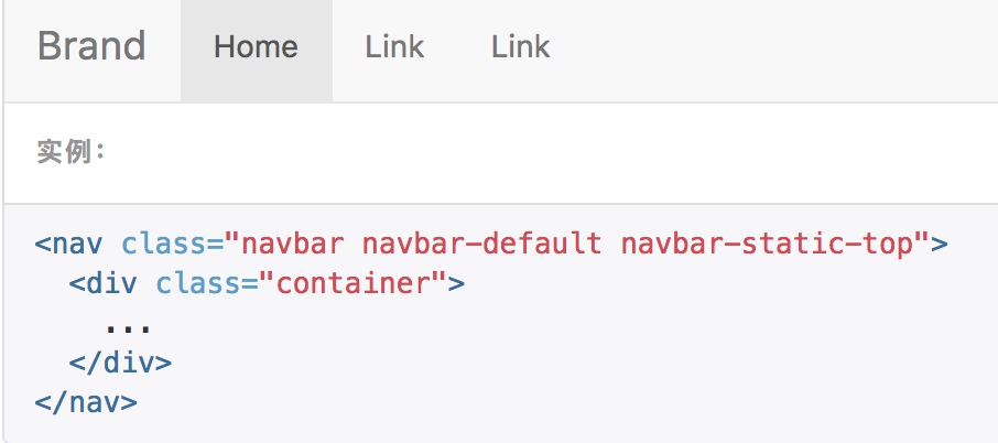
导航条是在您的应用或网站中作为导航页头的响应式基础组件。它们在移动设备上可以折叠(并且可开可关),且在视口(viewport)宽度增加时逐渐变为水平展开模式。

代码较为复杂:
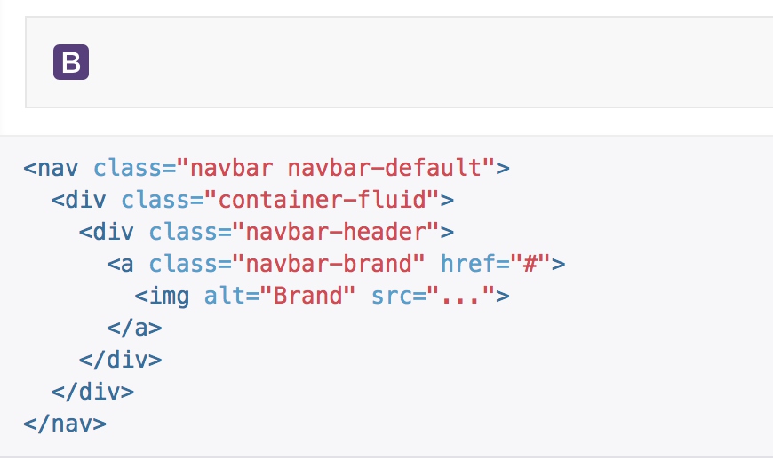
<nav class="navbar navbar-default">
<div class="container-fluid">
<!-- Brand and toggle get grouped for better mobile display -->
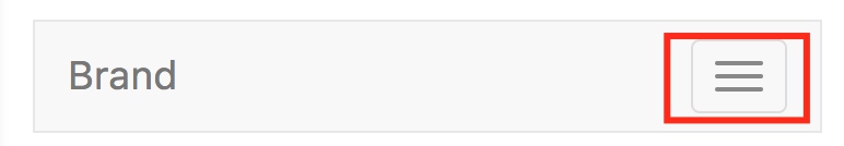
<div class="navbar-header">
<button type="button" class="navbar-toggle collapsed" data-toggle="collapse" data-target="#bs-example-navbar-collapse-1" aria-expanded="false">
<span class="sr-only">Toggle navigation</span>
<span class="icon-bar"></span>
<span class="icon-bar"></span>
<span class="icon-bar"></span>
</button>
<a class="navbar-brand" href="#">Brand</a>
</div>
<!-- Collect the nav links, forms, and other content for toggling -->
<div class="collapse navbar-collapse" id="bs-example-navbar-collapse-1">
<ul class="nav navbar-nav">
<li class="active"><a href="#">Link <span class="sr-only">(current)</span></a></li>
<li><a href="#">Link</a></li>
<li class="dropdown">
<a href="#" class="dropdown-toggle" data-toggle="dropdown" role="button" aria-haspopup="true" aria-expanded="false">Dropdown <span class="caret"></span></a>
<ul class="dropdown-menu">
<li><a href="#">Action</a></li>
<li><a href="#">Another action</a></li>
<li><a href="#">Something else here</a></li>
<li role="separator" class="divider"></li>
<li><a href="#">Separated link</a></li>
<li role="separator" class="divider"></li>
<li><a href="#">One more separated link</a></li>
</ul>
</li>
</ul>
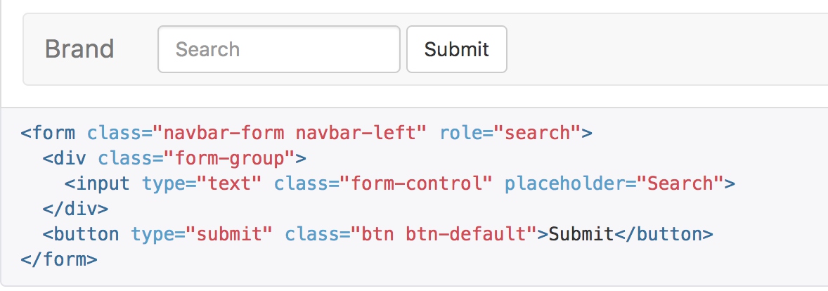
<form class="navbar-form navbar-left">
<div class="form-group">
<input type="text" class="form-control" placeholder="Search">
</div>
<button type="submit" class="btn btn-default">Submit</button>
</form>
<ul class="nav navbar-nav navbar-right">
<li><a href="#">Link</a></li>
<li class="dropdown">
<a href="#" class="dropdown-toggle" data-toggle="dropdown" role="button" aria-haspopup="true" aria-expanded="false">Dropdown <span class="caret"></span></a>
<ul class="dropdown-menu">
<li><a href="#">Action</a></li>
<li><a href="#">Another action</a></li>
<li><a href="#">Something else here</a></li>
<li role="separator" class="divider"></li>
<li><a href="#">Separated link</a></li>
</ul>
</li>
</ul>
</div><!-- /.navbar-collapse -->
</div><!-- /.container-fluid -->
</nav>
- 使用navbar navbar-default声明容器,其中的navbar-default定义了颜色主题
- container-fluid使得内容使用100%宽度
- navbar-toggle是一个关键的响应式控制,最下方的媒体查询使得他在宽屏时隐藏,只有屏幕缩小后才显示
.navbar-toggle {
  position: relative;
  float: right;
  margin-right: $navbar-padding-horizontal;
  padding: 9px 10px;
  @include navbar-vertical-align(34px);
  background-color: transparent;
  background-image: none; // Reset unusual Firefox-on-Android default style; see https://github.com/necolas/normalize.css/issues/214
  border: 1px solid transparent;
  border-radius: $border-radius-base;

  // We remove the `outline` here, but later compensate by attaching `:hover`
  // styles to `:focus`.
  &:focus {
    outline: 0;
  }

  // Bars
  .icon-bar {
    display: block;
    width: 22px;
    height: 2px;
    border-radius: 1px;
  }
  .icon-bar + .icon-bar {
    margin-top: 4px;
  }

  @media (min-width: $grid-float-breakpoint) {
    display: none;
  }
}
- navbar-brand是用来显示品牌名称的,在字体上会加粗显示; ```sass
.navbar-brand { float: left; padding: $navbar-padding-vertical $navbar-padding-horizontal; font-size: $font-size-large; line-height: $line-height-computed; height: $navbar-height;
&:hover, &:focus { text-decoration: none; }
img { display: block; }
@media (min-width: $grid-float-breakpoint) { .navbar > .container &, .navbar > .container-fluid & { margin-left: -$navbar-padding-horizontal; } } }
- collapse在响应式中承担了比较重要的责任,在宽屏幕时,显示内容,隐藏按钮;在窄屏幕的时候隐藏内容,显示按钮;这里重点关注内容部分,当屏幕宽度较小的时候,通过媒体查询隐藏body部分;


```sass
  @media (min-width: $grid-float-breakpoint) {
    width: auto;
    border-top: 0;
    box-shadow: none;

    &.collapse {
      display: block !important;
      height: auto !important;
      padding-bottom: 0; // Override default setting
      overflow: visible !important;
    }
}
- 导航主题嵌入nav navbar-nav,包含普通按钮和下拉组件
- 嵌入了一个navbar-form允许用户输入,其媒体查询主要用来控制与其他并列元素的分割样式
品牌图标
将导航条内放置品牌标志的地方替换为 元素即可展示自己的品牌图标
表单
将表单放置于 .navbar-form 之内可以呈现很好的垂直对齐,并在较窄的视口(viewport)中呈现折叠状态。 使用对齐选项可以规定其在导航条上出现的位置。
注意,.navbar-form 和 .form-inline 的大部分代码都一样,内部实现使用了 mixin。 某些表单组件,例如输入框组,可能需要设置一个固定宽度,从而在导航条内有合适的展现。
按钮
加上 .navbar-btn 后,可以让它在导航条里垂直居中。
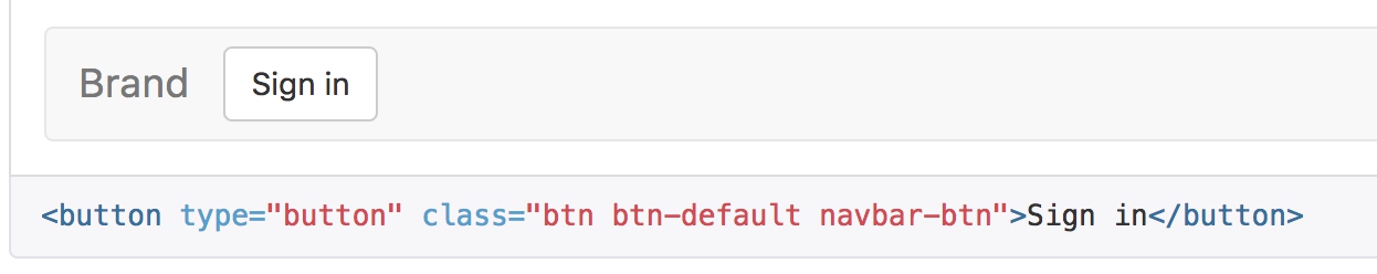
.navbar-btn {
  @include navbar-vertical-align($input-height-base);

  &.btn-sm {
    @include navbar-vertical-align($input-height-small);
  }
  &.btn-xs {
    @include navbar-vertical-align(22);
  }
}
计算方式比较直接,通过margin控制间隔和对齐
@mixin navbar-vertical-align($element-height) {
  margin-top: (($navbar-height - $element-height) / 2);
  margin-bottom: (($navbar-height - $element-height) / 2);
}
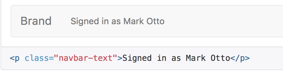
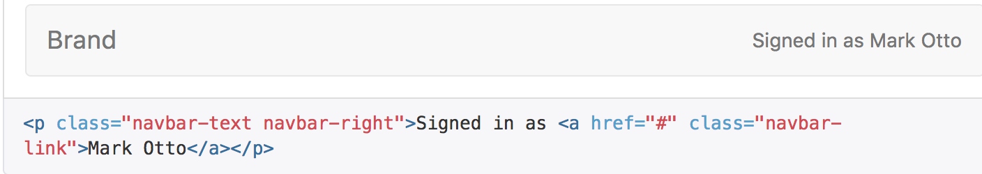
文本
把文本包裹在 .navbar-text中时,为了有正确的行距和颜色,通常使用 p 标签。
非导航的链接
或许你希望在标准的导航组件之外添加标准链接,那么,使用 .navbar-link 类可以让链接有正确的默认颜色和反色设置。
组件排列
通过添加 .navbar-left 和 .navbar-right 工具类让导航链接、表单、按钮或文本对齐。两个类都会通过 CSS 设置特定方向的浮动样式。
这些类是 .pull-left 和 .pull-right 的 mixin 版本,但是他们被限定在了媒体查询(media query)中,这样可以更容易的在各种尺寸的屏幕上处理导航条组件。
@media (min-width: $grid-float-breakpoint) {
  .navbar-left {
    float: left !important;
  }
  .navbar-right {
    float: right !important;
  margin-right: -$navbar-padding-horizontal;

    ~ .navbar-right {
      margin-right: 0;
    }
  }
}
固定在顶部
添加 .navbar-fixed-top 类可以让导航条固定在顶部,还可包含一个 .container 或 .container-fluid 容器,从而让导航条居中,并在两侧添加内补(padding)。
注意:这个固定的导航条会遮住页面上的其它内容,除非你给 body 元素底部设置了 padding。用你自己的值,或用下面给出的代码都可以。提示:导航条的默认高度是 50px。
<nav class="navbar navbar-default navbar-fixed-top">
  <div class="container">
    ...
  </div>
</nav>
// Fix the top/bottom navbars when screen real estate supports it
.navbar-fixed-top,
.navbar-fixed-bottom {
  position: fixed;
  right: 0;
  left: 0;
  z-index: $zindex-navbar-fixed;

  // Undo the rounded corners
  @media (min-width: $grid-float-breakpoint) {
    border-radius: 0;
  }
}
.navbar-fixed-top {
  top: 0;
  border-width: 0 0 1px;
}
.navbar-fixed-bottom {
  bottom: 0;
  margin-bottom: 0; // override .navbar defaults
  border-width: 1px 0 0;
}
静止在顶部
通过添加 .navbar-static-top 类即可创建一个与页面等宽度的导航条,它会随着页面向下滚动而消失。还可以包含一个 .container 或 .container-fluid 容器,用于将导航条居中对齐并在两侧添加内补(padding)。
与 .navbar-fixed-* 类不同的是,你不用给 body 添加任何内补(padding)。
.navbar-static-top 去掉了由 .navbar-default 设置的左、右和顶部的边框,让它看起来更适合放在页面的头部。
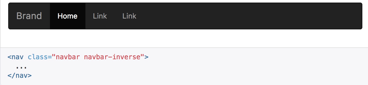
反色的导航条
通过添加 .navbar-inverse 类可以改变导航条的外观。
路径导航
在一个带有层次的导航结构中标明当前页面的位置。
各路径间的分隔符已经自动通过 CSS 的 :before 和 content 属性添加了。
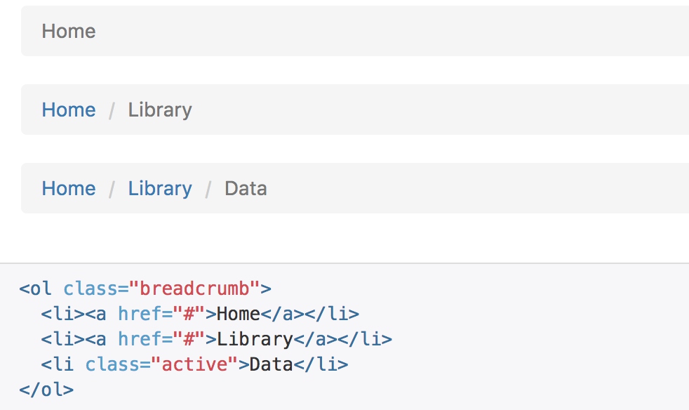
.breadcrumb {
  padding: $breadcrumb-padding-vertical $breadcrumb-padding-horizontal;
  margin-bottom: $line-height-computed;
  list-style: none;
  background-color: $breadcrumb-bg;
  border-radius: $border-radius-base;

  > li {
    display: inline-block;

    + li:before {
      // [converter] Workaround for https://github.com/sass/libsass/issues/1115
      $nbsp: "\00a0";
      content: "#{$breadcrumb-separator}#{$nbsp}"; // Unicode space added since inline-block means non-collapsing white-space
      padding: 0 5px;
      color: $breadcrumb-color;
    }
  }

  > .active {
    color: $breadcrumb-active-color;
  }
}
源码中有两个比较有意思的处理:
- 通过 li + li来排除第一个元素,因为+是严格的相邻匹配,被匹配的li是从第二个开始,是选择列表空位的常见用法
- 通过伪类选择器:before来设置间隔符号
分页
为您的网站或应用提供带有展示页码的分页组件,或者可以使用简单的翻页组件。
默认分页
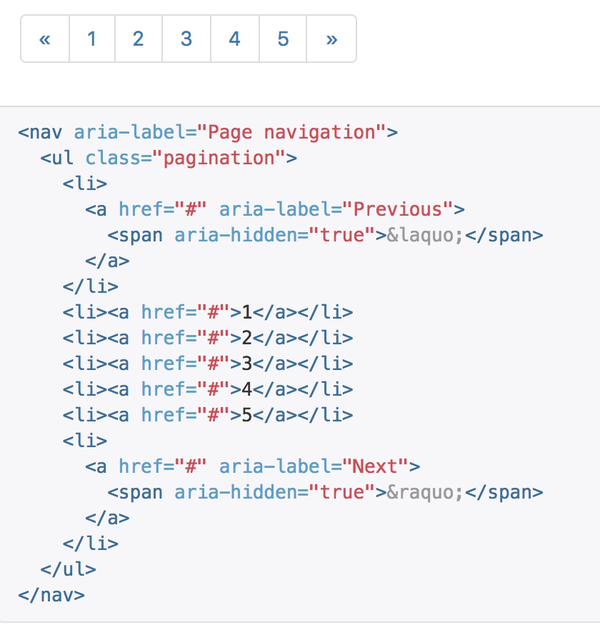 代码被封在一个比较大的样式中:
.pagination {
  display: inline-block;
  padding-left: 0;
  margin: $line-height-computed 0;
  border-radius: $border-radius-base;

  > li {
    display: inline; // Remove list-style and block-level defaults
    > a,
    > span {
      position: relative;
      float: left; // Collapse white-space
      padding: $padding-base-vertical $padding-base-horizontal;
      line-height: $line-height-base;
      text-decoration: none;
      color: $pagination-color;
      background-color: $pagination-bg;
      border: 1px solid $pagination-border;
      margin-left: -1px;
    }
    &:first-child {
      > a,
      > span {
        margin-left: 0;
        @include border-left-radius($border-radius-base);
      }
    }
    &:last-child {
      > a,
      > span {
        @include border-right-radius($border-radius-base);
      }
    }
  }

  > li > a,
  > li > span {
    &:hover,
    &:focus {
      z-index: 2;
      color: $pagination-hover-color;
      background-color: $pagination-hover-bg;
      border-color: $pagination-hover-border;
    }
  }

  > .active > a,
  > .active > span {
    &,
    &:hover,
    &:focus {
      z-index: 3;
      color: $pagination-active-color;
      background-color: $pagination-active-bg;
      border-color: $pagination-active-border;
      cursor: default;
    }
  }

  > .disabled {
    > span,
    > span:hover,
    > span:focus,
    > a,
    > a:hover,
    > a:focus {
      color: $pagination-disabled-color;
      background-color: $pagination-disabled-bg;
      border-color: $pagination-disabled-border;
      cursor: $cursor-disabled;
    }
  }
}
- 整体上提供了一些边距、圆角的设置
- 通过层层嵌套,设置了span的样式:浮动、颜色、边距等
- 通过first和last选择器,设置了组件整体的圆角显示
- 鼠标悬浮、选中时,通过颜色来区分
- 禁用的按钮通过颜色和鼠标样式进行区分
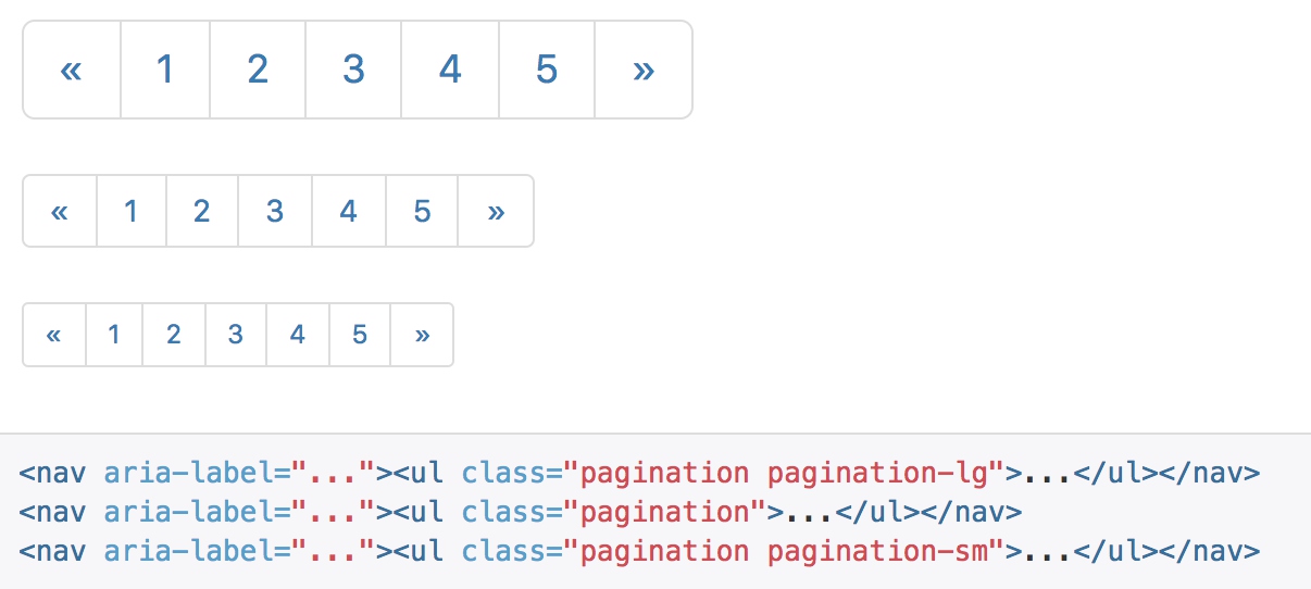
尺寸
想要更小或更大的分页?.pagination-lg 或 .pagination-sm 类提供了额外可供选择的尺寸。
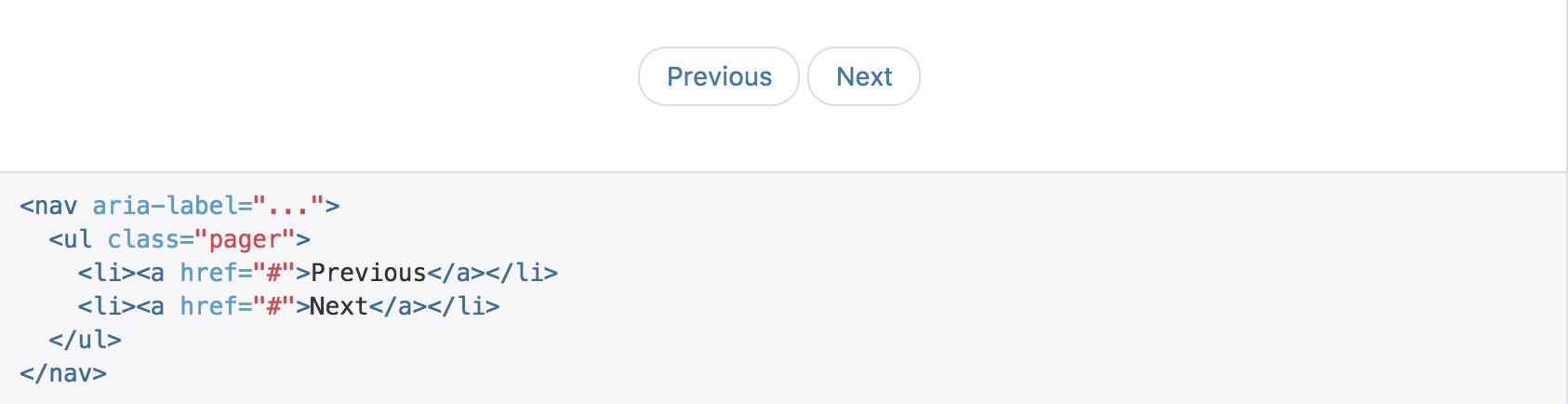
翻页
用简单的标记和样式,就能做个上一页和下一页的简单翻页。用在像博客和杂志这样的简单站点上棒极了。
pager样式主要处理居中
  padding-left: 0;
  margin: $line-height-computed 0;
  list-style: none;
  text-align: center;
对齐链接
你还可以把链接向两端对齐,通过previous和next来处理:
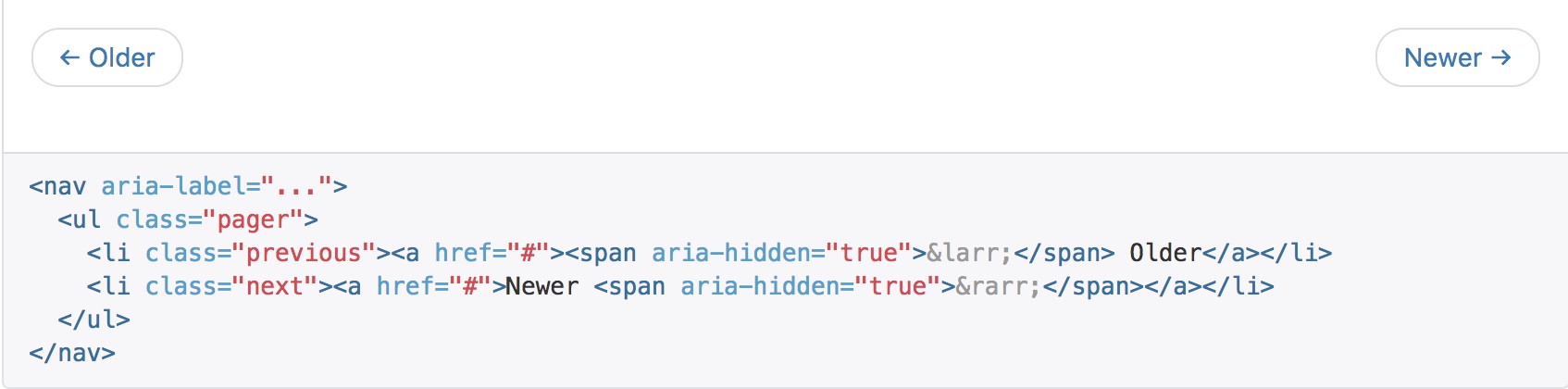
  .previous {
    > a,
    > span {
      float: left;
    }
  }
  .next {
    > a,
    > span {
      float: right;
    }
  }
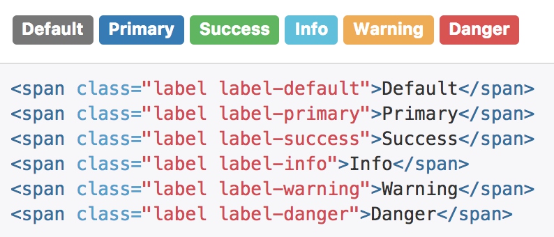
标签
标签会与hx系列混用,主要控制文本颜色
.label-default {
  @include label-variant($label-default-bg);
}

.label-primary {
  @include label-variant($label-primary-bg);
}

.label-success {
  @include label-variant($label-success-bg);
}

.label-info {
  @include label-variant($label-info-bg);
}

.label-warning {
  @include label-variant($label-warning-bg);
}

.label-danger {
  @include label-variant($label-danger-bg);
}

@mixin label-variant($color) {
  background-color: $color;

  &[href] {
    &:hover,
    &:focus {
      background-color: darken($color, 10%);
    }
  }
}
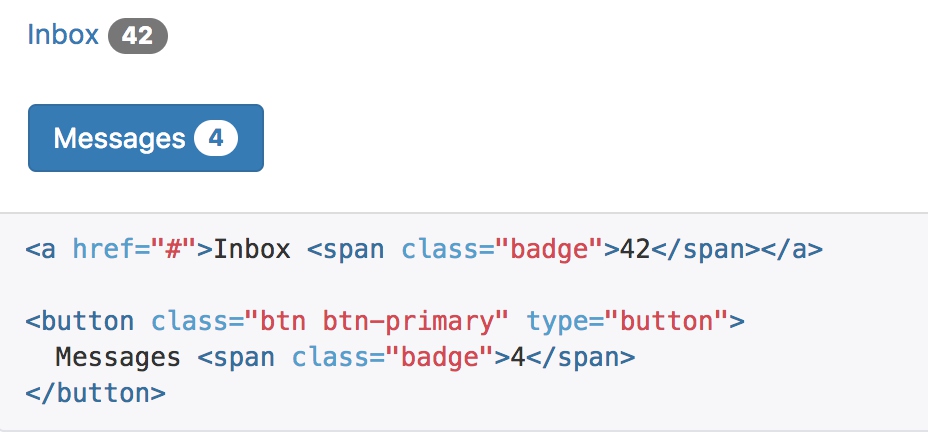
徽章
给链接、导航等元素嵌套 badge 元素,可以很醒目的展示新的或未读的信息条目。
badge主要通过颜色和圆角来展现
  display: inline-block;
  min-width: 10px;
  padding: 3px 7px;
  font-size: $font-size-small;
  font-weight: $badge-font-weight;
  color: $badge-color;
  line-height: $badge-line-height;
  vertical-align: middle;
  white-space: nowrap;
  text-align: center;
  background-color: $badge-bg;
  border-radius: $badge-border-radius;
如果没有新的或未读的信息条目,也就是说不包含任何内容,徽章组件能够自动隐藏(通过CSS的 :empty 选择符实现) 。
  // Empty badges collapse automatically (not available in IE8)
  &:empty {
    display: none;
  }
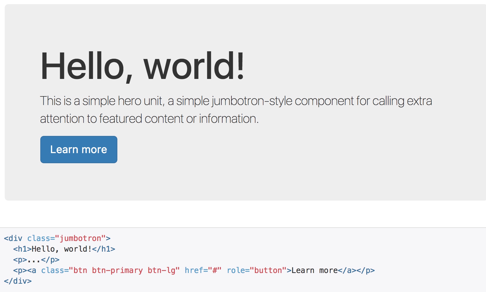
巨幕
这是一个轻量、灵活的组件,它能延伸至整个浏览器视口来展示网站上的关键内容。
jumbotron的特点是比较大的padding和margin-bottom;其他便是通过背景色来区分正文
  padding-top:    $jumbotron-padding;
  padding-bottom: $jumbotron-padding;
  margin-bottom: $jumbotron-padding;
  color: $jumbotron-color;
  background-color: $jumbotron-bg;
如果需要让巨幕组件的宽度与浏览器宽度一致并且没有圆角,请把此组件放在所有 .container 元素的外面,并在组件内部添加一个 .container 元素。
<div class="jumbotron">
  <div class="container">
    ...
  </div>
</div>
  .container &,
  .container-fluid & {
    border-radius: $border-radius-large; // Only round corners at higher resolutions if contained in a container
    padding-left:  ($grid-gutter-width / 2);
    padding-right: ($grid-gutter-width / 2);
  }
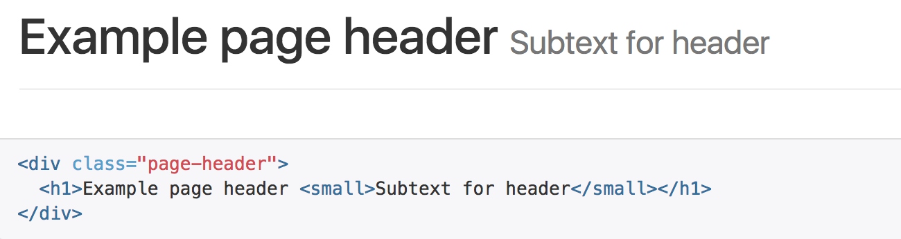
页头
页头组件能够为 h1 标签增加适当的空间,并且与页面的其他部分形成一定的分隔。它支持 h1 标签内内嵌 small 元素的默认效果,还支持大部分其他组件(需要增加一些额外的样式)。
.page-header {
  padding-bottom: (($line-height-computed / 2) - 1);
  margin: ($line-height-computed * 2) 0 $line-height-computed;
  border-bottom: 1px solid $page-header-border-color;
}
页头只是处理了一下上下间距,并且在底部增加border
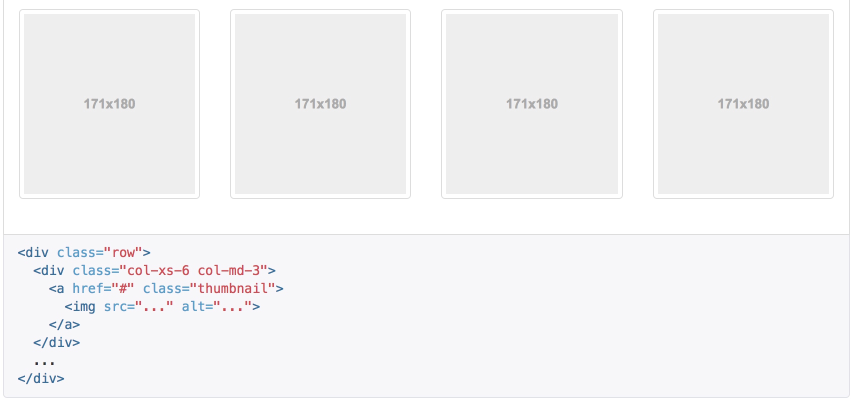
缩略图
通过缩略图组件扩展 Bootstrap 的 栅格系统,可以很容易地展示栅格样式的图像、视频、文本等内容。
默认样式的实例
Boostrap 缩略图的默认设计仅需最少的标签就能展示带链接的图片。
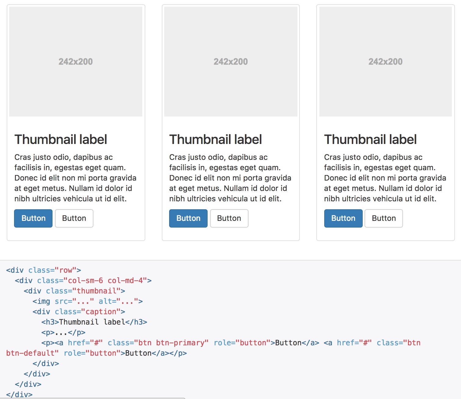
自定义内容
添加一点点额外的标签,就可以把任何类型的 HTML 内容,例如标题、段落或按钮,加入缩略图组件内。
// Mixin and adjust the regular image class
.thumbnail {
  display: block;
  padding: $thumbnail-padding;
  margin-bottom: $line-height-computed;
  line-height: $line-height-base;
  background-color: $thumbnail-bg;
  border: 1px solid $thumbnail-border;
  border-radius: $thumbnail-border-radius;
  @include transition(border .2s ease-in-out);

  > img,
  a > img {
    @include img-responsive;
    margin-left: auto;
    margin-right: auto;
  }

  // [converter] extracted a&:hover, a&:focus, a&.active to a.thumbnail:hover, a.thumbnail:focus, a.thumbnail.active

  // Image captions
  .caption {
    padding: $thumbnail-caption-padding;
    color: $thumbnail-caption-color;
  }
}
- 缩略图是用display: block显示的,配合栅格系统进行排列
- 用border和padding类处理周边的外框
- 通过margin来处理居中问题
- caption只是处理了边距和颜色
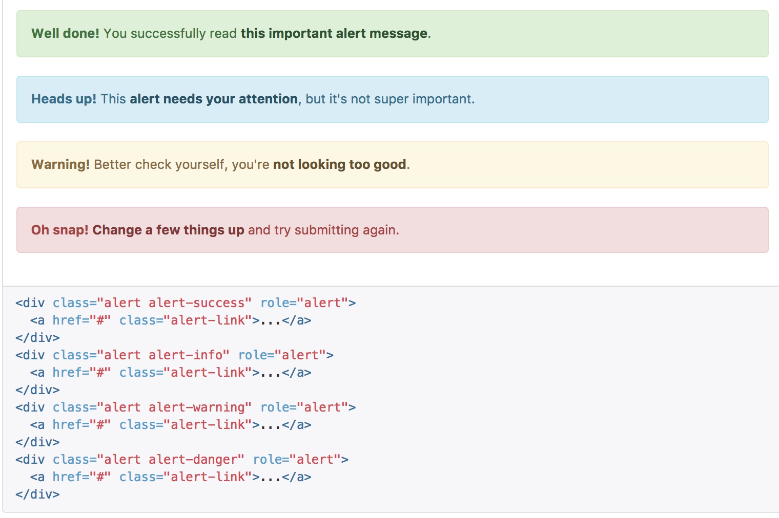
警告框
警告框组件通过提供一些灵活的预定义消息,为常见的用户动作提供反馈消息。
- alert自身处理基础样式,边距、圆角等
-
通过预设宏来给定各种类型的颜色 ```sass @mixin alert-variant($background, $border, $text-color) { background-color: $background; border-color: $border; color: $text-color;
hr { border-top-color: darken($border, 5%); } .alert-link { color: darken($text-color, 10%); } }
- 当中的关闭按钮被浮动到右侧
```sass
.alert-dismissable, // The misspelled .alert-dismissable was deprecated in 3.2.0.
.alert-dismissible {
  padding-right: ($alert-padding + 20);

  // Adjust close link position
  .close {
    position: relative;
    top: -2px;
    right: -21px;
    color: inherit;
  }
}
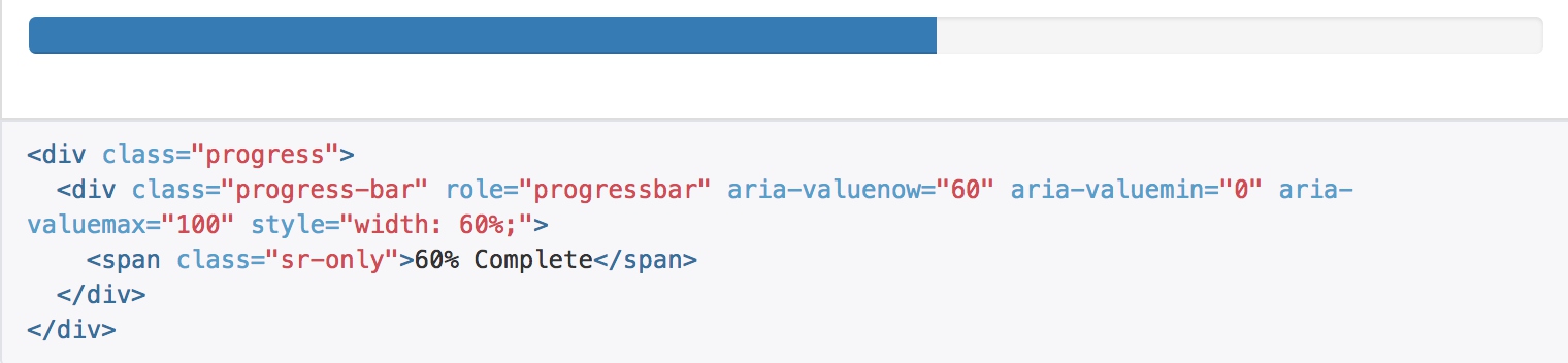
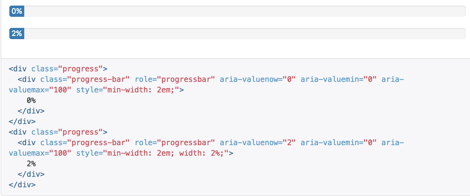
进度条
通过这些简单、灵活的进度条,为当前工作流程或动作提供实时反馈。
基本实例
// Outer container
.progress {
  overflow: hidden;
  height: $line-height-computed;
  margin-bottom: $line-height-computed;
  background-color: $progress-bg;
  border-radius: $progress-border-radius;
  @include box-shadow(inset 0 1px 2px rgba(0,0,0,.1));
}

// Bar of progress
.progress-bar {
  float: left;
  width: 0%;
  height: 100%;
  font-size: $font-size-small;
  line-height: $line-height-computed;
  color: $progress-bar-color;
  text-align: center;
  background-color: $progress-bar-bg;
  @include box-shadow(inset 0 -1px 0 rgba(0,0,0,.15));
  @include transition(width .6s ease);
}
进度条的控制主要是通过js来操作progradd-bar的width属性,通过背景颜色来展示
在展示很低的百分比时,如果需要让文本提示能够清晰可见,可以为进度条设置 min-width 属性。
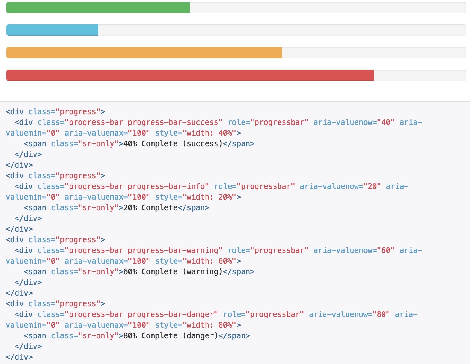
根据情境变化效果
进度条组件使用与按钮和警告框相同的类,根据不同情境展现相应的效果。
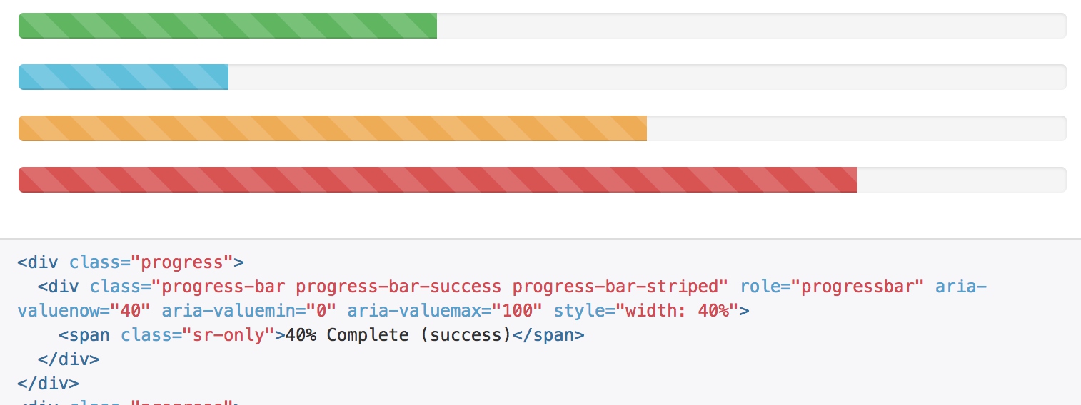
条纹效果
通过渐变可以为进度条创建条纹效果,IE9 及更低版本不支持。
.progress-striped .progress-bar,
.progress-bar-striped {
  @include gradient-striped;
  background-size: 40px 40px;
}

@mixin gradient-striped($color: rgba(255,255,255,.15), $angle: 45deg) {
  background-image: -webkit-linear-gradient($angle, $color 25%, transparent 25%, transparent 50%, $color 50%, $color 75%, transparent 75%, transparent);
  background-image: -o-linear-gradient($angle, $color 25%, transparent 25%, transparent 50%, $color 50%, $color 75%, transparent 75%, transparent);
  background-image: linear-gradient($angle, $color 25%, transparent 25%, transparent 50%, $color 50%, $color 75%, transparent 75%, transparent);
}
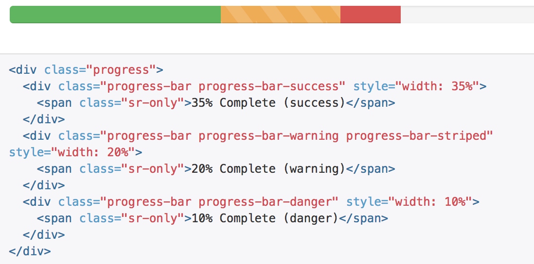
堆叠效果
把多个进度条放入同一个 .progress 中,使它们呈现堆叠的效果。
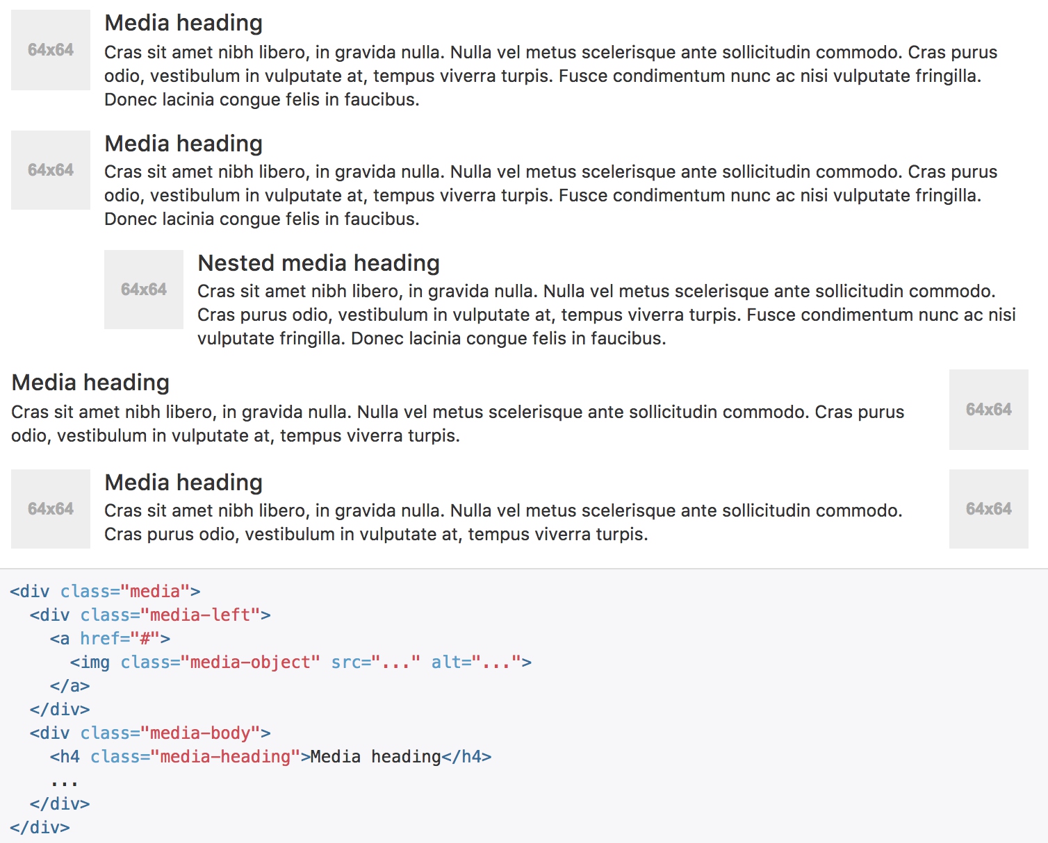
媒体对象
这是一个抽象的样式,用以构建不同类型的组件,这些组件都具有在文本内容的左或右侧对齐的图片(就像博客评论或 Twitter 消息等)。
默认样式
默认样式的媒体对象组件允许在一个内容块的左边或右边展示一个多媒体内容(图像、视频、音频)。
对齐
图片或其他媒体类型可以顶部、中部或底部对齐。默认是顶部对齐。
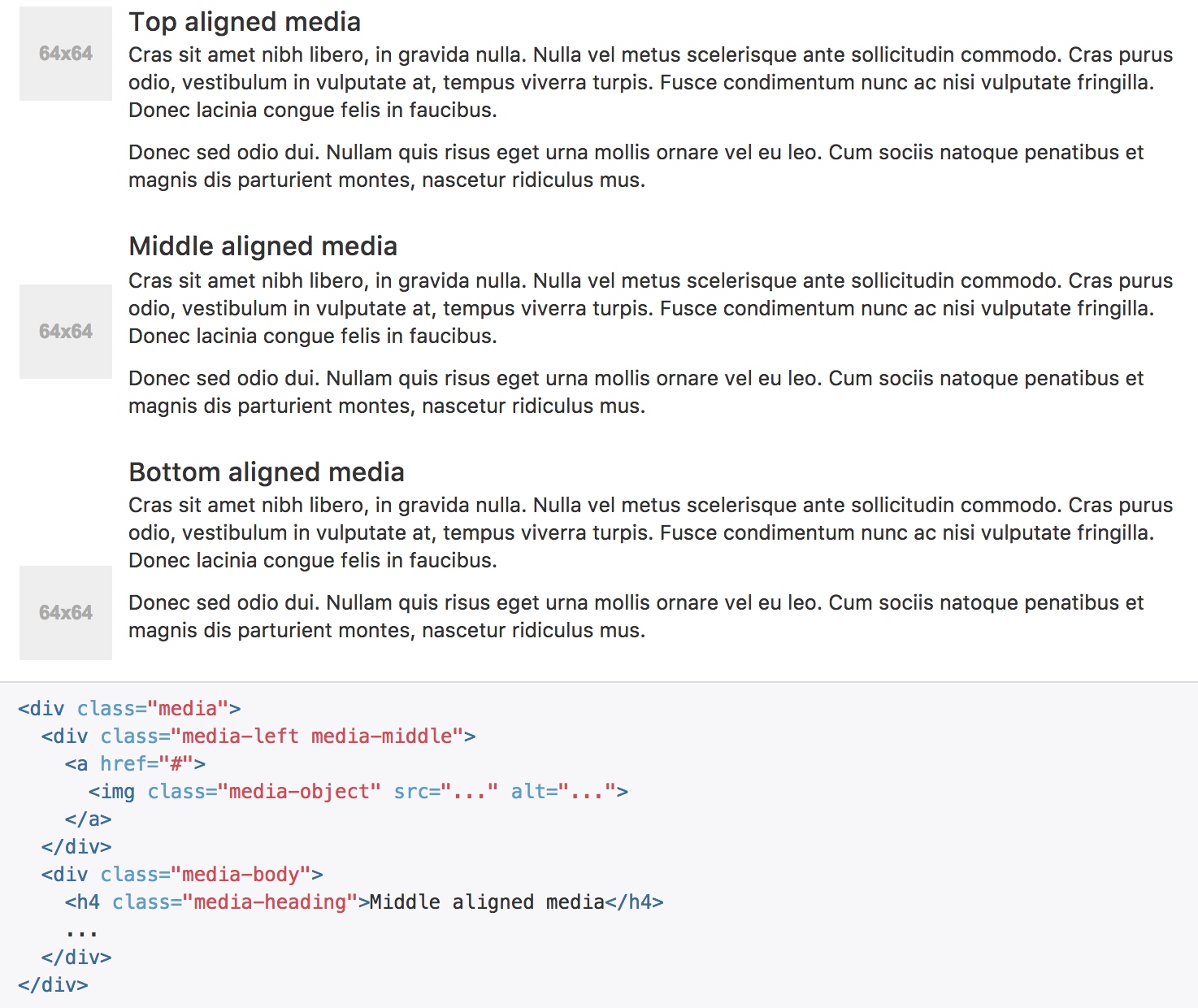
重点是table-cell的显示方式和verticle-align的设置:
.media-left,
.media-right,
.media-body {
  display: table-cell;
  vertical-align: top;
}

.media-middle {
  vertical-align: middle;
}

.media-bottom {
  vertical-align: bottom;
}
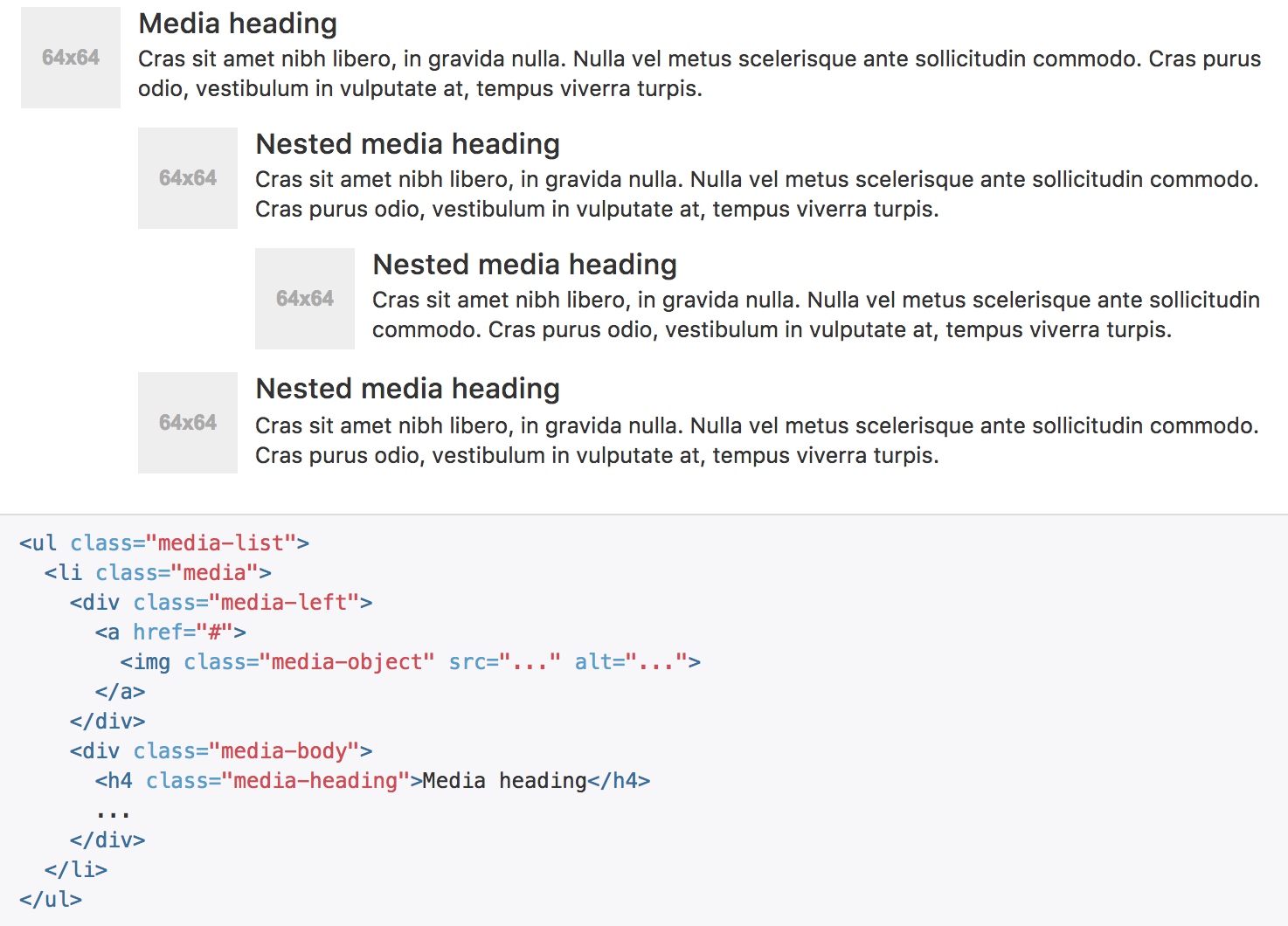
媒体对象列表
用一点点额外的标记,就能在列表内使用媒体对象组件(对评论或文章列表很有用)。
列表组
列表组是灵活又强大的组件,不仅能用于显示一组简单的元素,还能用于复杂的定制的内容。
基本实例
最简单的列表组仅仅是一个带有多个列表条目的无序列表,另外还需要设置适当的类。我们提供了一些预定义的样式,你可以根据自身的需求通过 CSS 自己定制
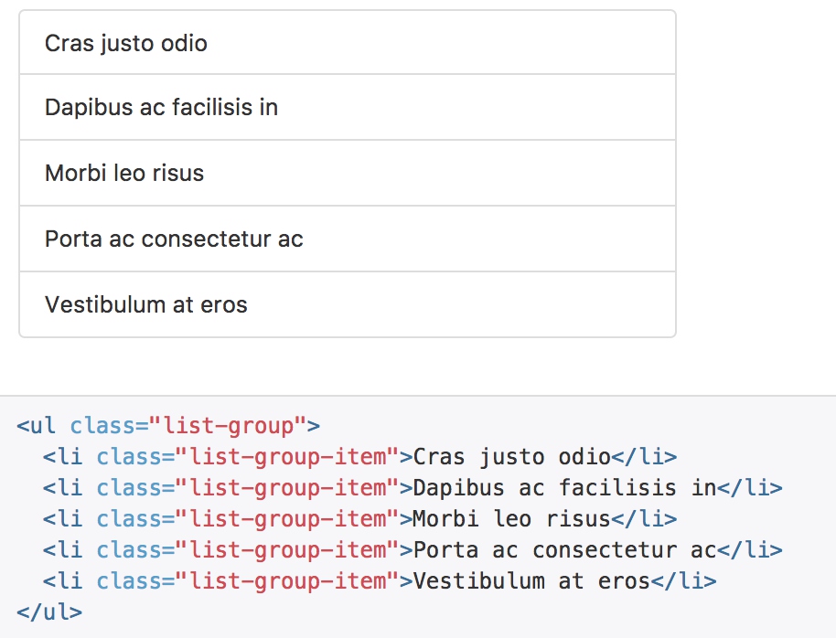
所处理的就是边距、颜色、圆角边框。
.list-group-item {
  position: relative;
  display: block;
  padding: 10px 15px;
  // Place the border on the list items and negative margin up for better styling
  margin-bottom: -1px;
  background-color: $list-group-bg;
  border: 1px solid $list-group-border;

  // Round the first and last items
  &:first-child {
    @include border-top-radius($list-group-border-radius);
  }
  &:last-child {
    margin-bottom: 0;
    @include border-bottom-radius($list-group-border-radius);
  }
}
徽章
给列表组加入徽章组件,它会自动被放在右边。
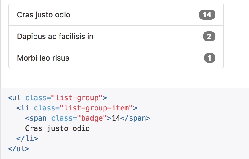
  .list-group-item > & {
    float: right;
  }

  .list-group-item > & + & {
    margin-right: 5px;
  }
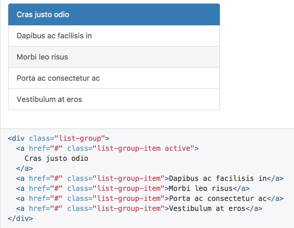
链接
用 a 标签代替 li 标签可以组成一个全部是链接的列表组 用来添加一些颜色和鼠标的交互效果
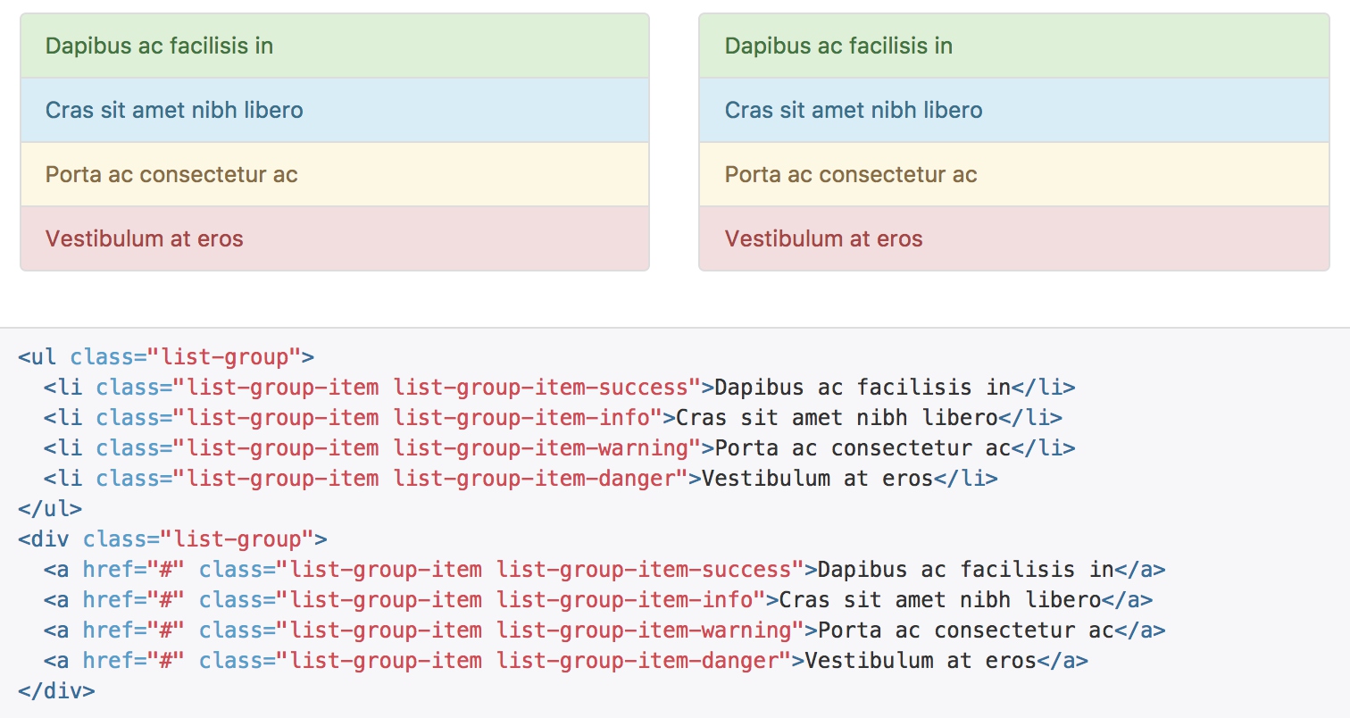
情境类
为列表中的条目添加情境类,默认样式或链接列表都可以。还可以为列表中的条目设置 .active 状态。
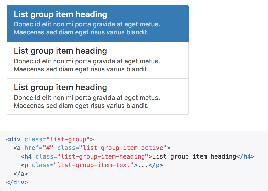
定制内容
列表组中的每个元素都可以是任何 HTML 内容,甚至是像下面的带链接的列表组。
面版
虽然不总是必须,但是某些时候你可能需要将某些 DOM 内容放到一个盒子里。对于这种情况,可以试试面板组件。
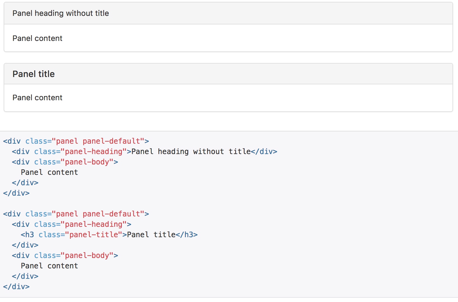
带标题的面版
通过 .panel-heading 可以很简单地为面板加入一个标题容器。你也可以通过添加设置了 .panel-title 类的 h1-h6 标签,添加一个预定义样式的标题。不过,h1-h6 标签的字体大小将被 .panel-heading 的样式所覆盖。
为了给链接设置合适的颜色,务必将链接放到带有 .panel-title 类的标题标签内。
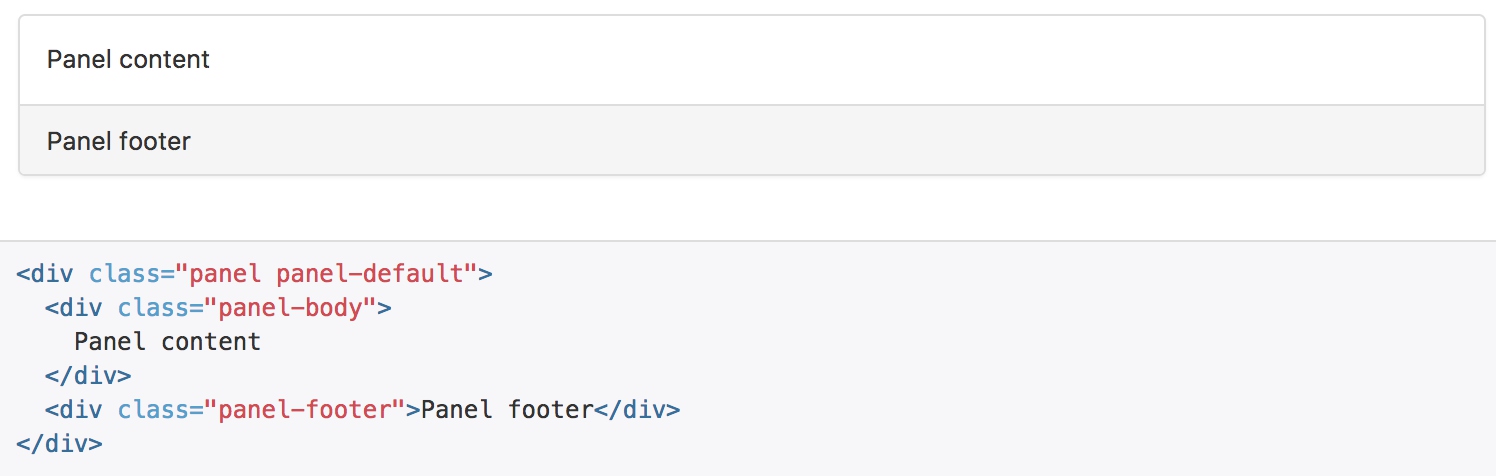
带脚注的面版
把按钮或次要的文本放入 .panel-footer 容器内。注意面版的脚注不会从情境效果中继承颜色,因为他们并不是主要内容。
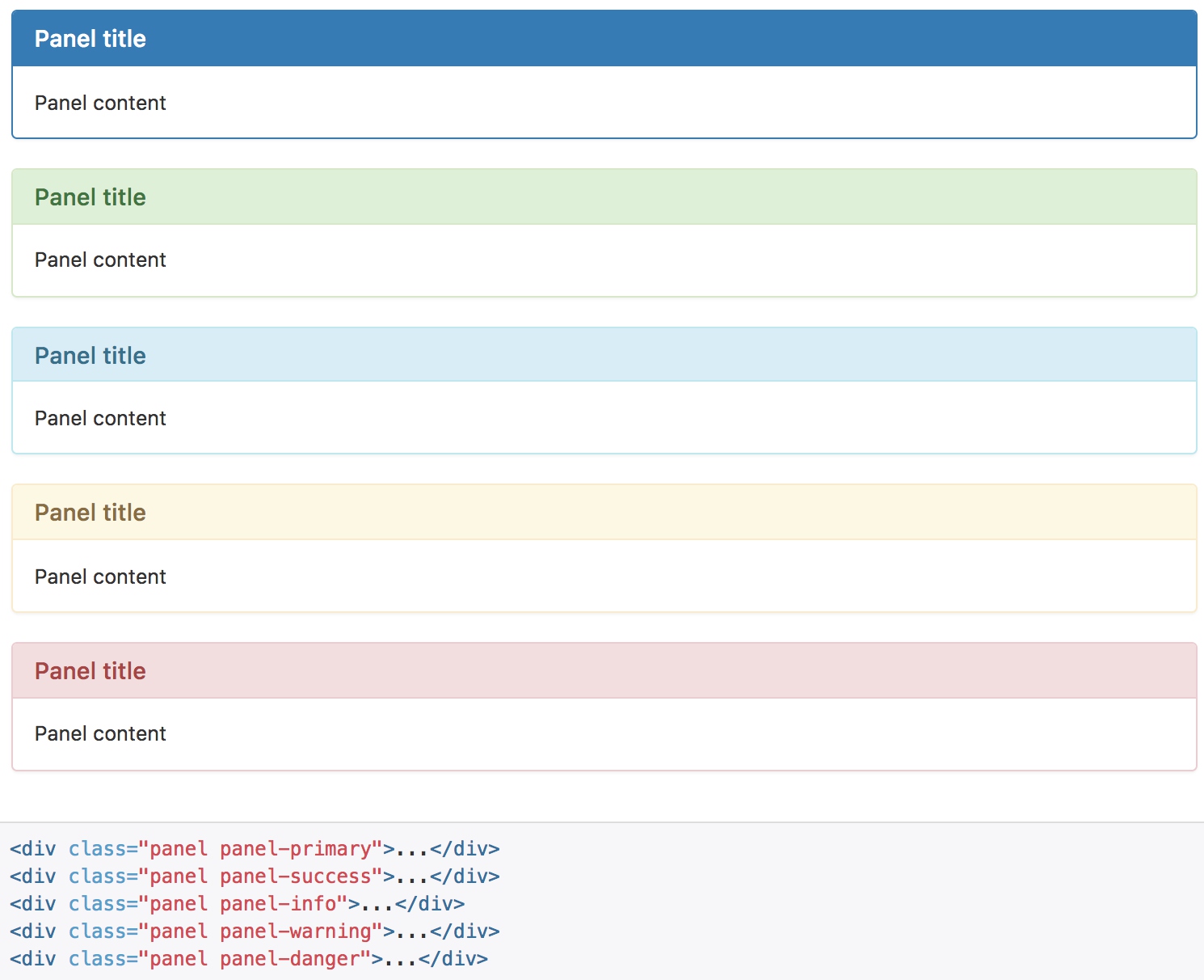
情境效果
像其他组件一样,可以简单地通过加入有情境效果的状态类,给特定的内容使用更针对特定情境的面版。
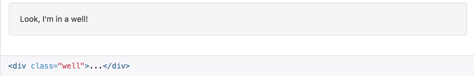
Well
把 Well 用在元素上,就能有嵌入(inset)的简单效果。