Developing a Popover directive
The Popover directive is similar with tooltop directive.
But the Popover contains title and has different class supplied by bootstrap.
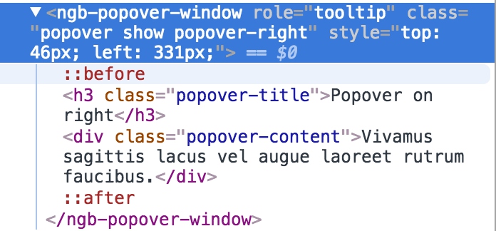
popover- in container elementshow- to show the windowpopover-rightto tell the positionpopover-titlein title elementpopover-contentin content
Create a PopoverComponent first to display the window.
  it('should use `popover` class in container, `popover-title` and `popover-content`', () => {
    fixture = createGenericTestComponent(`
      <popover-window></popover-window>
    `, TestComponent);
    component = fixture.componentInstance;

    const popup = fixture.debugElement.query(By.css('popover-window'));
    expect(popup.nativeElement.classList).toContain('popover');

    const title = fixture.debugElement.query(By.css('.popover-title'));
    expect(title).toBeTruthy();

    const content = fixture.debugElement.query(By.css('.popover-content'));
    expect(content).toBeTruthy();
  });
Supports title property and contents inside component selectors
  it('should support title property and contents inside tags', () => {
    fixture = createGenericTestComponent(`
      <popover-window title='Title'>
        Contents!
      </popover-window>
    `, TestComponent);

    const title = fixture.debugElement.query(By.css('.popover-title'));
    expect(title.nativeElement.textContent).toContain('Title');

    const content = fixture.debugElement.query(By.css('.popover-content'));
    expect(content.nativeElement.textContent).toContain('Contents!');
  });
<h3 class="popover-title">

</h3>
<div class="popover-content">
  <ng-content></ng-content>
</div>
Supports placement property to specify the style
  it('should support placement property', () => {
    fixture = createGenericTestComponent(`
      <popover-window title='Title' placement='right'>
        Contents!
      </popover-window>
    `, TestComponent);

    const popup = fixture.debugElement.query(By.css('popover-window'));
    expect(popup.nativeElement.classList).toContain('popover-right');
  });
export class PopoverWindowComponent implements OnInit {

  @Input() title: string;
  @Input() placement = 'top';

  @HostBinding('class') hostClass: string;
  @HostBinding('id') id: string;

  ngOnInit() {
    this.hostClass = `popover show popover-${this.placement}`;
  }
}
Developing our myPopover directive with TDD approach
Starting from the basic feature that when clicking the host element, open or clase method will be called.
  it('should call open and close method when clicking the host element', () => {
    fixture = createGenericTestComponent(`
      <button myPopover>Button</button>
    `, TestComponent);

    component = fixture.componentInstance;

    const buttonElement: HTMLElement = fixture.debugElement.query(By.css('button')).nativeElement;

    const openSpy = spyOn(component.myPopoverDirective, 'open').and.callThrough();
    const closeSpy = spyOn(component.myPopoverDirective, 'close').and.callThrough();

    buttonElement.click();
    expect(openSpy).toHaveBeenCalled();

    buttonElement.click();
    expect(closeSpy).toHaveBeenCalled();
  });
Fill the directive as simple as we can.
import { Directive, HostListener } from '@angular/core';

@Directive({
  selector: '[myPopover]'
})
export class MyPopoverDirective {

  private isOpened = false;

  constructor() { }

  @HostListener('click') toggle() {
    if (!this.isOpened) {
      this.open();
    } else {
      this.close();
    }
  }

  open() {
    this.isOpened = true;
  }

  close() {
    this.isOpened = false;
  }
}
Then a PopoverWindowComponent will be loaded when open method is called.
  it('should load a PopoverWindowComponent when open method is called', () => {
    fixture = createGenericTestComponent(`
      <button myPopover>Button</button>
    `, TestComponent);

    component = fixture.componentInstance;
    component.myPopoverDirective.open();

    expect(fixture.debugElement.query(By.css('popover-window'))).toBeTruthy();
  });
Load the component with PopupService.
  private windowRef: ComponentRef<PopoverWindowComponent>;
  private popupService: PopupService<PopoverWindowComponent>;
  private isOpened = false;

  constructor(
    private elementRef: ElementRef,
    private injector: Injector,
    private viewContainerRef: ViewContainerRef,
    private renderer: Renderer,
    private componentFactoryResolver: ComponentFactoryResolver,
    private ngZone: NgZone
  ) { }

  ngOnInit(): void {
    this.popupService = new PopupService<PopoverWindowComponent>(
      PopoverWindowComponent,
      this.injector,
      this.viewContainerRef,
      this.renderer,
      this.componentFactoryResolver
    );
  }
We should get popover’s title and string content from input property.
  it('should specify title and string content with input property', () => {
    fixture = createGenericTestComponent(`
      <button myPopover="Contents" popoverTitle="Title">Button</button>
    `, TestComponent);

    component = fixture.componentInstance;
    component.myPopoverDirective.open();

    fixture.detectChanges();

    const title = fixture.debugElement.query(By.css('.popover-title'));
    expect(title.nativeElement.textContent).toContain('Title');

    const content = fixture.debugElement.query(By.css('.popover-content'));
    expect(content.nativeElement.textContent).toContain('Contents');
  });
When opening the window, reset the component’s title property and pass the content as parameter.
    this.windowRef = this.popupService.open(this.myPopover);
    this.windowRef.instance.title = this.popoverTitle;
Support template contents.
  it('should specify content with a template', () => {
    fixture = createGenericTestComponent(`
      <button [myPopover]="t" popoverTitle="Title">Button</button>
      <template #t>
        Contents in template.
      </template>
    `, TestComponent);

    component = fixture.componentInstance;
    component.myPopoverDirective.open();

    fixture.detectChanges();

    const content = fixture.debugElement.query(By.css('.popover-content'));
    expect(content.nativeElement.textContent).toContain('Contents in template');
  });
Just change the property type to apply both string and TemplateRef type.
@Input() myPopover: string | TemplateRef<any>;
Support to specify the placement.
  it('should use top placement as default', () => {
    fixture = createGenericTestComponent(`
      <button myPopover="Contents" popoverTitle="Title">Button</button>
    `, TestComponent);

    component = fixture.componentInstance;
    component.myPopoverDirective.open();
    fixture.detectChanges();

    const popover = fixture.debugElement.query(By.css('.popover'));
    expect(popover.nativeElement.classList).toContain('popover-top');
  });

  it('should specify placement by input property', () => {
    fixture = createGenericTestComponent(`
      <button myPopover="Contents" popoverTitle="Title" placement="right">Button</button>
    `, TestComponent);

    component = fixture.componentInstance;
    component.myPopoverDirective.open();
    fixture.detectChanges();

    const popover = fixture.debugElement.query(By.css('.popover'));
    expect(popover.nativeElement.classList).toContain('popover-right');
  });
Same as title property, change the component’s property when opening.
  open() {
    this.windowRef = this.popupService.open(this.myPopover);
    this.windowRef.instance.title = this.popoverTitle;
    this.windowRef.instance.placement = this.placement;
  }
Add positioning like we have done in tooltip. Subscribe ngZone events in ngOnInit method and unsubscribe it in ngOnDestroy.
  ngOnInit(): void {
    // others...
    this.zoneSubscription = this.ngZone.onStable.subscribe(() => {
      if (this.windowRef) {
        positionElements(
          this.elementRef.nativeElement,
          this.windowRef.location.nativeElement,
          this.placement,
          this.container === 'body'
        );
      }
    });
  }

  ngOnDestroy(): void {
    this.close();
    this.zoneSubscription.unsubscribe();
  }
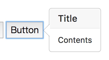
At this time, the popover directive can be used in our demo page.
<button myPopover="Contents" popoverTitle="Title" placement="right">Button</button>