Developing a tooltip directive
First of all, develop a TooltipWindow that will show a tooltip with the support of bootstrap
  it('should display a .tooltip and a .tooltip-inner inside', () => {
    fixture = createGenericTestComponent(`
      <tooltip-window></tooltip-window>
    `, TestComponent);

    const tooltipContainer = fixture.debugElement.query(By.css('.tooltip'));
    const inner = tooltipContainer.query(By.css('.tooltip-inner'));

    expect(tooltipContainer).toBeTruthy();
    expect(inner).toBeTruthy();
  });
<div class="tooltip">
  <div class="tooltip-inner">
    Tooltip
  </div>
</div>
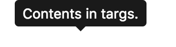
It will display content arround tags.
  it('should display content arround <tooltip-window> tags', () => {
    fixture = createGenericTestComponent(`
      <tooltip-window>Custom Content!</tooltip-window>
    `, TestComponent);

    const tooltip = fixture.debugElement.query(By.css('.tooltip-inner'));
    expect(tooltip.nativeElement.textContent).toContain('Custom Content!');
  });
Just use
<div class="tooltip">
  <div class="tooltip-inner">
    <ng-content></ng-content>
  </div>
</div>
Add placement class like tooltip-tip in the container depends on the placement property.
  it('should add tooltip-top class to the container as default', () => {
    fixture = createGenericTestComponent(`
      <tooltip-window>Custom Content!</tooltip-window>
    `, TestComponent);

    const tooltip = fixture.debugElement.query(By.css('.tooltip'));
    expect(tooltip.nativeElement.classList).toContain('tooltip-top');
  });

  it('should add tooltip-{placement} class to the container', () => {
    fixture = createGenericTestComponent(`
      <tooltip-window placement="bottom">Custom Content!</tooltip-window>
    `, TestComponent);

    const tooltip = fixture.debugElement.query(By.css('.tooltip'));
    expect(tooltip.nativeElement.classList).toContain('tooltip-bottom');
  });
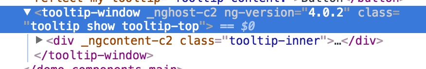
Add a placement property with top as default value and build class with it.
And it will be shown as default with show class.
  @Input() placement = 'top';
  @HostBinding('class') hostClass: string;
  ngOnInit() {
    this.hostClass = `tooltip show tooltip-${this.placement}`;
  }
<div class="tooltip-inner">
  <ng-content></ng-content>
</div>
Notice - add tooltip class with @HostBinding
It will be shown as:
Create a simple tooltip directive and only support string content.
We will create a attribute directive with selector [myTooltip].
Get the content with myTooltip input.
And show the tips with a dynamically loaded TooltipWindowComponent.
Init the spec enviroment
@NgModule({
  imports: [],
  exports: [],
  declarations: [TooltipWindowComponent],
  providers: [],
  entryComponents: [
    TooltipWindowComponent
  ]
})
export class TestModule { }

@Component({
  selector: 'test-component',
  template: ''
})
export class TestComponent {
}

describe('MyTooltipDirective', () => {
  let component: TestComponent;
  let fixture: ComponentFixture<TestComponent>;

  beforeEach(async(() => {
    TestBed.configureTestingModule({
      imports: [TestModule],
      declarations: [TestComponent, MyTooltipDirective]
    });
  }));


  it('should be created', () => {
    fixture = createGenericTestComponent(`
      <button myTooltip="Tooltip content.">Button</button>
    `, TestComponent);

    component = fixture.componentInstance;
    expect(component).toBeTruthy();
  });
});
When we use myTooltip in an element, a tooltip will be shown when the mosue moves over the element. We will finish this feature step by step.
  it('should show the tooltip when mose moves over the element', () => {
    fixture = createGenericTestComponent(`
      <button myTooltip="Tooltip content.">Button</button>
    `, TestComponent);

    const button: HTMLElement = fixture.debugElement.query(By.css('button')).nativeElement;
    button.dispatchEvent(new Event('mouseover'));

    const tooltip = fixture.debugElement.query(By.css('.tooltip-inner'));
    expect(tooltip).toBeTruthy();
  });
When mouse overs the element, open method will be called.
export class TestComponent {
  @ViewChild(MyTooltipDirective) myTooltipDirective: MyTooltipDirective;
}

  it('should call open method when mouseover', () => {
    fixture = createGenericTestComponent(`
      <button myTooltip="Tooltip content.">Button</button>
    `, TestComponent);
    component = fixture.componentInstance;

    const spy = spyOn(component.myTooltipDirective, 'open');

    const button: HTMLElement = fixture.debugElement.query(By.css('button')).nativeElement;
    button.dispatchEvent(new Event('mouseover'));

    expect(spy).toHaveBeenCalled();
  });
Add a HostListener and call open method when mouse over
  @HostListener('mouseover') open() {
    console.log('open method is called');
  }
We load a new TooltipWindowComponent when the directive has been inited with PopupService
  private popupService: PopupService<TooltipWindowComponent>;
  private windowRef: ComponentRef<TooltipWindowComponent>;

  constructor(
    private injector: Injector,
    private viewContainerRef: ViewContainerRef,
    private renderer: Renderer,
    private componentFactoryResolver: ComponentFactoryResolver
  ) { }

  ngOnInit(): void {
    this.popupService = new PopupService<TooltipWindowComponent>(
      TooltipWindowComponent,
      this.injector,
      this.viewContainerRef,
      this.renderer,
      this.componentFactoryResolver
    );
  }
When open method is called, we open the component
  @HostListener('mouseover') open() {
    this.windowRef = this.popupService.open(this.myTooltip);
  }
When mouse over the button, we will reset the tooltip’s position with default top placement
  it('should reset the position of the tooltip when mouseover with default `top` placement', () => {
    fixture = createGenericTestComponent(`
      <button myTooltip="Tooltip content.">Button</button>
    `, TestComponent);

    const button: HTMLElement = fixture.debugElement.query(By.css('button')).nativeElement;
    button.dispatchEvent(new Event('mouseover'));

    const tooltip = fixture.debugElement.query(By.css('tooltip-window')).nativeElement;

    const expectedLeft = button.getBoundingClientRect().left + button.offsetWidth / 2 - tooltip.offsetWidth / 2;

    expect(tooltip.style.top).toBe((button.getBoundingClientRect().top - tooltip.offsetHeight) + 'px');
    expect(tooltip.style.left).toBe(expectedLeft + 'px');
  });
Reset the position with positioning function.
  @HostListener('mouseover') open() {
    this.windowRef = this.popupService.open(this.myTooltip);
    positionElements(
      this.elementRef.nativeElement,
      this.windowRef.location.nativeElement,
      this.placement,
      false
    );
  }
But we found that the open method will be called twice, when the mouse over. And the tooltip’s position will be set twice. Fix it with an injected ngZone: NgZone
  @HostListener('mouseover') open() {
    this.windowRef = this.popupService.open(this.myTooltip);

    this.ngZone.onStable.subscribe(() => {
      positionElements(
        this.elementRef.nativeElement,
        this.windowRef.location.nativeElement,
        this.placement,
        false
      );
    });
  }
Hide the tooltip when mouseout
  it('should hide the tooltip when mose moves out the element', () => {
    fixture = createGenericTestComponent(`
      <button myTooltip="Tooltip content.">Button</button>
    `, TestComponent);

    component = fixture.componentInstance;
    component.myTooltipDirective.open();

    const button: HTMLElement = fixture.debugElement.query(By.css('button')).nativeElement;
    button.dispatchEvent(new Event('mouseout'));

    const tooltip = fixture.debugElement.query(By.css('.tooltip-inner'));
    expect(tooltip).toBeFalsy();
  });
  @HostListener('mouseout') close() {
    if (this.windowRef) {
      this.popupService.close();
      this.windowRef = null;
    }
  }
The tooltip should supports templateRef as content to be shown.
  it('should support tempalteRef as content', () => {
    fixture = createGenericTestComponent(`
      <button [myTooltip]="tooltipTemplate">Button</button>
      <ng-template #tooltipTemplate>
        Contents in a template!
      </ng-template>
    `, TestComponent);

    component = fixture.componentInstance;
    component.myTooltipDirective.open();

    const tooltip = fixture.debugElement.query(By.css('.tooltip-inner'));
    expect(tooltip.nativeElement.textContent).toContain('Contents in a template!');
  });
PopupService has already support TemplateRef, just change myTooltip's type to be string | TemplateRef<any>
@Input() myTooltip: string | TemplateRef<any>;
The placement property should support values "top" | "bottom" | "left" | "right"
  it('should support `right` placement', () => {
    fixture = createGenericTestComponent(`
      <button myTooltip="Tooltip content." placement="right">Button</button>
    `, TestComponent);

    const button: HTMLElement = fixture.debugElement.query(By.css('button')).nativeElement;
    button.dispatchEvent(new Event('mouseover'));

    const tooltip = fixture.debugElement.query(By.css('tooltip-window')).nativeElement;

    const expectedTop = Math.round(button.getBoundingClientRect().top + button.offsetHeight / 2 - tooltip.offsetHeight / 2);
    const expectedLeft = Math.round(button.getBoundingClientRect().right);

    expect(tooltip.style.top).toBe(expectedTop + 'px');
    expect(tooltip.style.left).toBe(expectedLeft + 'px');
  });
Set TooltipWindowComponent’s placement.
this.windowRef.instance.placement = this.placement;
The tooltip can be appended in body
  it('should support to append tooltip window in body', () => {
    fixture = createGenericTestComponent(`
      <button [myTooltip]="Content" container="body">Button</button>
    `, TestComponent);

    component = fixture.componentInstance;
    component.myTooltipDirective.open();

    const tooltipInBody = document.querySelector('tooltip-window');
    expect(tooltipInBody.parentElement.nodeName.toLowerCase()).toBe('body');
  });
Move tooltip window to body and positioning the window relative to body
        positionElements(
          this.elementRef.nativeElement,
          this.windowRef.location.nativeElement,
          this.placement,
          this.container === 'body'
        );

  @HostListener('mouseover') open() {
    this.windowRef = this.popupService.open(this.myTooltip);
    this.windowRef.instance.placement = this.placement;

    if (this.container === 'body') {
      window.document.querySelector(this.container).appendChild(this.windowRef.location.nativeElement);
    }
  }
It should support isOpen method to check whether the tooltip window is opened.
  it('should support `isOpen` method to check whether the window is opened', () => {
    fixture = createGenericTestComponent(`
      <button [myTooltip]="Content">Button</button>
    `, TestComponent);

    component = fixture.componentInstance;

    expect(component.myTooltipDirective.isOpen()).toBeFalsy();

    component.myTooltipDirective.open();

    expect(component.myTooltipDirective.isOpen()).toBeTruthy();
  });
Check open status base on this.windowRef
  isOpen() {
    return this.windowRef != null;
  }
We should get shown and hidden events when status changed.
  it('should catch events when status changed', () => {
    fixture = createGenericTestComponent(`
      <button [myTooltip]="Content" (shown)="onOpen($event)" (hidden)="onClose($event)">Button</button>
    `, TestComponent);
    component = fixture.componentInstance;

    const openSpy = spyOn(component, 'onOpen');
    const closeSpy = spyOn(component, 'onClose');

    component.myTooltipDirective.open();
    expect(openSpy).toHaveBeenCalled();

    component.myTooltipDirective.close();
    expect(closeSpy).toHaveBeenCalled();
  });
Create shown and hidden EventEmitter, emit event when open and close method is called.
  @Output() shown = new EventEmitter();
  @Output() hidden = new EventEmitter();
  @HostListener('mouseover') open() {
    this.windowRef = this.popupService.open(this.myTooltip);
    this.windowRef.instance.placement = this.placement;

    if (this.container === 'body') {
      window.document.querySelector(this.container).appendChild(this.windowRef.location.nativeElement);
    }

    this.shown.emit();
  }

  @HostListener('mouseout') close() {
    if (this.windowRef) {
      this.popupService.close();
      this.windowRef = null;

      this.hidden.emit();
    }
  }
When opening the tooltip window, pass a context and insert into the template
  it('should pass a context when opening the tooltip', () => {
    fixture = createGenericTestComponent(`
      <button [myTooltip]="tooltipTemplate">Button</button>
      <ng-template #tooltipTemplate let-name="name">
        Contents in a template -  !
      </ng-template>
    `, TestComponent);

    component = fixture.componentInstance;

    component.myTooltipDirective.open({name: 'Stone'});

    fixture.detectChanges(); // Important!!!

    const tooltip = fixture.debugElement.query(By.css('.tooltip-inner')).nativeElement;
    expect(tooltip.textContent).toContain('Stone');
  });
Pass a context method to PopupService and show the template content.
  @HostListener('mouseover') open(context?: any) {
    this.windowRef = this.popupService.open(this.myTooltip, context);
    // others
  }
Compare with source of ng-bootstrap
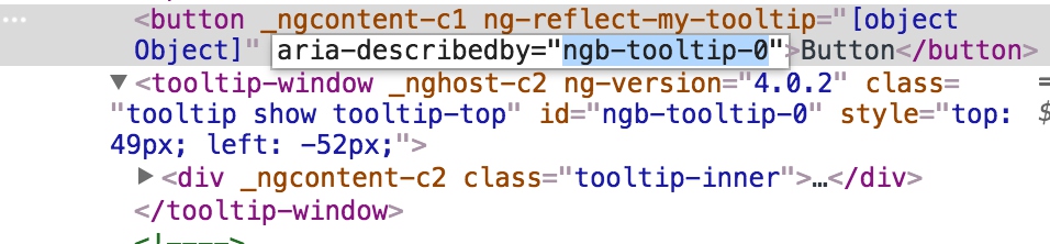
Accessibility with aria-describedby - the host element is described by the tooltip window
TooltipWindowComponent will set id attribute by @HostBinding
export class TooltipWindowComponent implements OnInit {

  @Input() placement = 'top';
  @HostBinding('class') hostClass: string;
  @HostBinding('id') id: string;

  constructor() { }

  ngOnInit() {
    this.hostClass = `tooltip show tooltip-${this.placement}`;
  }
}
When opening, set the component instance’s id.
  private ngbTooltipWindowId = `ngb-tooltip-${nextId++}`;

  open() {
      // others
      this.renderer.setElementAttribute(this.elementRef.nativeElement, 'aria-describedby', this.ngbTooltipWindowId);
      // others
  }
When closing, remove the attribute in close method
this.renderer.setElementAttribute(this.elementRef.nativeElement, 'aria-describedby', null);
When destroying the directive, unsubscribe ngZone
this.zoneSubscription.unsubscribe();
toggle supports in ng-bootstrap
Specifies events that should trigger. Supports a space separated list of event names.
It can be used like:
<!-- open when click and close on blur -->
<button type="button" class="btn btn-secondary" ngbTooltip="You see, I show up on click!" triggers="click:blur">
  Click me!
</button>

<!-- when using 'manual', only support open/close by calling methods -->
<button type="button" class="btn btn-secondary" ngbTooltip="What a great tip!" triggers="manual" #t="ngbTooltip" (click)="t.open()">
  Click me to open a tooltip
</button>
<button type="button" class="btn btn-secondary" (click)="t.close()">
  Click me to close a tooltip
</button>
The trigglers is processed in ngOnInit method
  ngOnInit() {
    this._unregisterListenersFn = listenToTriggers(
        this._renderer, this._elementRef.nativeElement, this.triggers, this.open.bind(this), this.close.bind(this),
        this.toggle.bind(this));
  }
export function listenToTriggers(renderer: any, nativeElement: any, triggers: string, openFn, closeFn, toggleFn) { }
The listenToTriggers function is supplied by util/triggers.
rendereris used to listen events.nativeElementis the target to be bind events.triggersis event names split with:openFn, closeFn, toggleFnbind to the real functions to be done.