Developing Dropdown
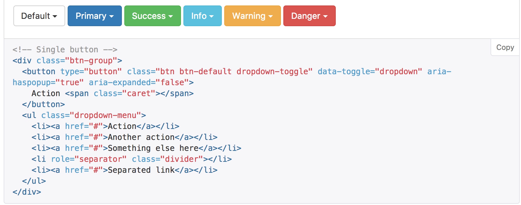
Dropdown styles are supported by bootstrap. But there are not any response when clicking the button.
Create directive files and create spec for testing.
import { async, ComponentFixture, TestBed, fakeAsync, tick } from '@angular/core/testing';
import { Component, OnInit, ViewChild } from '@angular/core';
import { createGenericTestComponent } from 'test/common';
import { By } from '@angular/platform-browser';
import { MyDropdownDirective } from 'app/demo-components/my-dropdown/my-dropdown.directive';
import { MyDropdownButtonDirective } from 'app/demo-components/my-dropdown/my-dropdown-button.directive';

@Component({
  selector: 'app-test-component',
  template: ''
})
export class TestComponent {
  @ViewChild(MyDropdownDirective) instance: MyDropdownDirective;
}

function clickMyDropdownButton(fixture): void {
  const btn = fixture.debugElement.query(By.css('[myDropdownButton]')).nativeElement;
  btn.click();
}

describe('MyDropdownDirective', () => {
  let component: TestComponent;
  let fixture: ComponentFixture<TestComponent>;
  let instance: MyDropdownDirective;

  beforeEach(async(() => {
    TestBed.configureTestingModule({
      declarations: [TestComponent, MyDropdownDirective, MyDropdownButtonDirective]
    });
  }));

  it('should layout host div with bootstrap classes', () => {
    fixture = createGenericTestComponent(`
      <div class="btn-group" myDropdown>
        <button myDropdownButton type="button" class="btn btn-outline-primary dropdown-toggle">
          Action
        </button>
        <div class="dropdown-menu">
          <button class="dropdown-item">Action - 1</button>
          <button class="dropdown-item">Action - 2</button>
        </div>
      </div>
    `, TestComponent);
    component = fixture.componentInstance;
    instance = component.instance;
    expect(component).toBeTruthy();
    expect(instance).toBeTruthy();
  });
});
- We create two directives: a
myDropdownButtoninsidemyDropdown
When clicking the myDropdownButton a class named show will be add to or remove from myDropdown
function clickMyDropdownButton(fixture): void {
  fixture.debugElement.query(By.css('[myDropdownButton]')).nativeElement.click();
}

  it('should toggle `show` class when clicking myDropdownButton', () => {
    fixture = createGenericTestComponent(`
      <div class="btn-group" myDropdown>
        <button myDropdownButton type="button" class="btn btn-outline-primary dropdown-toggle">
          Action
        </button>
        <div class="dropdown-menu">
          <button class="dropdown-item">Action - 1</button>
          <button class="dropdown-item">Action - 2</button>
        </div>
      </div>
    `, TestComponent);
    component = fixture.componentInstance;
    instance = component.instance;

    const dropdownContainerElement = fixture.debugElement.query(By.css('[myDropdown]')).nativeElement;

    expect(dropdownContainerElement.classList).not.toContain('show');

    clickMyDropdownButton(fixture);
    fixture.detectChanges();
    expect(dropdownContainerElement.classList).toContain('show');

    clickMyDropdownButton(fixture);
    fixture.detectChanges();
    expect(dropdownContainerElement.classList).not.toContain('show');
  });
We use test spec to describe our purpose.
- Hide the list as default.
- Show the list after clicking.
- Hide the list when we click it again.
Bind show class with @HostBinding in my-dropdown.directive.ts
@HostBinding('class.show') isOpen = false;
When clicking myDropdownButton, isOpen will be changed.
@Directive({
  selector: '[myDropdownButton]'
})
export class MyDropdownButtonDirective {

  constructor(private myDropdown: MyDropdownDirective) { }

  @HostListener('click') click() {
    this.myDropdown.isOpen = !this.myDropdown.isOpen;
  }
}
- The parent directive is injected.
- Bind click event with
@HostListener.
We can open the droplist as default with input property opened
  it('should set defulat open state with input property', () => {
    fixture = createGenericTestComponent(`
      <div class="btn-group" myDropdown [opened]="true">
        <button myDropdownButton type="button" class="btn btn-outline-primary dropdown-toggle">
          Action
        </button>
        <div class="dropdown-menu">
          <button class="dropdown-item">Action - 1</button>
          <button class="dropdown-item">Action - 2</button>
        </div>
      </div>
    `, TestComponent);
    component = fixture.componentInstance;
    instance = component.instance;

    const dropdownContainerElement = fixture.debugElement.query(By.css('[myDropdown]')).nativeElement;
    expect(dropdownContainerElement.classList).toContain('show');
  });
Add a set method to specify the default state.
  @Input() set opened(isOpen) {
    this.isOpen = isOpen;
  }
We shoud get notice when open status is changed.
  it('should emit statusChange event when it is opened or closed', () => {
    fixture = createGenericTestComponent(`
      <div class="btn-group" myDropdown (statusChange)="onStatusChange($event)">
        <button myDropdownButton type="button" class="btn btn-outline-primary dropdown-toggle">
          Action
        </button>
        <div class="dropdown-menu">
          <button class="dropdown-item">Action - 1</button>
          <button class="dropdown-item">Action - 2</button>
        </div>
      </div>
    `, TestComponent);
    component = fixture.componentInstance;
    instance = component.instance;

    const spy = spyOn(component, 'onStatusChange');

    clickMyDropdownButton(fixture);
    expect(spy).toHaveBeenCalledWith(true);

    clickMyDropdownButton(fixture);
    expect(spy).not.toContain(false);
  });
We need to emit an event when change status, so only changing the boolean value is not enough. Surround it with a method, change the boolean value and emit an event.
  @Output() statusChange = new EventEmitter<boolean>();

  toggle() {
    this.isOpen = !this.isOpen;
    this.statusChange.emit(this.isOpen);
  }
In the child directive, call the method instead of changing the property.
  @HostListener('click') click() {
    this.myDropdown.toggle();
  }
The dropdown can be open or close manually with open, ‘close’ and ‘toggle’ method.
  it('should open or close manually', () => {
    fixture = createGenericTestComponent(`
      <div class="btn-group" myDropdown>
        <button myDropdownButton type="button" class="btn btn-outline-primary dropdown-toggle">
          Action
        </button>
        <div class="dropdown-menu">
          <button class="dropdown-item">Action - 1</button>
          <button class="dropdown-item">Action - 2</button>
        </div>
      </div>
    `, TestComponent);
    component = fixture.componentInstance;
    instance = component.instance;

    expect(instance.isOpen).toBeFalsy('closed as default');

    instance.open();
    expect(instance.isOpen).toBeTruthy('opened after open()');

    instance.close();
    expect(instance.isOpen).toBeFalsy('closed after close()');

    instance.toggle();
    expect(instance.isOpen).toBeTruthy('toggle to opened');

    instance.toggle();
    expect(instance.isOpen).toBeFalsy('toggle to closed');
  });
We already have toggle method works well, just add open and close.
  open() {
    this.isOpen = true;
    this.statusChange.emit(true);
  }

  close() {
    this.isOpen = false;
    this.statusChange.emit(false);
  }

  toggle() {
    this.isOpen = !this.isOpen;
    this.statusChange.emit(this.isOpen);
  }
The list can be drop up with input property.
  it('should be dropup with input property', () => {
    fixture = createGenericTestComponent(`
      <div class="btn-group" myDropdown [up]="true">
        <button myDropdownButton type="button" class="btn btn-outline-primary dropdown-toggle">
          Action
        </button>
        <div class="dropdown-menu">
          <button class="dropdown-item">Action - 1</button>
          <button class="dropdown-item">Action - 2</button>
        </div>
      </div>
    `, TestComponent);
    component = fixture.componentInstance;
    instance = component.instance;

    const dropdownContainerElement = fixture.debugElement.query(By.css('[myDropdown]')).nativeElement;
    expect(dropdownContainerElement.classList).toContain('dropup');
    expect(dropdownContainerElement.classList).not.toContain('dropdown');

    instance.up = false;
    fixture.detectChanges();

    expect(dropdownContainerElement.classList).not.toContain('dropup');
    expect(dropdownContainerElement.classList).toContain('dropdown');
  });
Add input property up and then bind dropdown and dropup class with it.
  @Input() up = false;

  @HostBinding('class.dropup') get dropup() {
    return this.up;
  }

  @HostBinding('class.dropdown') get dropdown() {
    return !this.up;
  }
An opened droplist can be closed with pressing esc or clicking outside if autoClose is set to truthy.
autoClose is true as default. And when pressing ESC the opened list will be closed.
  it('should be trutry of `autoClose`', () => {
    fixture = createGenericTestComponent(`
      <div class="btn-group" myDropdown>
        <button myDropdownButton type="button" class="btn btn-outline-primary dropdown-toggle">
          Action
        </button>
        <div class="dropdown-menu">
          <button class="dropdown-item">Action - 1</button>
          <button class="dropdown-item">Action - 2</button>
        </div>
      </div>
    `, TestComponent);
    component = fixture.componentInstance;
    instance = component.instance;

    expect(instance.autoClose).toBeTruthy();

    instance.open();
    fixture.debugElement.query(By.directive(MyDropdownDirective)).triggerEventHandler('keyup.esc', {});

    expect(instance.isOpen).toBeFalsy();
  });
We use @HostListener to bind the ESC keypress.
  @HostListener('keyup.esc') closeFromEsc() {
    if (this.autoClose) {
      this.close();
    }
  }
Then we need to catch the clicking outside and close the list.
  it('should close the list when clicking the button if `autoClose` is true', () => {
    fixture = createGenericTestComponent(`
      <div class="btn-group" myDropdown>
        <button myDropdownButton type="button" class="btn btn-outline-primary dropdown-toggle">
          Action
        </button>
        <div class="dropdown-menu">
          <button class="dropdown-item">Action - 1</button>
          <button class="dropdown-item">Action - 2</button>
        </div>
      </div>
    `, TestComponent);
    component = fixture.componentInstance;
    instance = component.instance;

    const btn = fixture.debugElement.query(By.css('.dropdown-item')).nativeElement;

    instance.open();
    btn.click();

    expect(instance.isOpen).toBeFalsy();
  });
First of all, bind document:click event to a method and get the target by the second parameter of HostListener.
  @HostListener('document:click', ['$event.target']) closeFormOutside(target) {
    if (this.autoClose) {
      this.close();
    }
}
If we do not check the event target as the code above, we will find that the list can’t be opened.
We need to remember the clicked element when opening the list. The element is known by myDropdownButton directive with the help of Angular injector.
@Directive({
  selector: '[myDropdownButton]'
})
export class MyDropdownButtonDirective {

  constructor(
    private myDropdown: MyDropdownDirective,
    private elementRef: ElementRef
  ) {
    this.myDropdown.toggleElement = this.elementRef; // saving the toggle element
  }

  @HostListener('click') click() {
    this.myDropdown.toggle();
  }
}
Then check whether the clicking target is inside the toggle element.
  @HostListener('document:click', ['$event.target']) closeFormOutside(target) {
    if (this.autoClose && !this.isEventFromToggle(target)) {
      this.close();
    }
  }

  private isEventFromToggle(target) {
    return !!this.toggleElement && this.toggleElement.nativeElement.contains(target);
  }
Gains
- Extend bootstrap components with directive.
<div myDropdown class="btn-group">
  <button myDropdownButton type="button" class="btn btn-outline-primary dropdown-toggle">
    Action
  </button>
  <div class="dropdown-menu" aria-labelledby="dropdownBasic2">
    <button class="dropdown-item">Action - 1</button>
    <button class="dropdown-item">Another Action</button>
    <button class="dropdown-item">Something else is here</button>
  </div>
</div>
- Setting host’s class with
@HostBinding
  @HostBinding('class.show') isOpen = false;

  @HostBinding('class.dropup') get dropup() {
    return this.up;
  }
- How to bind clicking on the document and check the scope.
  @HostListener('document:click', ['$event.target']) closeFormOutside(target) {
    if (this.autoClose && !this.isEventFromToggle(target)) {
      this.close();
    }
  }

  private isEventFromToggle(target) {
    return !!this.toggleElement && this.toggleElement.nativeElement.contains(target);
  }
- Query by directive and trigger
keyup.esc
fixture.debugElement.query(By.directive(MyDropdownDirective)).triggerEventHandler('keyup.esc', {});