Developing a Progress Bar Component with TDD approach
Feature - we don’t know all the features and we will find them step by step with TDD approach
Generate component with @angular/cli and create the tempalte, style, componet and spec file
First of all, we just need to confirm that the empty component will be created and is used as an element selector
import { async, ComponentFixture, TestBed } from '@angular/core/testing';

import { MyProgressBarComponent } from './my-progress-bar.component';
import { createGenericTestComponent } from 'test/common';
import { ViewChild, Component } from '@angular/core';

@Component({
  selector: 'test-component',
  template: ''
})
export class TestComponent {
  @ViewChild(MyProgressBarComponent) myProcessBarComponent: MyProgressBarComponent;
}

describe('MyProgressBarComponent', () => {
  let component: MyProgressBarComponent;
  let fixture: ComponentFixture<TestComponent>;

  beforeEach(async(() => {
    TestBed.configureTestingModule({
      declarations: [ TestComponent, MyProgressBarComponent ]
    })
    .compileComponents();
  }));

  it('should create', () => {
    fixture = createGenericTestComponent(`
      <my-progress-bar></my-progress-bar>
    `, TestComponent);
    component = fixture.componentInstance.myProcessBarComponent;

    expect(component).toBeTruthy();
  });
});
- The component is used in the mocked template with
<my-process-bar></my-process-bar>
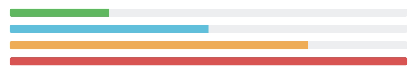
Progress bar styles is offered by bootstrap v4
Display an empty bar with bootstrap style
Test first to figure out what we want
  it('should display an empty bar with bootstrap style', () => {
    fixture = createGenericTestComponent(`
      <my-progress-bar></my-progress-bar>
    `, TestComponent);

    const wapper = fixture.debugElement.query(By.css('.progress'));
    expect(wapper).toBeTruthy();

    const progressBar = fixture.debugElement.query(By.css('.progress-bar'));
    expect(progressBar).toBeTruthy();

    const barElement: HTMLDivElement = progressBar.nativeElement;
    expect(barElement.getAttribute('role')).toBe('progressbar');
  });
After a failure in jasmine, we add template with bootstrap styles
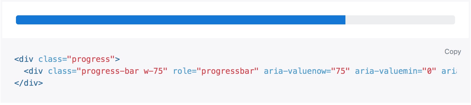
<div class="progress">
  <div class="progress-bar" role="progressbar"></div>
</div>
Test pass and we finish this feature
Move progress bar with max and value property
Create a sample test to move the progress bar
  it('should move the progress bar with value property as a percent value', () => {
    fixture = createGenericTestComponent(`
      <my-progress-bar [value]="25"></my-progress-bar>
    `, TestComponent);

    const progressBar = fixture.debugElement.query(By.css('.progress-bar'));
    const barElement: HTMLDivElement = progressBar.nativeElement;

    expect(barElement.style.width).toBe('25%');
    expect(barElement.getAttribute('aria-valuenow')).toBe('25');
  });
- Get width style with
barElement.style.width - Get element attribute with `barElement.getAttribute(‘aria-valuenow’)
<div class="progress">
  <div class="progress-bar" [style.width.%]="value" [attr.aria-valuenow]="value" role="progressbar"></div>
</div>
- width style is set with
[style.width.%]="value" - custom attribute is set with
[attr.aria-valuenow]="value"
The step above suppose the max value is 100 and move the bar to 1/4. But when the mix value is 200, it should move to 1/8.
  it('should move to 1/8  when the max value is 200', () => {
    fixture = createGenericTestComponent(`
      <my-progress-bar [value]="25" [max]="200"></my-progress-bar>
    `, TestComponent);

    const progressBar = fixture.debugElement.query(By.css('.progress-bar'));
    const barElement: HTMLDivElement = progressBar.nativeElement;

    expect(barElement.style.width).toBe('12.5%');
    expect(barElement.getAttribute('aria-valuenow')).toBe('12.5');
  });
Test fails again and we should add max property with @Input() decorator and calculate progress with value / max
export class MyProgressBarComponent {

  @Input() value: number;
  @Input() max: number;

  getProgressPercent() {
    return this.value / this.max * 100;
  }
}
  <div class="progress-bar"
    [style.width.%]="getProgressPercent()"
    [attr.aria-valuenow]="getProgressPercent()"
    role="progressbar"></div>
The newest test passed but the earlier fails
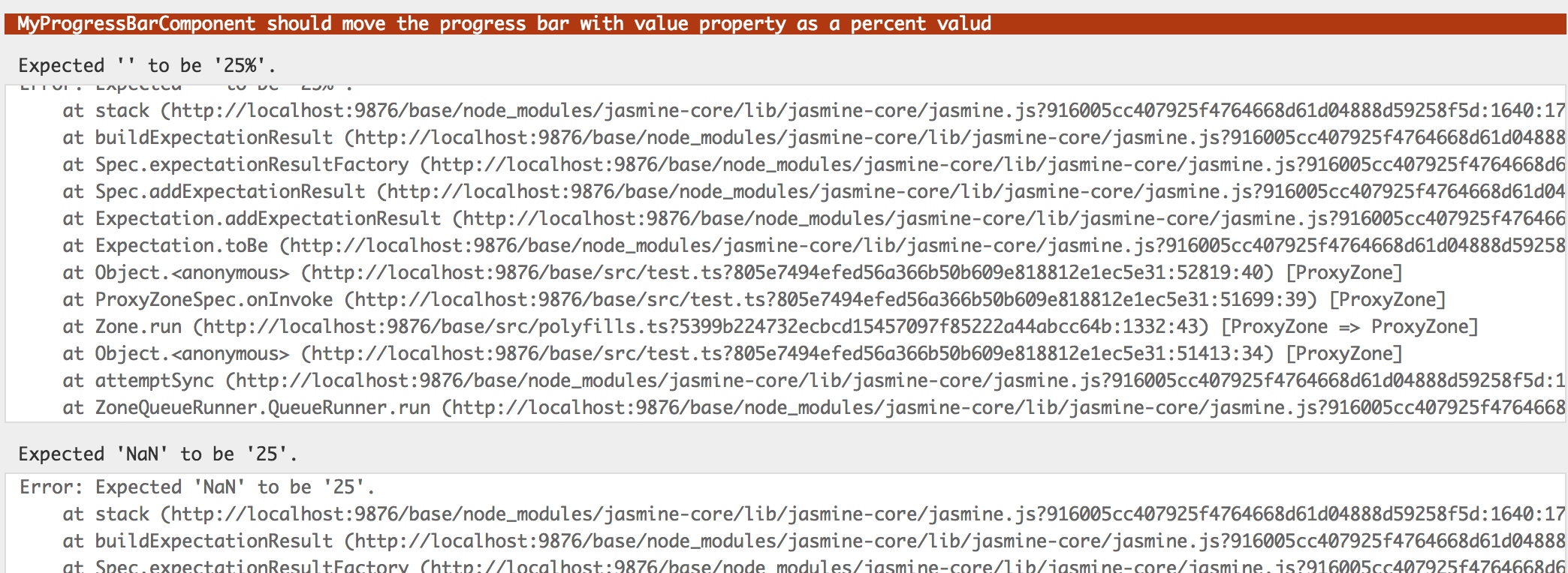
Because we create component without specifying value and max, then throws error when running this.value / this.max * 100.
So we add default values to fix failed tests.
  @Input() value = 0;
  @Input() max = 100;
Throughout all tests we have done, there are similar codes for getting current width and aria-valuenow property, so we extract as a method
function getProgressWitdh(fixture) {
  const barElement = fixture.debugElement.query(By.css('.progress-bar')).nativeElement;
  return barElement.style.width;
}

function getAriaValuenow(fixture) {
  const barElement = fixture.debugElement.query(By.css('.progress-bar')).nativeElement;
  return barElement.getAttribute('aria-valuenow');
}
Tests become shorter and more clear.
  it('should move the progress bar with value property as a percent value', () => {
    fixture = createGenericTestComponent(`
      <my-progress-bar [value]="25"></my-progress-bar>
    `, TestComponent);

    expect(getProgressWitdh(fixture)).toBe('25%');
    expect(getAriaValuenow(fixture)).toBe('25');
  });

  it('should move to 1/8  when the max value is 200', () => {
    fixture = createGenericTestComponent(`
      <my-progress-bar [value]="25" [max]="200"></my-progress-bar>
    `, TestComponent);

    expect(getProgressWitdh(fixture)).toBe('12.5%');
    expect(getAriaValuenow(fixture)).toBe('12.5');
  });
Specify progress bar styles with type property
  it('should specify style with type property', () => {
    fixture = createGenericTestComponent(`
      <my-progress-bar [value]="25" [max]="200" type="warning"></my-progress-bar>
    `, TestComponent);

    expect(getProgressElement(fixture).classList).toContain('bg-warning');
  });
Add class to process-bar
[class]="'progress-bar bg-' + type"
And get type property as @Input()
@Input() type: string;
Displaying percent value in the center of the bar if showValue is set to true
  it('should hide current percent value in bar as default', () => {
    fixture = createGenericTestComponent(`
      <my-progress-bar [value]="25"></my-progress-bar>
    `, TestComponent);

    expect(getProgressElement(fixture).textContent.trim().toBe('');
  });

  it('should show current percent value in bar if showValue is true', () => {
    fixture = createGenericTestComponent(`
      <my-progress-bar [value]="25"></my-progress-bar>
    `, TestComponent);

    expect(getProgressElement(fixture).textContent.trim()).toBe('25%');
  });
Add showValue property and show current percent value in the bar with *ngIf directive
<span *ngIf="showValue">%</span>
Add striped property and animated property as we have done with showValue property, add class with [ngClass] directive
[ngClass]="{'progress-bar-striped': striped, 'progress-bar-animated': animated}"
Show custom labels inside the selector
<span *ngIf="showValue">%</span><ng-content></ng-content>
Gains
- Progress bar supports with bootstrap:
progress, progress-bar, progress-bar-striped, progress-bar-animated - Element width with
w-{percent}class - Add class with
class,[class]and[ngClass]directive